
Data Visualisations
Kit of resources to build charts in the Quantum Design System.
Overview
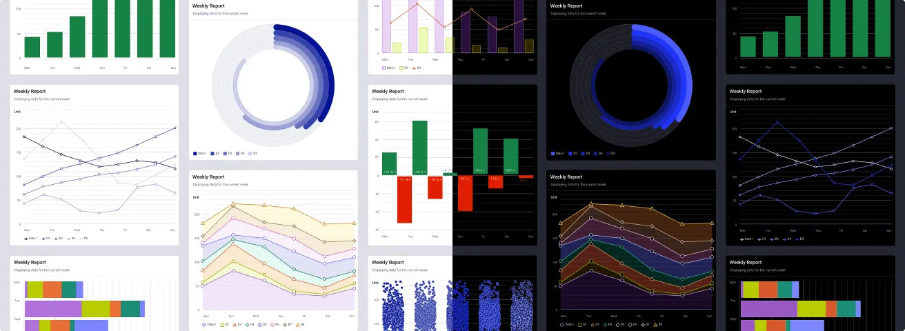
Welcome to the Quantum Dataviz Resources Kit. This file includes different assets to help you building data visualisations in the context of Quantum. The kit is based on a custom definition fo colors to match Thales visual identity and a well-established open source library data visualisation library, Apache ECharts, for accelerating implementation.
About Apache ECharts
The Dataviz Resources Kit is relying on the well-established Apache ECharts open source library. This library is not a requirement but is highly recommended to accelerate your way to build charts in Figma but also in development. This library has been chosen for its large range of charts, its technical reliability as well as its theming capacity. For your information, the Quantum Core Team is currently building an Apache ECharts theme to make it easier to go from Figma to Code.
The following tutorials explain how to make use of it to build charts in Figma. If your technical team has made the choice to use a different data visualisation library, that’s fine! You can still rely on this resources kit alone or grab your charts from another library to then apply the Quantum styles stored in this library.
Information
As a designer, it is highly recommended to know which data visualisation library will be used by your technical team and collaborate with the developers in charge to smooth the design-to-dev process.
What’s inside
- Documentation: Information about how the Dataviz resources kit is structured as well as guidelines and tutorials explaining how to make the most of it.
- Color Styles: A collection of chart examples showcasing what you can build with the available resources and that you can directly copy/past in your projects.
- Charts Library: A set of dedicated Figma Styles, published as a Figma Library, to cover all the styling needs to build data visualisations in your projects.
- Utility Components (not production ready): Lightweight building blocks used internally to assemble the Charts Library. There are not production-ready but you can use them as a starting point in your project.
- Quantum Apache ECharts Theme (alpha): A dedicated theme for the Apache ECharts web library in alpha version to ease the implementation of Quantum charts in code (see GitLab repository).
Disclaimers
- Dataviz color is a complex discipline: Making data visualisation intelligible and accessible is a craft in itself. This resources kit does not aim at providing all the keys to do this job perfectly out of the box so make sure to carefully consider your design decisions.
- Available colors are a starting point: Chart types, data density, and rendering contexts can vary widely. Adapt the palette for your project’s needs. If a styles combination does not work as intended, modify it and document your changes.
- We’re here to help: If the provided set does not cover your use case, or if a styles behaves unexpectedly, please get in touch with the Core Team. The system evolves through real-world usage.
Other resources
- Data visualisations Documentation: by Polaris (Shopify Design System): Practical guidelines on chart types, color, labelling, and accessibility.
- Apache ECharts Aria Best Practices by Apache ECharts: ARIA labels and decal patterns in ECharts, for screen readers and color blind users.
- Visually Accessible Data Visualisation by Derek Torsani: A case study on high contrast dataviz using shapes, patterns, and fills.
- Data visualisation Guide by data.europa.eu: A Comprehensive Guide to Unlocking Your Data’s Potential.
Color Styles
A specific set of Styles to manage data visualisation in the Quantum Design System.
Palettes
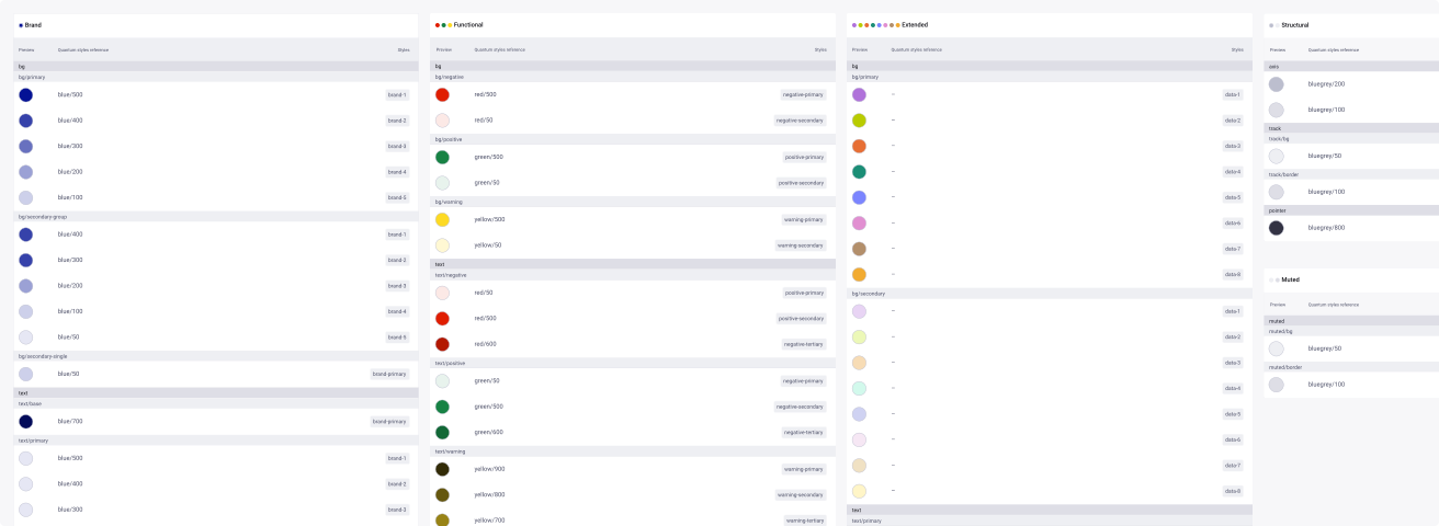
This file includes specific Figma Color Styles, published as a Figma Library, to create charts with the design system. Those Styles are defined around a semantic language clarifying their use and intent specifically in the context of data visualisation. They are broken down into two main groups:
-
Role
Used for distinct data series themes:
- Brand: based on Quantum blue color for high visual impact and low data complexity data visualisations.
- Functional: based on Quantum red and green color to highlight positive and negative data points, trends, …
- Extended: a broader set of up to eight colors for large data sets of highly contrasted data distinction.
Each Role group covers design decisions for background, text and border visual attributes.
-
Structural
Used for elements part of the charts anatomy.
- Axis: Colors to style the x/y axis and horizontal/vertical grid lines.
- Area: Colors to style the underneath surfaces of the chart like tracks and filling zones.
- Pointer: Color to style elements that pinpoint specific data points on a chart.
Modes
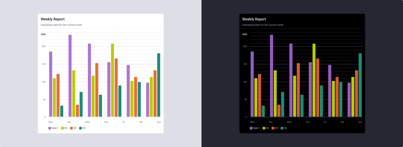
Each palette is provided in Light and Dark mode and are separated into two specific groups of Styles:
- dataviz-light: colors for designing in light mode
- dataviz-dark: colors for designing in dark mode
Even if this library brings semantic colors, the file does not support Variable mode in order to match the state of the current major version of the design system (Version 1) where the Light and Dark component libraries ar still two separated files wired on Figma Styles. This means that there is no automatic switch between Light and Dark mode via the native feature of Figma. Designing in Light and Dark modes mean adapting the Styles applied to your chart compositions manually.
Color styles are not simple inversions, as contrast and luminance are tuned per mode to preserve series legibility to meet accessibility standards.
Usage Guidelines
Do not mix palettes
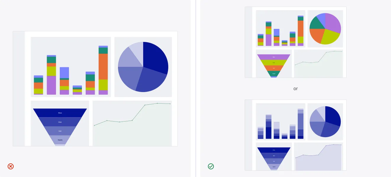
Brand, functional, and extended subsets are designed to operate independently.
- Don’t: Combine the brand palette with other palettes within the same dashboard.
- Do: Combine functional and extended palettes; use brand palette alone.
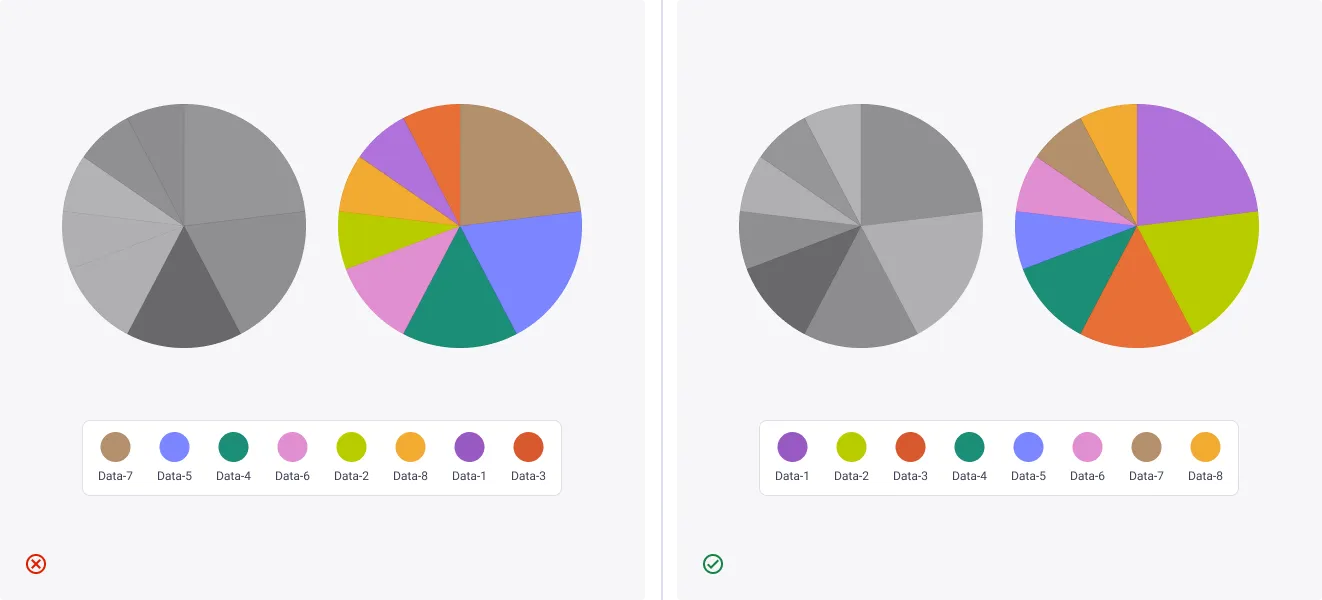
Use colors in the right order
Colors are sequenced to ensure each pairs with the first have sufficient contrast and hue distance. Skipping or reordering breaks that guarantee.
- Don’t: Reorder colors or apply them out of sequence.
- Do: Apply colors in the order defined by the palette.
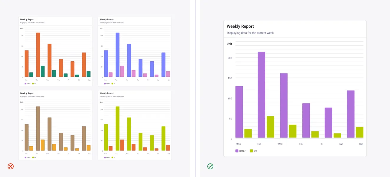
Pair the first two colors
When a chart needs only two colors, use data-1 and data-2. They sit at the right contrast and hue distance. A pairing further down the sequence can still work when it serves the brand.
- Don’t: Pick two colors from further down the sequence.
- Do: Use data-1 and data-2 to represent two sets of data across a dashboard.
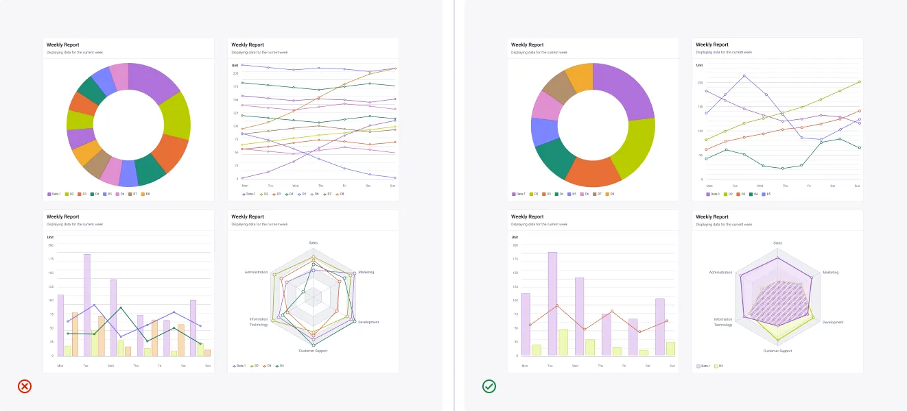
Keep series count low, keep charts readable
The system supports up to eight data series, but readability degrades quickly beyond five or six. If your chart needs more, consider splitting it into smaller views or consolidated categories.
- Don’t: Exceed 8 series. Some chart types can’t handle it. Always aim for fewer.
- Do: Aim for 5 or 6. Group or split your data first.
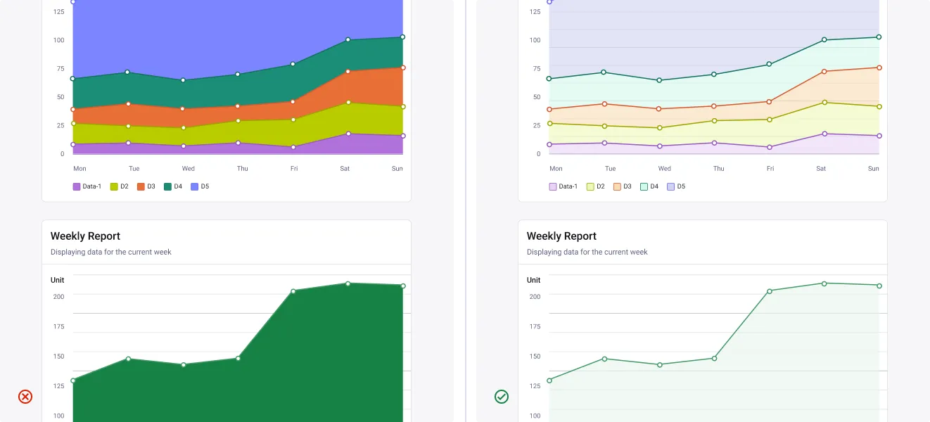
Use the secondary styles to fill large areas, at 60% opacity
Reserve primary styles for key elements. Use secondary to fill large areas like backgrounds or chart regions.
- Don’t: Fill large zones with primary styles.
- Do: Use secondary styles at 60% opacity for area charts and broad surfaces.
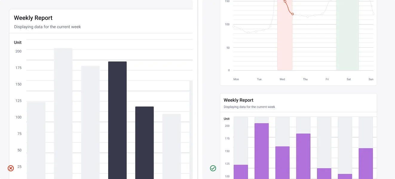
Use neutrals for structure, not for data
Neutral tones indicate structure or absence of value. They should never represent actual data series.
- Don’t: Use neutral colors to encode data values.
- Do: Use neutrals to highlight muted states (top) or to render background tracks (bottom).
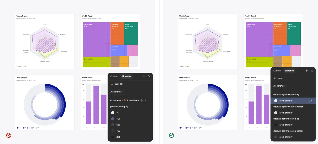
What is the area role for, and how do you use it?
Area fills the surface that carries a data series, bars, segments, rings, shaded regions, so each value stays visible and distinct from the rest.
- Don’t: Assign a raw palette value (grey 50, 500, 650) where an area role token belongs.
- Do: Use the area role tokens (role/area/bg, role/area/border) instead.
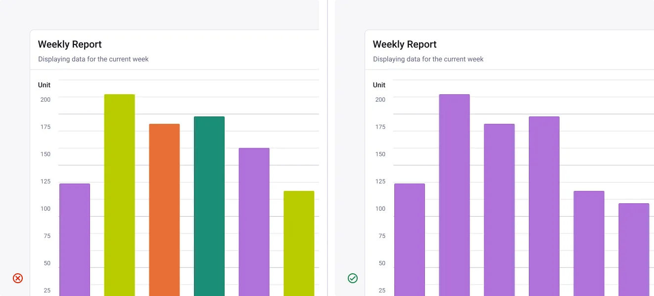
One color per data series
Assign a single, consistent color to each series across all charts and views.
- Don’t: Change the color of a series between charts.
- Do: Use one color per series, and keep it consistent throughout the interface.
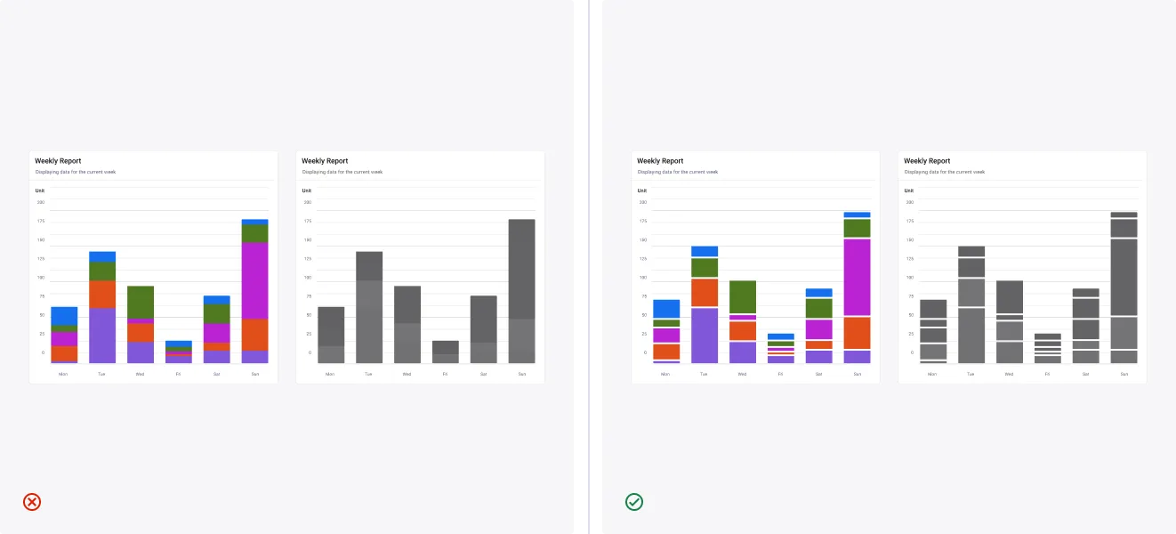
Apply space between adjacent colors
When using colors outside the Quantum palettes, adjacent contrast can drop even if each passes against the background. Add space between data elements to stay distinguishable.
- Don’t: Let adjacent chart colors touch when they come from non Quantum palettes.
- Do: Insert a visual separator between bars, segments, or stacks to restore separation.
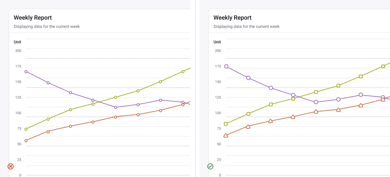
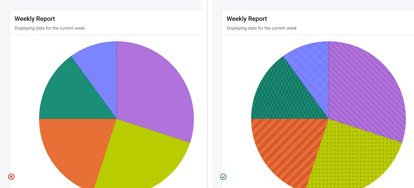
Ensure accessible visual distinctions
Color alone isn’t enough for all users. When necessary, supplement color with patterns, textures, or labels.
- Don’t: Rely solely on color to distinguish between data series.
- Do: Combine color with patterns, or labels to ensure readability for everyone.
Tutorial
Check our tutorials to learn how to Figma | Apply a pattern to a chart segment.
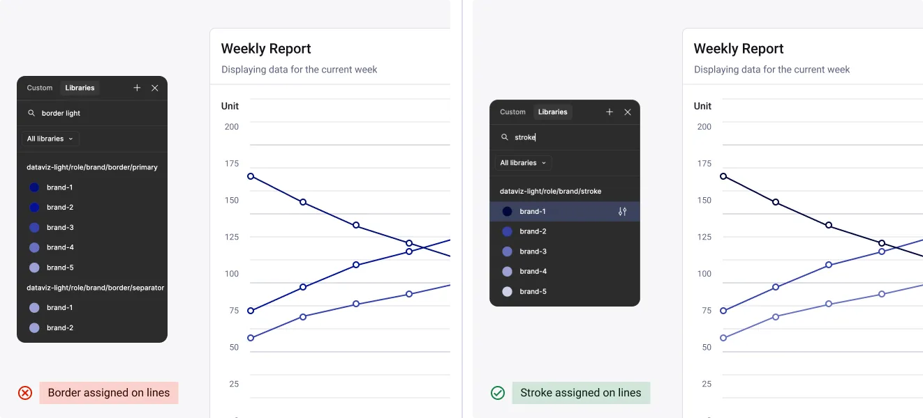
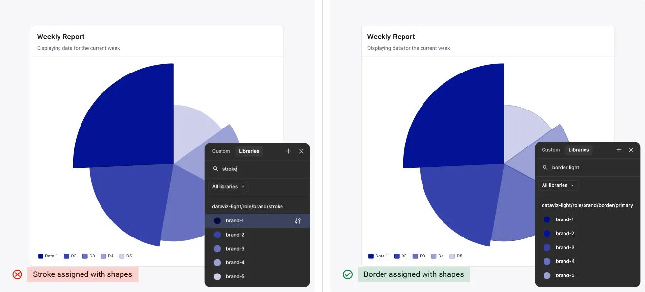
Do not mix border and stroke (brand only)
Borders complement filled shapes with lighter contrast. Strokes carry data alone and need stronger contrast. Do not swap them.
- Don’t: Apply border/primary to lines and border/stroke to shapes.
- Do: Apply border/stroke to lines and border/primary to shapes.
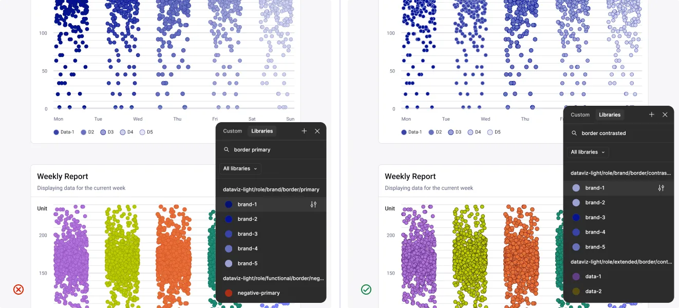
Use contrasted border for scatter view
Scatter points overlap and sit close in hue, so the border has to hold the edge on its own. Use this pairing to pick the right token instead of guessing from the name.
- Don’t: Use border/primary. It blends into the fill on dense points.
- Do: Use border/contrasted. It holds against the surface, so points stay separated.
Tutorials
Step-by-step guides for importing and customising charts in Figma using the Quantum Design System.