
Colors
Color is one of the fastest things the human brain is able to process and interpret. So yes, big deal. In Thales Design System, color help us bring brand identity and consistency to our products.
Color themes
Color themes are designed to be harmonious, ensure accessible text, and distinguish UI elements and surfaces from one another. Multiple color themes ensure that we can support various environmental requirements from our users.
Quantum themes
Quantum Design System currently offers 2 color themes: light, and dark.
However, a dark color theme is being evaluated with the Guild to ensure that we create a theme that delivers the correct expectations for our designers and end-users. Thales products can support a number of color themes, allowing users to switch between them. The choice of which color themes to support should be based on the content, platform and user experience.

Recommendation
Quantum is aimed at being compatible with multiple background colors, to allow designers to choose the best for their users:
- Light theme: White 100, bg25, bg50 and bg100.
- Dark theme: Black 100, bg900, bg850, bg800.

Digitalizing Thales Light & Dark Blue
In the Thales Brand Standards, the Thales blue had been modified for use on digital medium. For the Thales Design System to optimize the communication of Thales Signature while meeting accessibility standards, colors needed a rework.
Group color palette
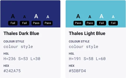
The two main Group colors, Thales dark blue and Thales light blue, have a direct correlation with the Thales logo. These colors must be used at values of 100% only (transparency set to 0). On pages inside publications and in online documents/pages, the colors may be used with different transparency levels but not different hue values.
Initial proposal for digital use
In the Thales Brand Standards, the light blue had been modified for use on digital medium. It was intended to be used as the primary color. No change had been applied to the digital dark blue compared to the dark blue from the Thales group palette.
These choices arise some issues that were pinpointed by digital teams at Thales:
- The light blue is not a colour that can be easily compliant with accessibility standards.
- The light blue digital rework did not follow a clear formula based on the colour model approach.
- The dark blue does not have enough vibrancy to really thrive on digital medium.
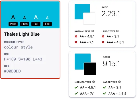
By consequence, some decisions had to be made:
- The light blue must not be used as the primary colour in order to preserve Thales signature while meeting accessibility standards on the web.
- The dark blue colour must be reworked to be optimised for digital use.
- The reworked dark blue colour must be contrast compliant and become the primary colour.
Creating a dark blue colour for digital use
To achieve a digitalised dark blue for the Thales Design System, a HSL (for hue, saturation, lightness) formula was created in order to generate the Thales dark blue in a digitalised format.
The formula was taken from the Thales Digital Light Blue:
- H (Hue) = (original value) - 2
- S (Saturation) = (original value) + 42
- L (Lightness) = (original value) - 17
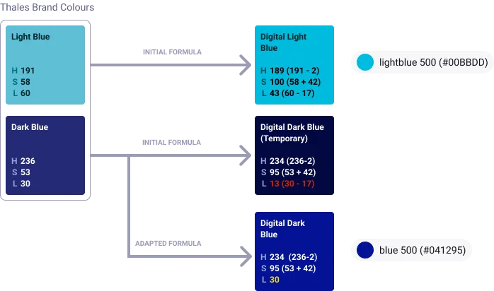
The purpose of the dark blue is to compliment the TDS light theme, therefore it has been decided that the lightness of the original colour will be maintained to ensure a reasonable level of contrast with black and other dark colours. Hence, the adapted formula has been agreed to maintain this level of contrast.
Color palettes
Thales Design System’s colours are designed to be clear and accessible. They come in different colour themes. Each theme is constituted of greys, semantic colours (e.g., blue, red, orange, green), and label colours.
Blue Palette
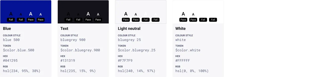
Our primary palette is derived from the Thales Brand Standards, comprised of neutrals, white and blue. These colours are designed to be clear and accessible.
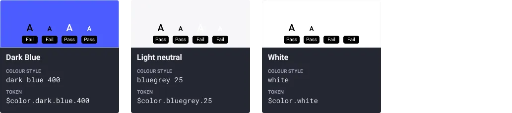
We use blue ($color.blue.500) for primary actions, buttons, text links. Text ($color.bluegrey.900) is used primarily for body text and headings, white ($color.white) is used for surfaces such as cards, and light neutral ($color.bluegrey.25) is used for page backgrounds.
Secondary Palette
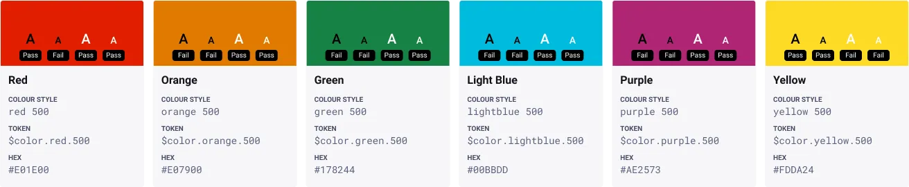
Our secondary palette contains a variety of colours derived from the Thales Brand Standards additional colour palette. These colours are used to emphasize elements within your user interface and to keep things fresh and interesting.
It is made up of red ($color.red.500), yellow ($color.yellow.500), green ($color.green.500), light blue ($color.secondary.500), and magenta ($color.purple.500). Each colour is selected intentionally to provide meaningful feedback within our products. See the semantic colour guidelines below for more information.
Color usage
Find appropriate usage for the base Light Theme in Quantum in the palette below.





Colour Ramps
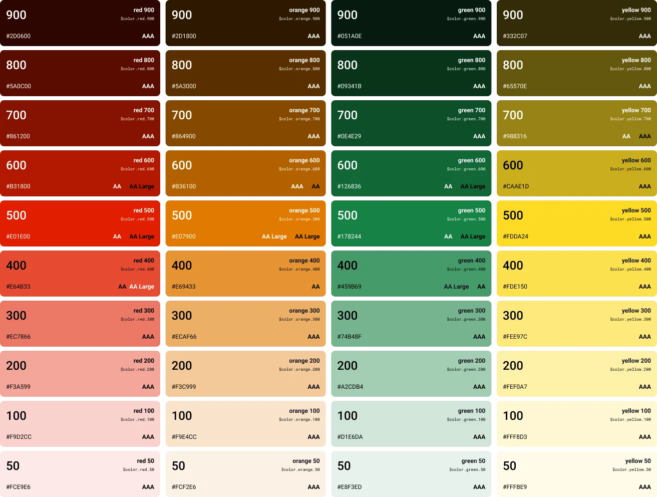
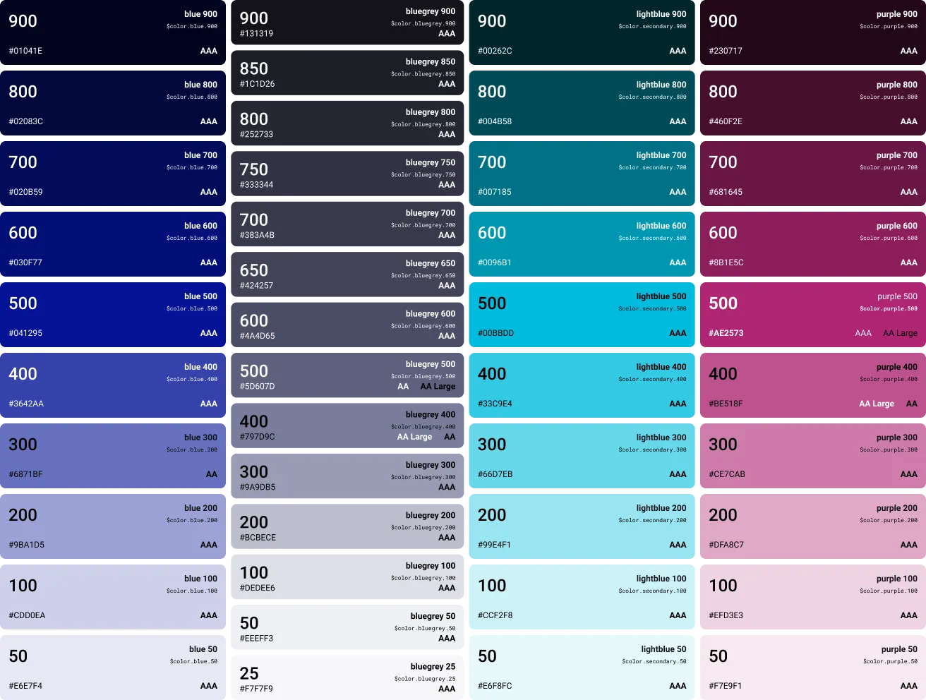
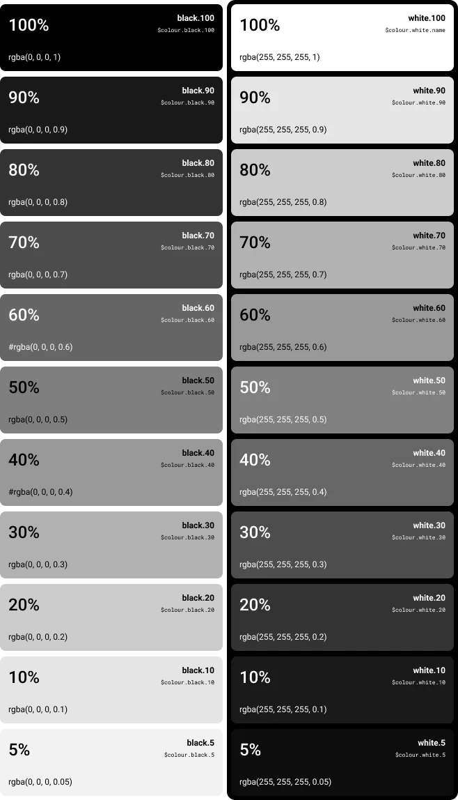
The Colour Ramps are a comprehensive set of tint shades, based on Core and Secondary Palettes. This palette is complementary to the main colours to create emphasis on the colour choice. Every colour has been tested for WCAG 2.1 contrasts and the results are displayed on the cards.
To check your colour contrasts, we encourage using the Figma | Stark – Contrast & Accessibility AI Checker plugin, available by default for all Thales Figma users.

Semantic Colors
Semantic colours have assigned meanings and are consistently used throughout TDS to set expectations for our users.
Semantic colour helps users to identify status, see actions, locate help, and understand next steps. The consistent use of colour keeps cognitive load low and makes for a unified and engaging user experience.
TDS has different semantic colours (accessible with white to support our light theme) that are associated with the following predefined value states:

Semantic colours are to be used if:
- You want to highlight an important status.
- You want to validate fields using form field validation.
- Your platform needs message or alert handling.
- You want to use the value states for a control.
Do not use semantic colours if:
- The colour has no meaning and is used only for decoration.
- You want to use colours in an industry-specific context, where the meaning of the colours differs from the standard semantic meaning. Use industry-specific colours instead.
When to use which Semantic Colour
Only use a semantic colour if you need to convey the meaning defined for that colour.
Accessibility
Most themes are WCAG AA+ accessible. If a higher level of accessibility is required, allow the user to activate an accessible theme as a user preference.
AA has a contrast level of 4.5:1 or higher, and AAA has a contrast of at least 7:1. AA Large means the font size must be at least 18 points or 14 points bolded to be AA accessible.
Primary/Informative
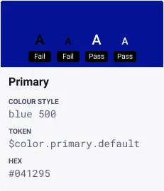
Use this colour for a main action or an informative state.
Use the primary colour if:
- You want to draw attention to a control for an important purpose.
- You want to highlight newly added items, such as a new table row.
Don’t use this colour if you want to highlight an information text. The blue text color is explicitly reserved for links. Use bold or italic formatting instead.
Neutral
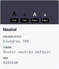
Use this colour as the neutral state of all UI elements.
Use the neutral colour if:
- You want to use the default state of a UI element.
- There is no reason to use another semantic state.
- You want to indicate a neutral object status.
- A message contains non-critical, additional information for users.
Success/Positive
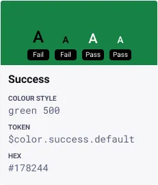
Use this colour as the positive state when reinforcing that an action was successful/complete.
Use the positive colour if:
- You want to highlight a good or positive status.
- A message contains information about a process that was completed without any issues.
To indicate a successfully completed process, a short notification is enough. In this case, you can use a message toast.
Warning/Critical
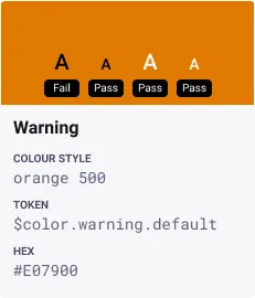
This colour indicates a critical situation, a warning or an action that requires caution.
Use the warning/critical colour if:
- You want to highlight a critical status.
- A minor problem has occurred. The user can carry on working, but might run into an error later on.
- The user input was validated and a minor problem occurred. The user can continue without fixing the problem, but might run into an error later on.
- A message contains information about a warning.
Danger/Error/Negative
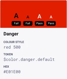
This colour is to be used for errors, or to indicate a bad or negative status/consequence.
Use the negative/critical colour if:
- Something bad has happened, or is about to happen. The issue requires the user’s attention. Until the issue is resolved, the user can’t continue working.
- You want to indicate that a value has caused an error.
- The user needs to be prevented from completing an action.
- The user input failed a validation, and the problem must be fixed before the user can continue.
- A message contains information about an error.
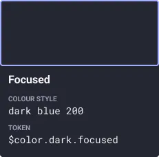
Focused
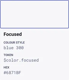
This colour is used for focus ring on interactive elements.
Sources and references
- Designing Semantic Colours - UX Planet
- Using Semantic and Industry-Specific Colors - SAP Fiori Design Guidellines
- Colours - Adobe Spectrum
- DefStan 23-009 - Wikipedia
- ISO 9241 - ISO
Dark Mode Colors
To cater for a more various range of display capabilities, we have worked on specific color addition to complete the palette, and make it more friendly for Dark Mode usage.
Overview of the main palette
Our primary palette is derived from the Thales Brand Standards, comprised of neutrals, white and blue. These colours are designed to be clear and accessible.
Semantic colours for Dark Mode
Our semantic colour palette contains a variety of colours derived from the Thales Brand Standards additional colour palette. These colours are used to emphasize elements within your user interface and to keep things fresh and interesting.
It is made up of red ($color.dark.red.500), yellow ($color.dark.orange.500), green ($color.dark.green.500), bluegreen ($color.bluegreen.500). Each colour is selected intentionally to provide meaningful feedback within our products. See the semantic colour guidelines below for more information.

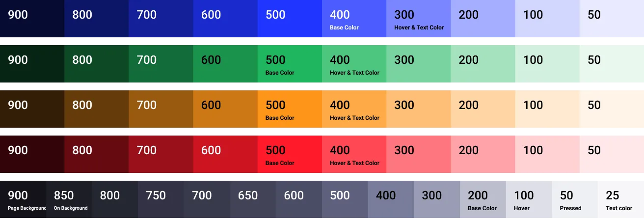
Color usage
Find appropriate usage for the base Dark Theme in Quantum in the palette below.
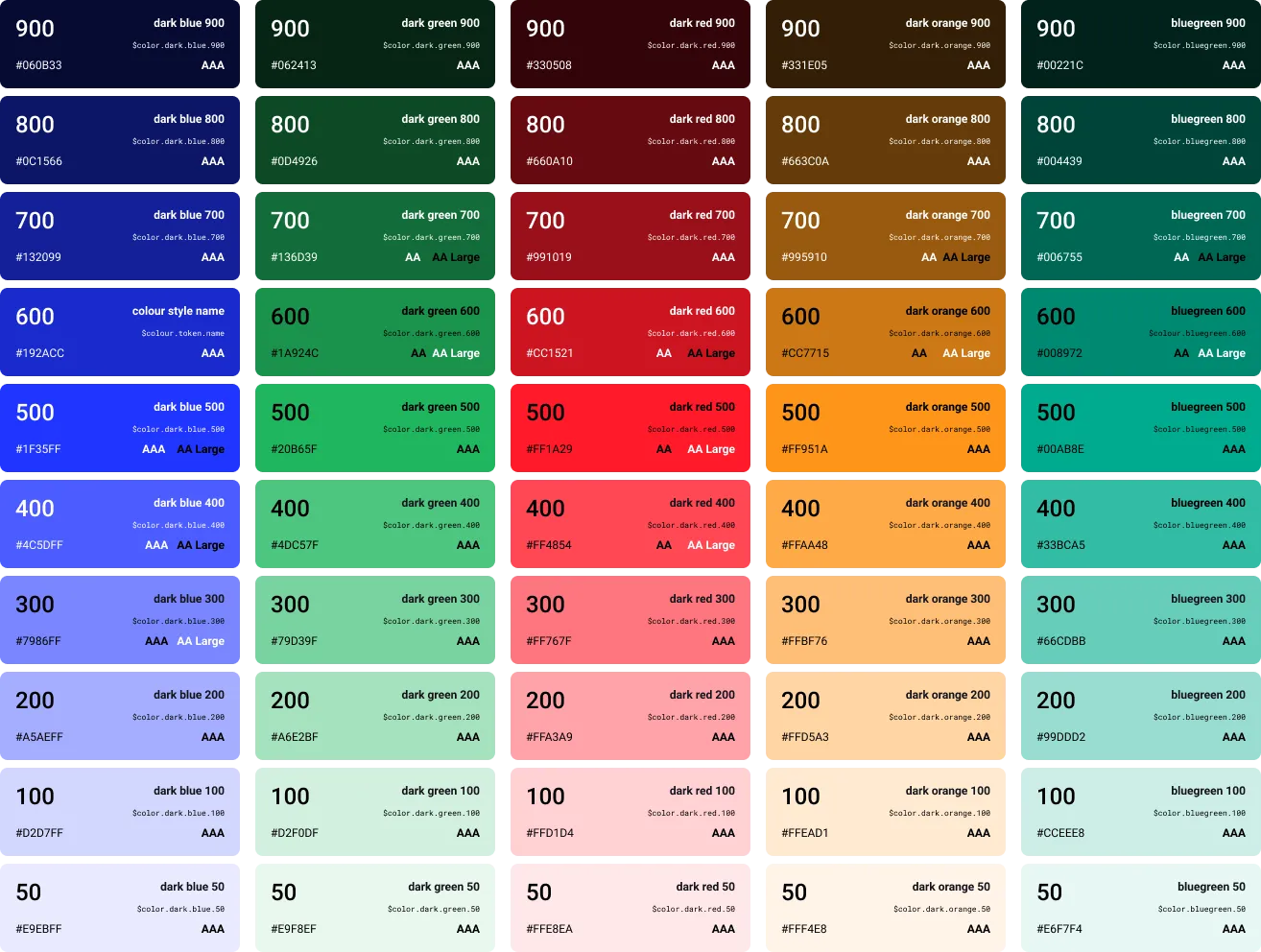
Colour Ramps
The Colour Ramps are a comprehensive set of tint shades, based on Core and Secondary Palettes. This palette is complementary to the main colours to create emphasis on the colour choice. Every colour has been tested for WCAG 2.1 contrasts and the results are displayed on the cards.
To check your colour contrasts, we encourage using the Figma | Stark – Contrast & Accessibility AI Checker plugin, available by default for all Thales Figma users.

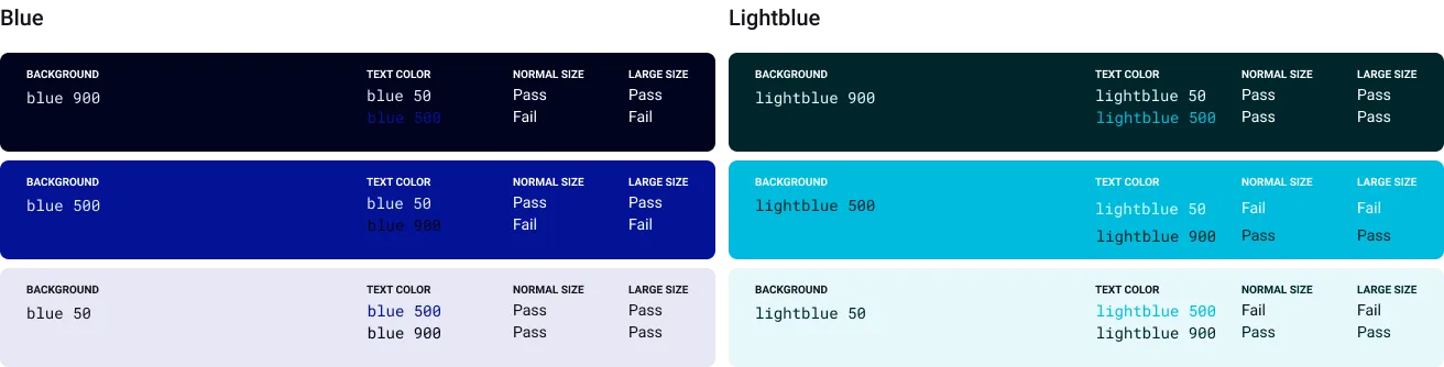
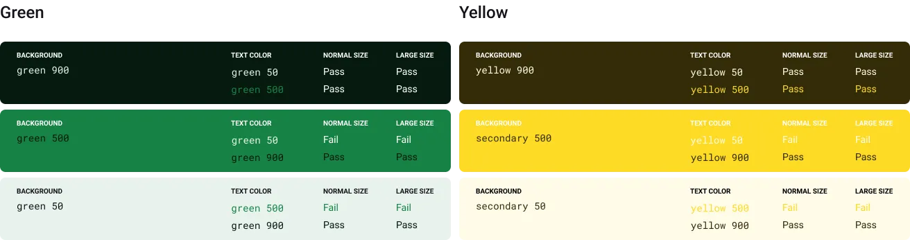
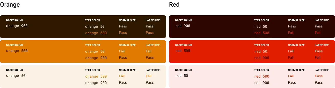
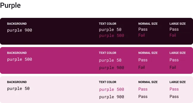
Accessible color combinations
Accessibility is of paramount importance when it comes to building products, hence we have provided a collection of the TDS colour combinations that satisfy the Web Content Accessibility Guidelines (WCAG).
All background/foreground combinations in this section are relative to each tint shade. If you want to know combinations for universal text colours (white for dark backgrounds, bluegrey-900 for light ones), please refer to the AA/AAA ratings on the extended palette.
International colors
Thales provides solutions for customers across the globe, each with their own cultures where colour and language exist at the root. As designers and solution providers, we must always keep this in mind when building new products.
Best Practices
Always assume that the colors you are using might have a significant impact on your end users’ understanding according to their culture. For example, in Western Europe and Americas, red is synonym for error, criticality, failure. Whereas in China the red is symbol of happiness, prosperity.
In order to be more inclusive and design for the broadest audience, we recommend to never assume the color can be self-explanatory. Textual indicators or other visual indicators (i.e icons) should always come jointly with the color to express a message. As expressed in the WCAG 1.4.1 rule.
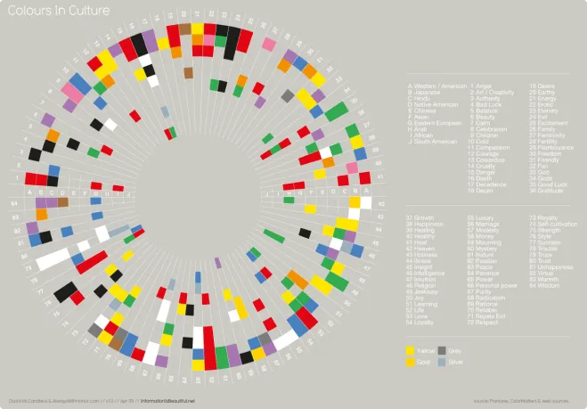
More information about this can be found at informationisbeautiful.net.