
Iconography
Iconography in Thales Design System plays an essential role. It helps to create visual indicators and enhance readability of components, and guide users through a better understanding of actions when used correctly.
Thales Design System uses Material Icons.
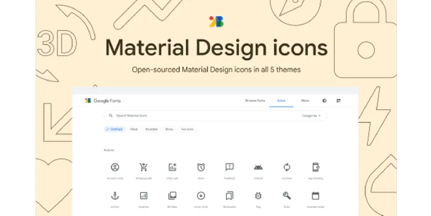
Google Material Icons (main icons library)
Material Icons library serves as the default and main icons library within Quantum Design System. Your first reflex should be to look at the Figma | Material Icons library in Quantum to search for icons. This library alone can cover most of your needs in interface design.
Google Material provides a wide range of day-to-day icons. It also comes in a variety of styles and rely on a clean, simple form factor style, perfect for carrying functional visual representations.
Quantum Design System aims to be as flexible as possible for product creators like you, designers and developers. Apart from these reasons, the decision to use Material Icons for our icon base was also taken because many Thales digital products already use them, thus this brings consistency along the way!
- Material Icons are available in five styles and a range of downloadable sizes and densities.
- We strongly recommend using only one style set of icon per product (either choose solid, outline or any other style and stick to it).
You can also visit the Material Icons library online to have a better search experience for specific icons.
How to use this library?
You can use Material icons as a Figma library in your project file. Search for the library Figma | Material Design icons in your Figma assets panel.