Grids & layout
The layout system
The entire layout system of Thales Design System is based on the 8px baseline, and is built upon the spacing scale. All the grids provided in the library are made to help you build better experiences, and bring consistency across your different products, and within product themselves.
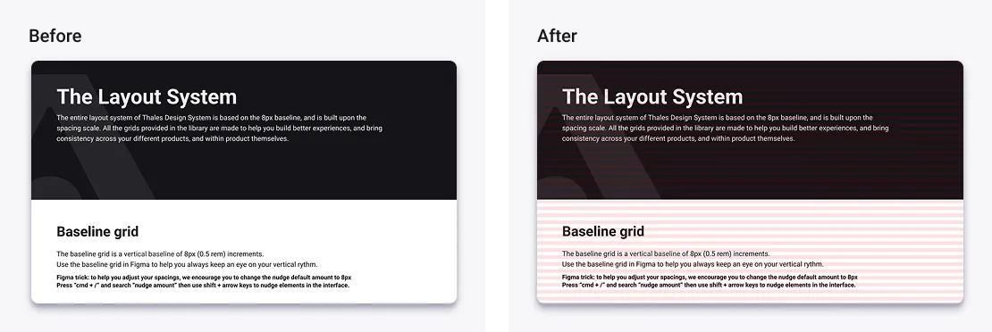
Baseline grid
The baseline grid is a vertical baseline of 8px (0.5 rem) increments. Use the baseline grid in Figma to help you always keep an eye on your vertical rhythm.
Figma trick: to help you adjust your spacings, we encourage you to change the nudge default amount to 8px Press “cmd + /” and search “nudge amount” then use shift + arrow keys to nudge elements in the interface.
How to use?
To apply the baseline grid to your interfaces, follow these steps:
- Make sure your layout grids are shown by pressing: Ctrl + G (Windows) or ⌃ + G (macOS)
- Select the frames you want to apply the grid on.
- In the right panel, click on the styles in Layout Grids section.
- Select “Grids > Baseline Grid 8”
Columns Grids and breakpoints
There are countless options when it comes to creating breakpoints. We wanted to make sure that the Designers could design with reliable and adapted grids that would fit most of the cases. Based on the most commonly used devices and resolutions, we cut down to 5 major breakpoints.
If you need more grids to be created, please contact the Thales Design System Core Team. You can find the associated statistics by clicking on this link.
How to use?
To apply grids to your interfaces, follow these steps:
- Make sur you layout grids shown by pressing: Ctrl + G (Windows) or ⌃ + G (macOS)
- Select the frames you want to apply the grid on.
- In the right panel, click on the styles in Layout Grids section.
- Select “Grids > Select your grid”
To help you select the right grid according to your screen size, please follow the breakpoints recommendations below.
Breakpoints system
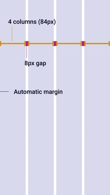
Thales Design System provides layouts with different column structures. You will find 4, 6, 8 and 12 columns grids. For each breakpoint, you will find recommendations on number of columns, gutters and margins to apply.
Fluid containers
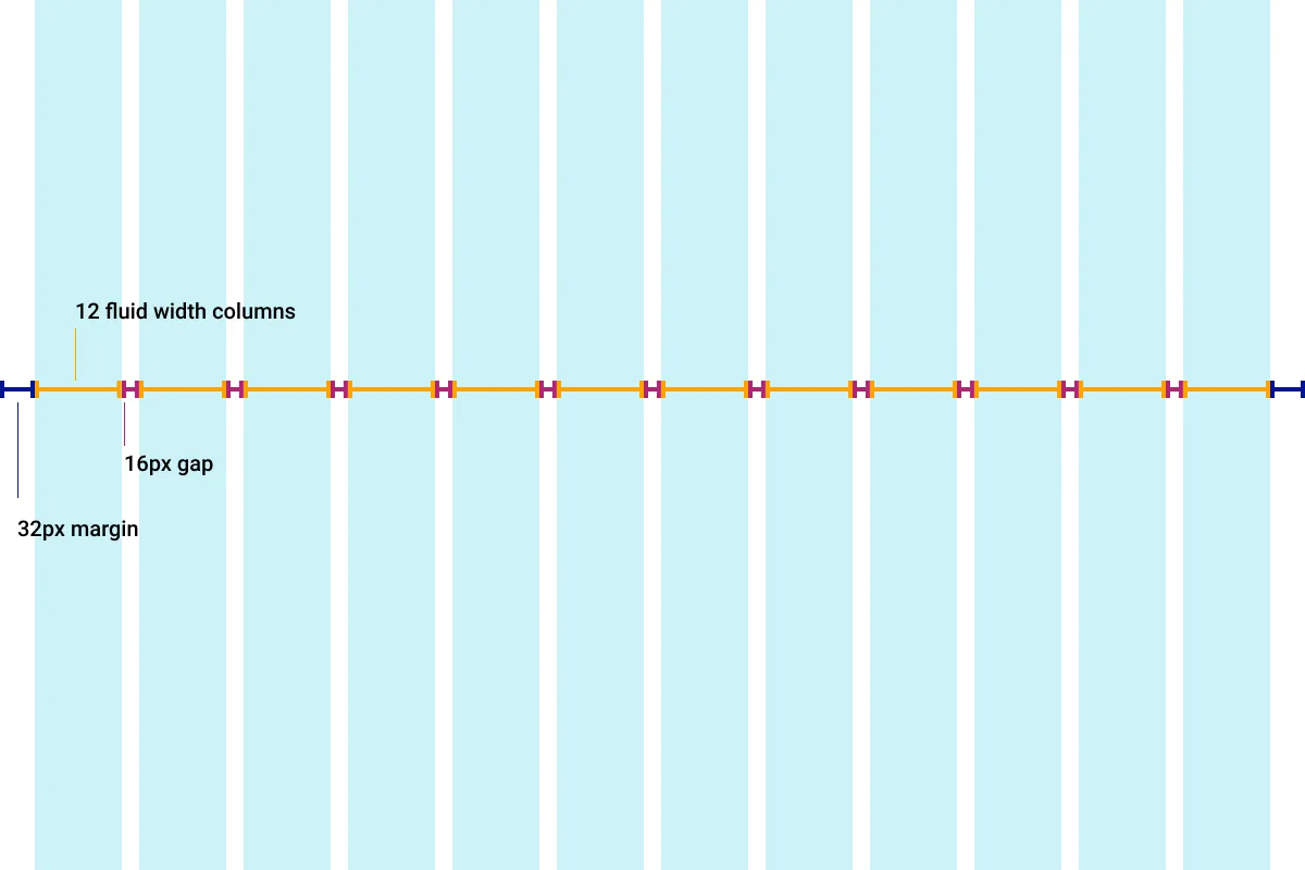
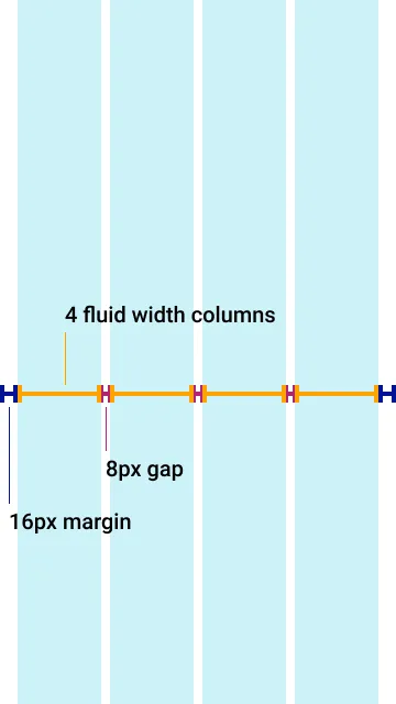
The fluid grid system is based on fluidity, so the size of columns adapts according to gutters and margin, in this way, the grid will scale with your screen size.
| Breakpoint | Range (px) | Devices | Columns | Gutters | Margins |
|---|---|---|---|---|---|
| xxsmall | 0-360 | smartwatches | 4 | 8px | 16px |
| xsmall | 360 - 640 | mobile, small tablets | 4 | 8px | 16px |
| small | 640 - 767 | small tablets P, small mobiles L | 8 | 16px | 32px |
| medium | 768 - 991 | tablets (P/L), large mobiles (L) | 8 | 16px | 32px |
| large | 992 - 1199 | medium to large tablets | 12 | 16px | 32px |
| xlarge | 1280 and above | large tablets, desktop, large devices | 12 | 16px | 32px |
Responsive scale
The breakpoint should always be defined by the min-width value (e.g the breakpoint value for medium should be min-width: 768px)
The columns widths are fluid and should scale according to the viewport size and the associated breakpoint.
Fixed width containers
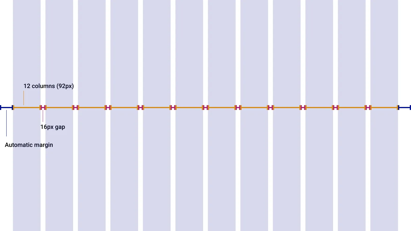
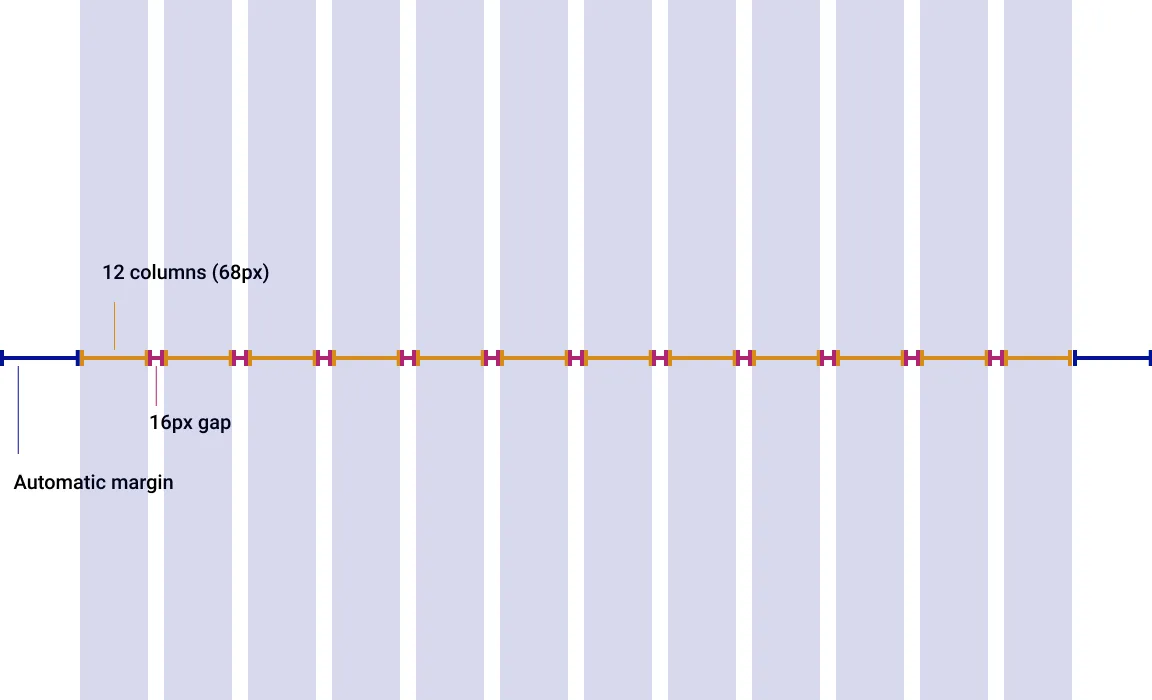
The fixed grid system is based on defined layout sizes, triggered by breakpoints. The maximum width of every containers is based on the breakpoint value and its relative minimum width.
| Breakpoint | Range (px) | Devices | Columns | Column Size | Gutter |
|---|---|---|---|---|---|
| xxsmall | 0-360 | smartwatches | 4 | Fluid | 8px |
| xsmall | 360 - 640 | mobile, small tablets | 4 | 84px | 8px |
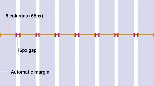
| small | 640 - 767 | small tablets P, small mobiles L | 8 | 66px | 16px |
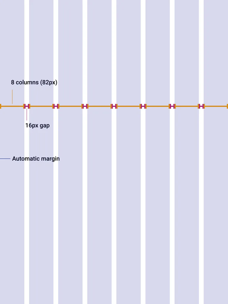
| medium | 768 - 991 | tablets (P/L), large mobiles (L) | 8 | 82px | 16px |
| large | 992 - 1199 | medium to large tablets | 12 | 68px | 16px |
| xlarge | 1280 and above | large tablets, desktop, large devices | 12 | 92px | 16px |
Available grids
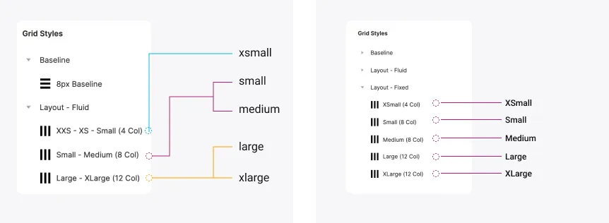
To make it easier, we cut down the number of grid to their initial utility. This means some breakpoints share the same grid.
Usage guidelines
The entire layout system of Thales Design System is based on the 8px baseline, and is built upon the spacing scale. All the grids provided in the library are made to help you build better experiences, and bring consistency across your different products, and within product themselves.
Create regions
To help prepare your designs for responsiveness, you should define regions in your layouts to create a consistent structure in the product. To create regions, use the gutters and the margins as limits to the zones you want to define. To optimize responsiveness, design the regions for every breakpoint.
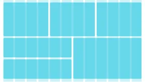
Don’t align everything to the grid
When creating regions, you create an enclosed environnement to contextualize components that belong together. Those elements need to be aligned according to their relationships and purpose. Only align layout regions strictly to the grid and do not compromise the design by doing it with individual components.
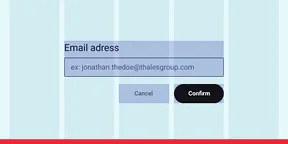
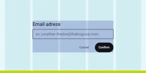
Don’t fall in the gutter/gap
The grid gutters are here to create space and breathing room between the regions. Do not, ever, extend a layout region in the gutters and only span them from a column edge to another.

Layout Grid Examples
Desktop Fluid Grid
Desktop | 1366 * 768
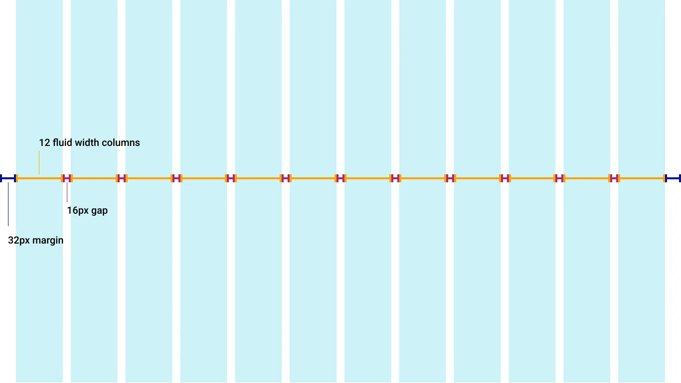
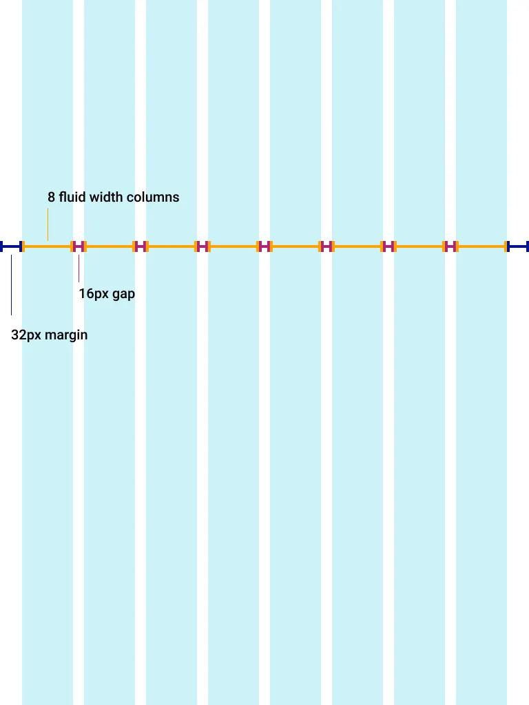
Tablet Fluid Grid
Portrait Tablet | 768 * 1024
Landscape Tablet | 1200 * 800
Mobile Fluid Grid
Mobile | 360 * 640
Breakpoint: 1280px (x large)
Desktop | 1366 * 768
Breakpoint: 992px (large)
Small Desktop | 1152 * 700
Breakpoint: 768px (medium)
Tablet | 768 * 1024
Breakpoint: 640px (small)
Landscape Mobile | 640 * 360
Breakpoint: 360px (x small)
Mobile | 360 * 640