
Typography
Overview
Typography in Thales Design System plays an essential role in interface readability. It helps to create a clear visual hierarchy and organize information for a better user’s experience.
Typeface
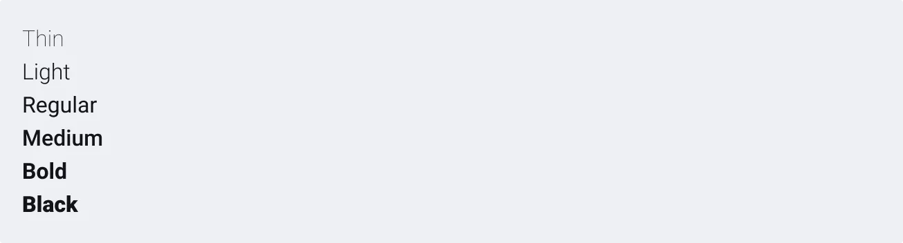
Roboto font is used for the Thales Design System. It is designed and maintained by Google Fonts. Roboto is a copyright free font, which gives it the advantage of being free with no copyright attached and hosted by the Google server (meaning it receives updates easily, each time the font is updated). Moreover, it has many style variations (thin, light, regular, medium, bold, black, condensed…), which gives a wide variety of font format choice for your design.
Note that it also remains perfectly readable, even in small font sizes and paragraphs of dense text. Modern and sober, it is suitable for Thales products.
Link to Roboto on Google Fonts (No need to download if you use Figma. Roboto is available by default in Figma).

Specific aeronautic fonts
Note that other font such as B612 can be used if necessary to improve accessibility and comfort of reading. Provided by collaboration between ENAC and Toulouse III College, it results from a prospective study, which aims to define and validate a font for aeronautical use cases. (Study called: Definition and Validation of an Aeronautical Font). The font called PolarSys B612 allows to better highlight information on the aircraft cockpit according to readability, reading comfort and cockpit information uniformity. Their principal characteristics are to maximize the distance between shape and letters, respect the primitive shape of letters and uniform their shapes and separations.
Find more information about this font: B612 Google Font page and B612 GitHub repository.
Scale
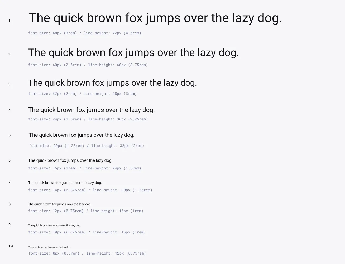
Typography scale is built on a modular scale based on a 4px baseline grid : All font sizes have a ratio of 1.25, known as the major third type scale. It means that each size is multiplied or divided by 1.25 from the previous size, starting with the base size (16 px or 1rem), and rounded up or down.
Weights
Font weight adds contrast to lead your reader down the page by adding emphasis and differentiate content hierarchy. It must be carefully balanced with size pairings. A bold weight will always have more emphasis than a lighter weight font of the same size. However, a lighter weight font can rank hierarchically higher than a bold font if the lighter weight type size is significantly larger than the bold one.
We suggest using Roboto Regular, Medium, Bold and Black for digital experiences. The Bold and Black weight are ideal for section headers, but should not be used for long text.
Text styles
Typography in Thales Design System plays an essential role in interface readability. It helps to create a clear visual hierarchy and organize information for a better user experience.
Always use the text styles to stay synchronized with the library and keep consistency in visual hierarchy. If you need to use a new text style, you can add one by following these steps.
Titles
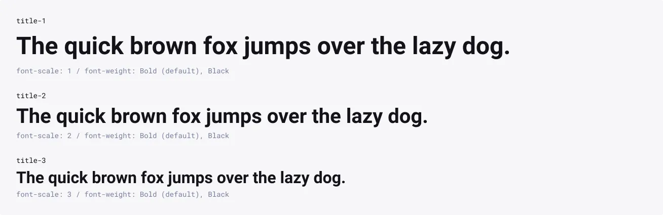
Titles are the first level of hierarchy text that draws users into the design. They are used to create clear various levels of hierarchies between text or blocs. Titles provide core information or draw attention to the key benefit.
Usage
- Main layout title
- Main section title
- Core informations
- Component Heading
Recommended colors
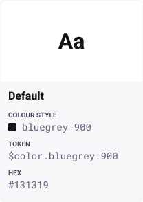
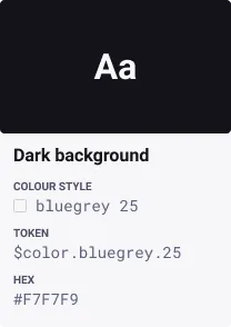
For more color combinations, refer to Accessible Groupings.
Subtitles
Subtitles are a level lower in the hierarchy than Titles and are reserved for medium-emphasis text. They are used to create vertical rhythm along with the higher level titles. They help to keep the attention of the user with the design and quickly navigate through the content.
Usage
- Subtitles should never appear as the first navigation element in a layout
- Categories
- Sub-section
- Field group heading
- Component heading

Recommended colors
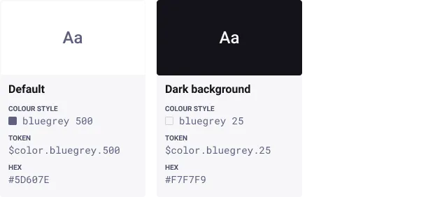
For more color combinations, refer to Accessible Groupings.
Body
Body text is the most common text. It is used for main content and long or short paragraphs. It is a good size for comfortable, long-form reading. Use this for longer body copy in components such as accordion or structured list.
Usage
- Paragraphs
- Text line

Recommended colors
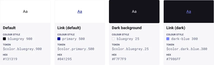
For more color combinations, refer to Accessible Groupings.
Caption
Captions are the smallest font size with Overline. They are used sparingly to annotate imagery or add indications that can helps the user.
Usage
- Annotations
- Legal content
- Explanatory helper text
- Complementary content
- Legend

Recommended colors


For more color combinations, refer to Accessible Groupings.
Overline
An overline is a single line above a chunk of text. When associated with a title or a subtitle, it is used sparingly to add context for the user. It can also be used to name categories in small components.
Usage
- Add context indication
- Category title in small components

Recommended colors
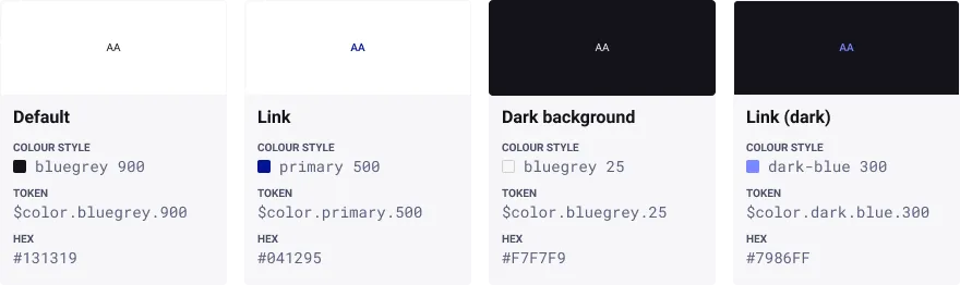
For more color combinations, refer to Accessible Groupings.
Code
Roboto Mono is used to display code or snippets. It makes code easier to read and understand for developers.
Usage
- Code
- Snippets

Recommended colors
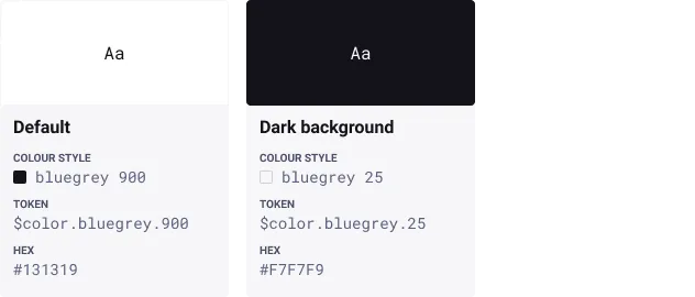
For more color combinations, refer to Accessible Groupings.
Links
Links are used to navigate to another page, or section by clicking on it. They can appear within a sentence or paragraph, or also can exist on their own.
Usage
When to use:
Links should be use sparingly to:
- Navigate to a different page within the application
- Navigate to an external website
- Scroll quickly to a specific section of the current page
- Link to emails or phone numbers
When not to use:
- Users need to trigger an action.
- Users need to manipulate data.
In these cases, consider using Buttons instead.
Text styles
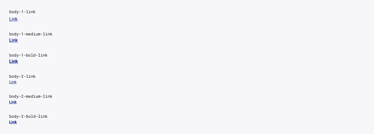
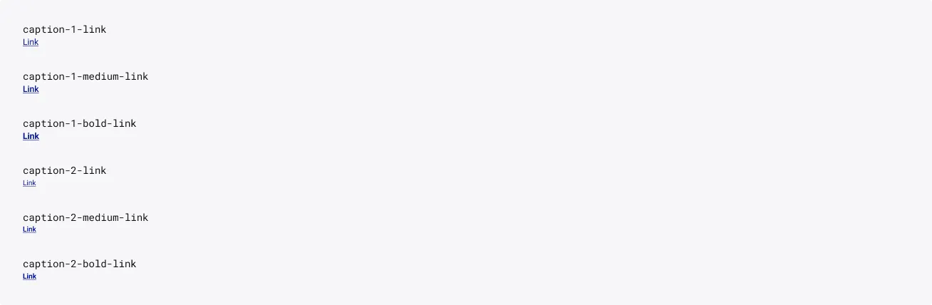
When introducing links into your design, it’s recommended to use the ‘Foundations’ library text styles to stay synchronized with the library.
When you need to create a link using another text style or another style library, we recommend still using the underline to highlight that the text is a link. You can achieve this in the text decoration menu, or with Cmd+u / Ctrl+u.
Body
Caption
Colour styles
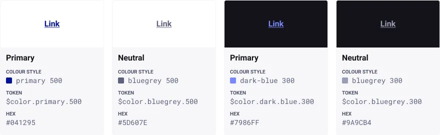
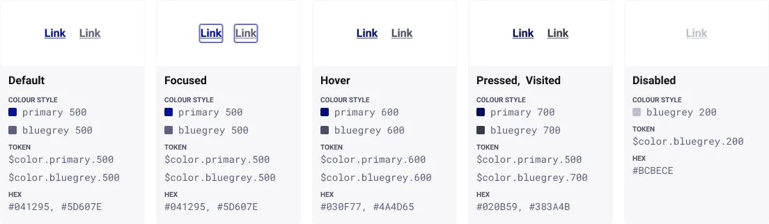
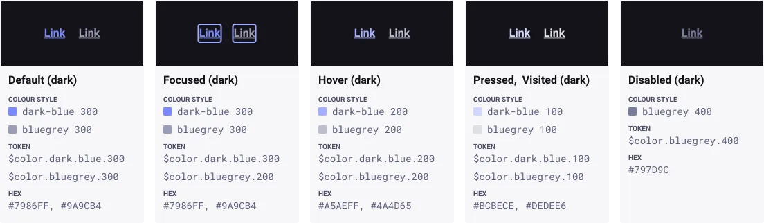
By default, links use the primary blue as it provides the strongest perceived affordance of clickability.
However, it is possible to use a neutral variant that can be more appropriate when you need to deprioritize its focus on the screen.
States
Underlining
In addition of the colour, underlining a link is important for low-vision users’ accessibility and it is recommended to maximize the affordance. Users shouldn’t have to guess or scrub the page to find out where they can click.
However, there are some cases where it is not necessary to underline a link, such as:
- Navigation menus, breadcrumbs
- Lists of links.
These cases are true only when the page design clearly indicates the area’s function.
Exception: Underlining is essential if you use link colours such as reds or greens, which cause problems for users with common forms of colour-blindness.
Sources and references
- Guidelines for Visualizing Links - Nielsen Norman Group
- Link - IBM Carbon
- Link - U.S. Web Design System
Usage guidelines
Use library text styles
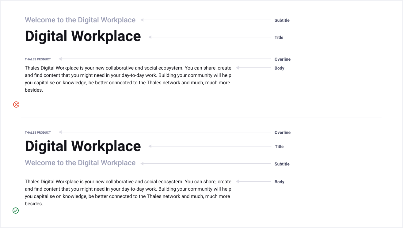
It is recommended to use library text styles to stay synchronized with the library and keep consistency in visual hierarchy. Sometimes the style options aren’t suitable for specific scenarios. In these situations, it’s ok to deviate from the size options by taking a font size specified in the scale system.
A consistent typo hierarchy helps the user to navigate through the content and easily find what they are looking for.
Typography component pairing
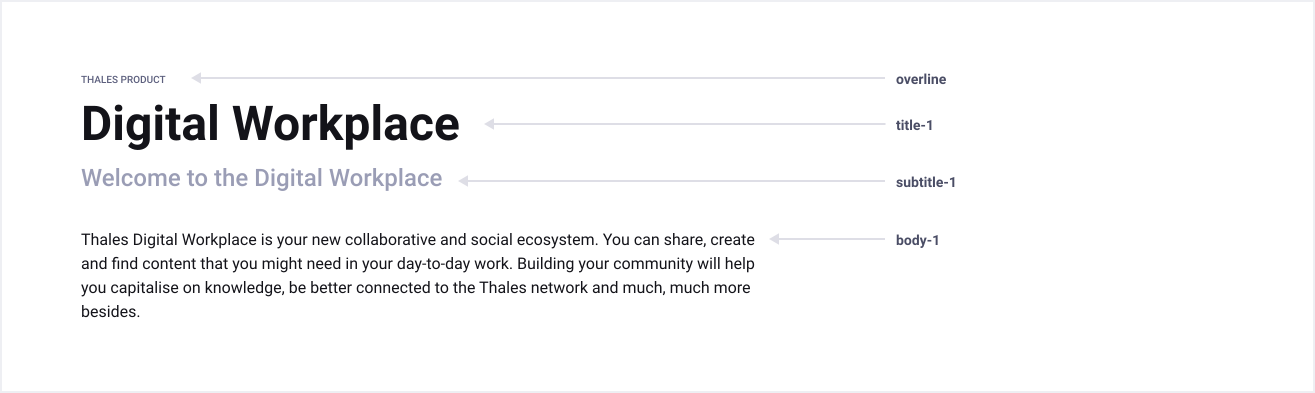
Titles, subtitles, body, caption, and overline typography components can be paired together in order to enforce hierarchy of content. It is recommended to use the same sizes while using multiple styles to create balanced relationships between them.
Relationships may sometimes need to be more or less pronounced, so in those use cases, it’s acceptable to combine your own selection of sizes as long as you’re maintaining consistent hierarchy.
Formatting
Bold
Bold is used to add emphasis within a sentence or tall attention. Use it sparingly to enhance visual hierarchy.

Underline
Underline text exclusively for text links. It should never be used to emphasize text.

Avoid using all caps
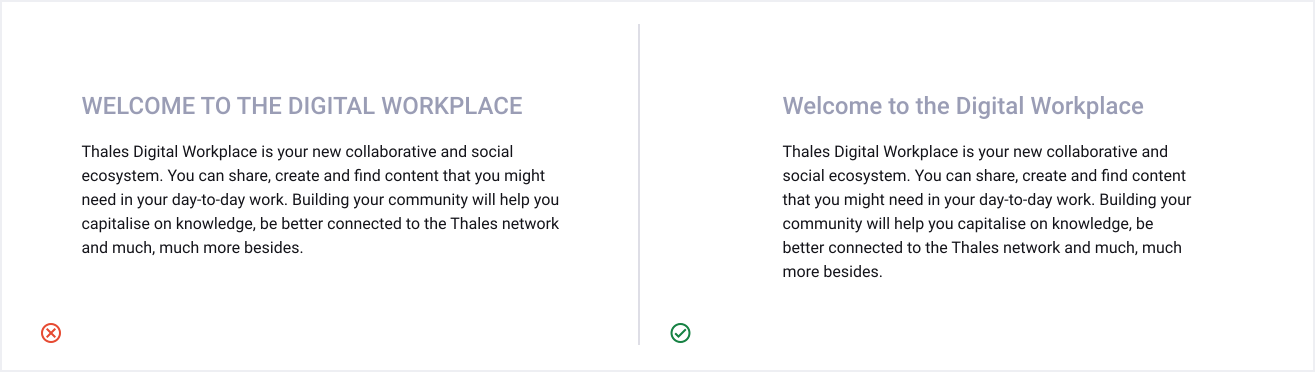
All caps is difficult to read and scan and makes the reading speed slowed about 13 to 20 percent. Excepting for specific text styles (e.g. Overline ), prefer using mixed-case.
Readability
Readability allows users to efficiently read and process informations in the content. Poor readability can make it challenging for the user to stay focused on the content and scares them away from it. The following guidelines promote good readability.
Spacings
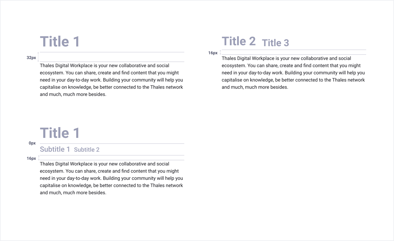
White space or negative space, is the area between elements in a design composition. It affects how the user focuses their attention on the content and makes it easier to know what to read and where to begin. Spacing between typographic elements should be open enough to feel light, but close enough to establish a proper relationship between elements.
When setting titles or subtitles and body copy, the white space should be 16px or 32px.
Alignment
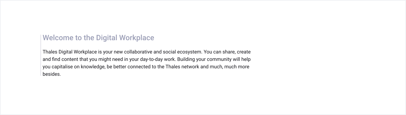
We recommend to use Left-aligned text for left-to-right languages such as English. It provides the eye a constant starting point for each line, making text easier to read.
Don’t fully-justify text
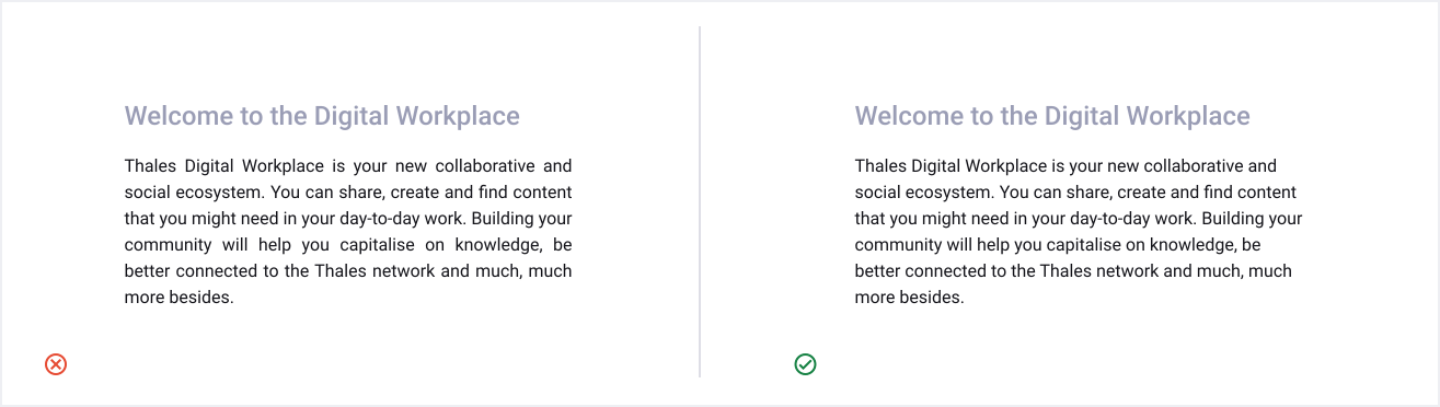
By using block-justified text, white spaces are created within paragraphs and make it harder to read, especially for those with cognitive disabilities or dyslexia.
Line length
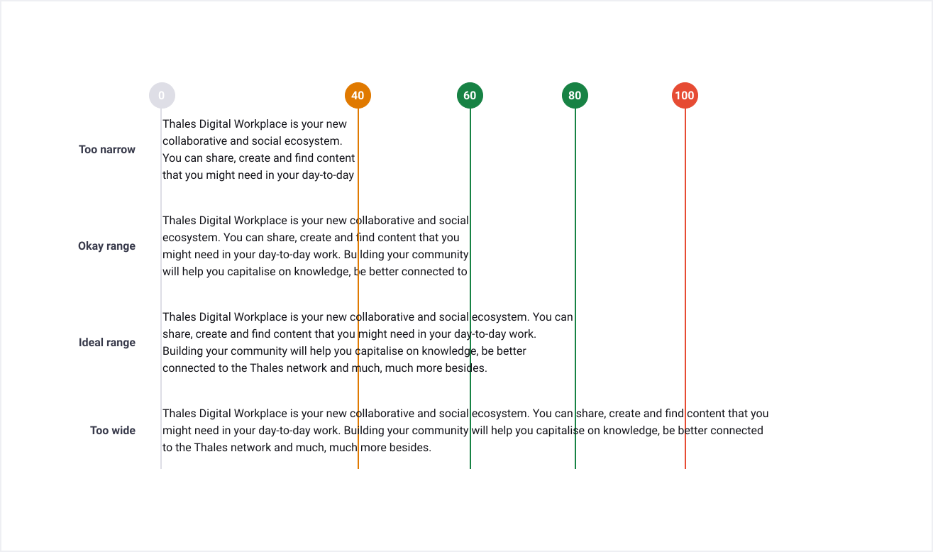
Comfortable line length allows the user’s eyes to flow easily from the end of one line to the beginning of the next. Ideally, blocks of text should be roughly 70 characters wide. Be sure to keep them at least between 50 and 120 characters wide.
Accessibility
Text contrast
The WCAG (Web Content Accessibility Guidelines) are part of a series of web accessibility guidelines that provides sets of recommendations for making content accessible by everyone, regardless of any disability or user device.
To ensure text remains compliant with WCAG 2.1 standards, we provide you in the recommended colors section of each text style the colors that can be used depending of the usage.
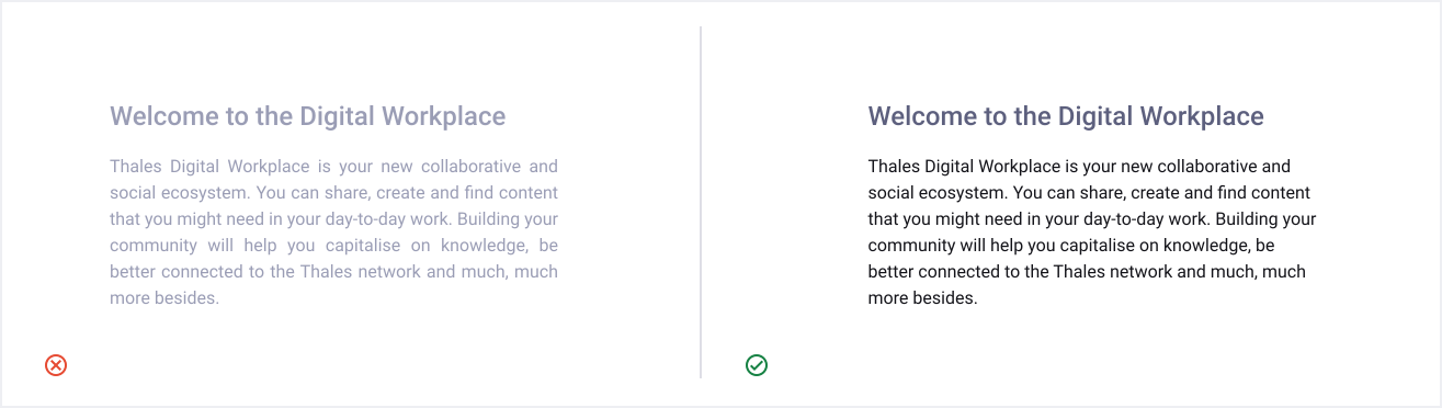
For black or white usage, you can refer to the contrasts indicated in the Extended Palette. For other color combinations, you can refer to the Accessible Groupings section.
References
To learn more about WCAG 2.1, refer to the https://www.w3.org/TR/WCAG21/
To check your color contrasts, we encourage using the Figma | Stark – Contrast & Accessibility AI Checker plugin, available by default for all Thales Figma users.
Links
Don’t underline body text that’s not a link
In a paragraph, underline text exclusively for text links. It should never be used to emphasize text. If you need to emphasize certain words or sentences, using italics or bold is much safer.

Avoid using colour for text unless it’s a link
Avoid using primary blue for non-link text because it’s the colour with the strongest perceived affordance of clickability. If an user try to click on a blue text that is not clickable, this can results in frustation.
Using a colour for a text is not recommanded unless it’s a link. However, assuming it differs from the link colour, you can sometimes use coloured text without causing major usability problems. For example, in a card, you could show the word “Success” in green and the word “Error” in red. (The fact that the word meanings are clearly different provides the required redundant cue for colour-blind users.)

Use meaningful link text
Links should explain the link’s purpose and help the user understand the link’s destination.
