Navigation
Product architecture
Overview
People tend to be unaware of an product’s navigation until it fails to meet their expectations.
Your job, as a designer, is to design your navigation in a way that supports the structure and purpose of your product without calling attention to itself. Navigation should feel natural and familiar, and shouldn’t dominate the interface or draw focus away from content.
Based on your platforms information architecture (IA), a user can move in one of three navigational directions.
Hierarchical Navigation
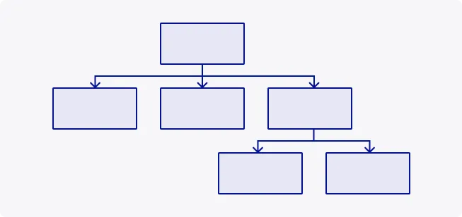
Also referred to as ‘forward navigation’ and ‘reverse navigation’, this navigation pattern refers to the moving between destinations at consecutive levels of your information architecture.
For example, users may want to move through your platform to in order to complete a task, however they would also like to move back up the IA to get back home.
Hierarchical navigation can be implemented using:
- Content containers such as cards, lists, or image lists
- Buttons that advance to another screen or return to previous
- In-platform search on one or more screens
- Links within content
Flat Navigation
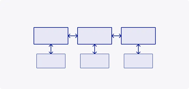
Also referred to as ‘lateral navigation’, this navigation pattern refers to movement between screens at the same level of hierarchy. It enables access to different destinations and features, at the same contextual level.
Flat navigation can be implemented using:
- Navigation drawer
- Navigation rail
- Tabs
Experience-Driven Navigation
This navigation pattern allows users to move freely through content, or the content itself defines the navigation. Legislative workflows, games, and other immersive apps generally use this navigation style.
Experience-driven navigation can be implemented using:
- Content containers such as cards, lists, or image lists
- Buttons that advance to another screen or return to previous
- In-platform search on one or more screens
- Links within content

| Component | Used for | # destinations | Devices |
|---|---|---|---|
| Navigation drawer | Top-level destinations | 5+ | Mobile, Tablet, Desktop |
| Navigation rail | Top-level destinations | 5+ | Mobile, Tablet, Desktop |
| Tabs | Any level of hierarchy | 2+ | Mobile, Tablet, Desktop |
Configuration
The TDS navigation components are entirely configurable so that your product is built in the most appropriate way for your users. Simpler products have the flexibility of using a header or a navigation drawer, whereas more complex products may require a combination of navigation components to accommodate the depth of their information hierarchy.
Want to learn more? Visit our Top tips area to find out more about composing effective information and visual hierarchies.
Header only
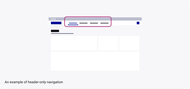
The Header component can be used as a standalone navigation for your product through the use of tabs.
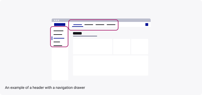
Header with Navigation Drawer/Rail
The Navigation Drawer or Rail allows for more navigational items to stack vertically and an additional level of hierarchy when paired with the header navigation.
In this instance, the header remains the highest level of navigation. Therefore, it is important to place any product-level navigation/actions within the header and any subsequent pages of navigation underneath these in the drawer/rail.
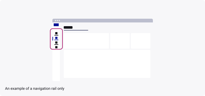
Navigation Drawer/Rail only
The Navigation Drawer/Rail can be used as a standalone navigation for your product.
However, please ensure that if you are only using a drawer/rail, that the component has the header turned on. This is to keep the product identifiable to customers with the Thales branding.
Responsiveness
When designing your layout system, you may want to include some form of navigation to help your users better orientate themselves within your product.
This page aims to promote best practices and the TDS standard for implementing navigation components, while optimising the pre-defined layout system.
So what is the ‘Safe zone’?
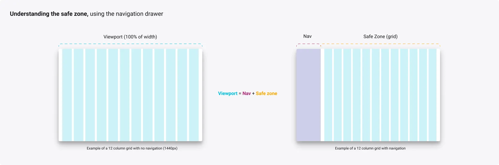
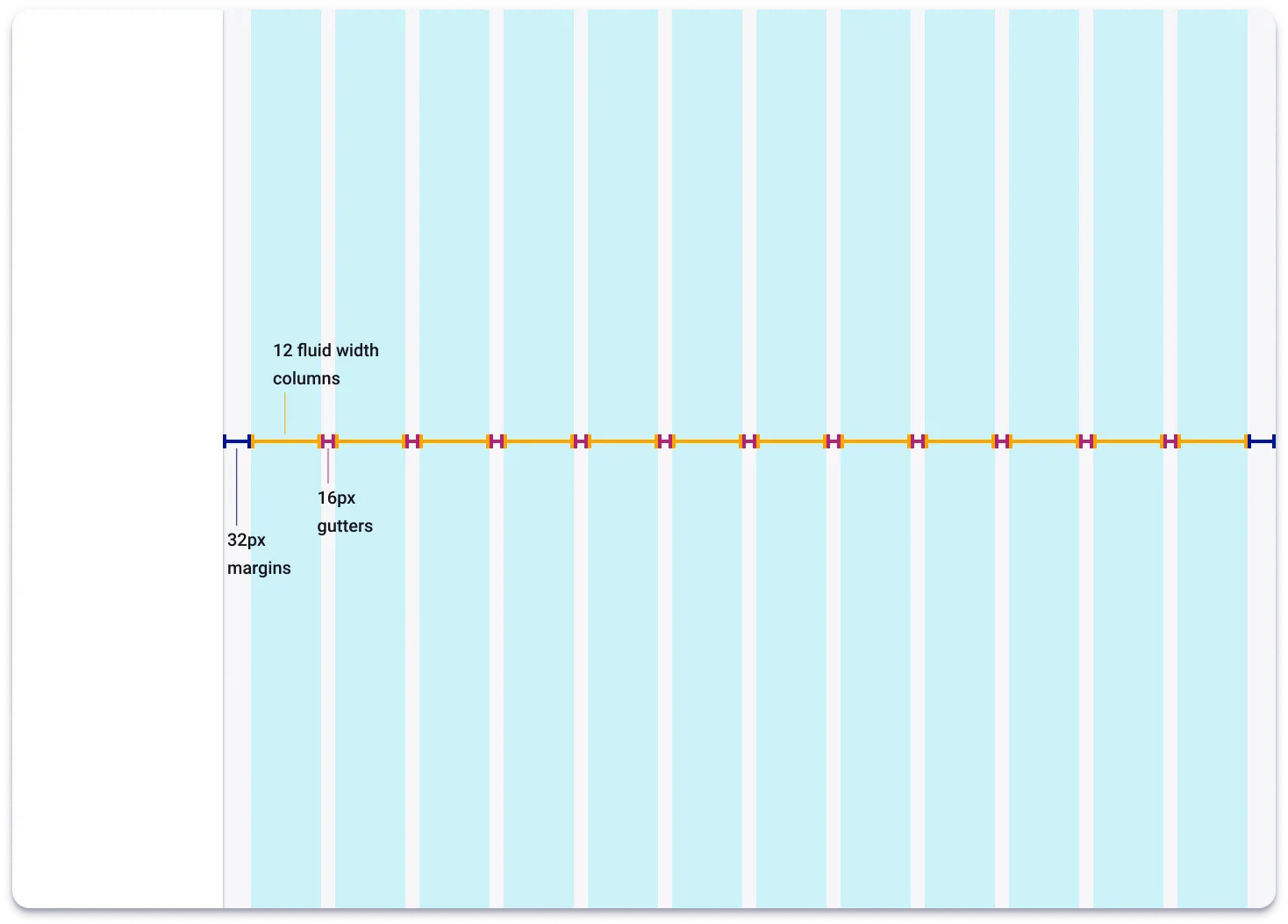
The TDS provides a grid system based on a fluid grid type, designed for complex screens and web applications as it uses 100% of the screen’s width. When implementing a navigation system, it is important to adapt your grid layout based on the size of your “safe zone”.
Safe zones are designed to keep your user interface (UI) in-view, taking into consideration internal factors, such as components that push content like the navigation drawer, and external factors, such as the edge of a TV display or under the notch and home bar of an iPhone X. It is often referred to as the main viewport.
When safe zones hit a breakpoint in the grid system, it is important to consider whether the UI needs to adapt for the new layout.
To help us calculate a navigation component’s correct size, we divide the viewport into zones. The more important one is the safe zone.
As mentioned above, it is important to always consider the safe zone as your main viewport in which you apply the grid to.
Choosing the right grid and component
Depending on the size of your safe zone, you should consider making a consistent choice between which navigation pattern to choose (rail or drawer) and also which grid to apply on your safe zone frame.
| Viewport size | Recommended navigation pattern | Safe zone grid |
|---|---|---|
| 1440px | persistent drawer (240px width) | xlarge |
| 1366px | persistent drawer (240px width) Collapsible drawer | @ large |
| 1024px | Overlay drawer Rail (72px width) | medium medium |
| 768px | Overlay drawer Rail (72px width) | xsmall xsmall |
| 320px | Overlay drawer | xsmall |
Responsive sizing using the Navigation Drawer
XLARGE GRID 1440px
- High resolution desktops and laptops
XLARGE GRID 1366px
- Standard resolution desktops and laptops
- Tablets in landscape mode.
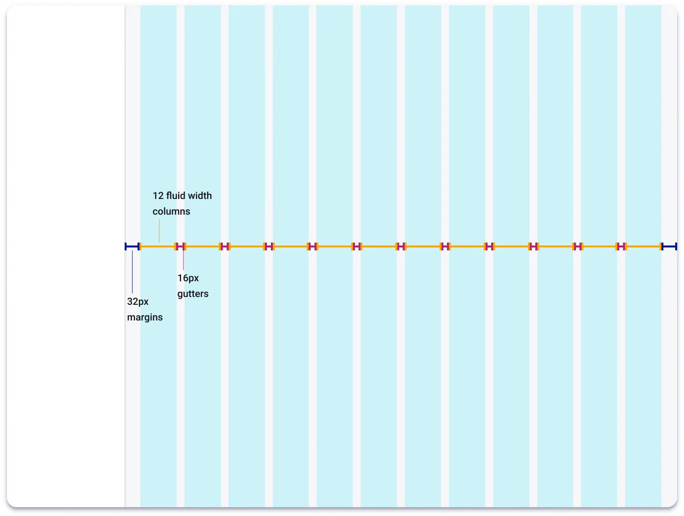
MEDIUM GRID 1024px
- Standard resolution desktops and laptops
- Tablets in portrait mode.
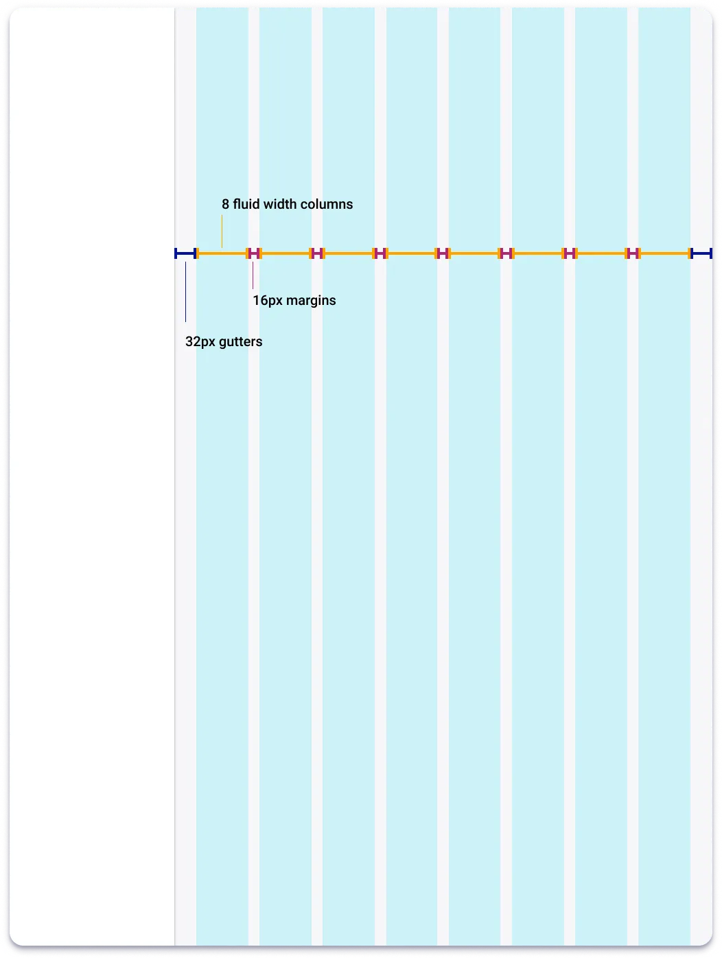
MEDIUM GRID 768px
- Small tablets in portrait mode.
Note
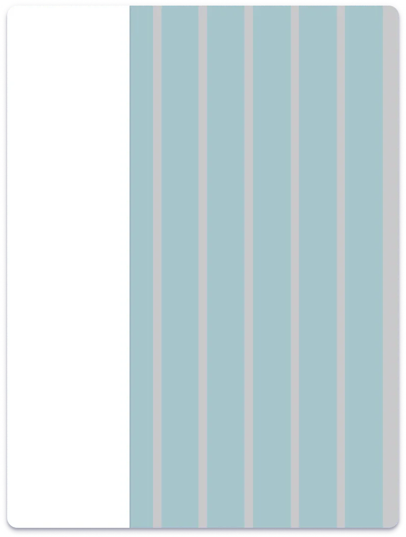
For any device that force the main content to fall within the ‘xsmall’ breakpoints (0-599px), the drawer must overlay rather than push the main content.
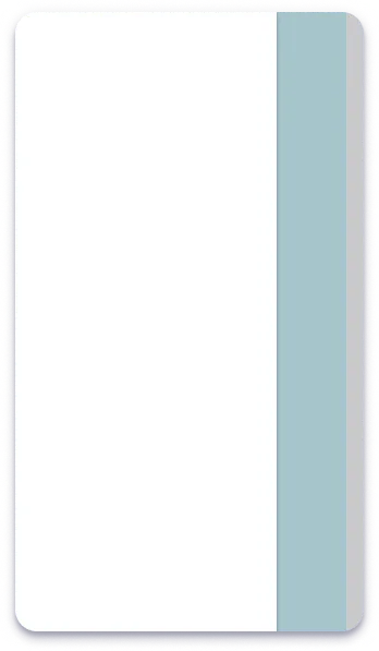
XSMALL GRID 320px
- Phones in portrait mode.
Note
For any device that force the main content to fall within the ‘xsmall’ breakpoints (0-599px), the drawer must overlay rather than push the main content.
Top tips
The handy guide is designed to help you build an effective navigation system using the TDS Navigation Drawer component.
Through careful analysis of Thales’ own products, the TDS Core Team recognises that navigation can differ from product to product.
We have produced this handy guide to help you, the designer 🎨, build the most effective navigation system for your product using our pre-built navigation drawer. It is almost entirely configurable through the diverse range of variants designed with you in mind.
With tips on how to structure your navigation and a guide on building your very own navigation drawer using the diverse range of variants provided, we hope that you find this guide helpful and you enjoy designing with the Thales Design System (TDS).
💡Tip #1: Know your Information Architecture (IA) first
Abby Cover, author of How to Make Sense of Any Mess, describes information architecture as “the way that we arrange the parts of something to make it understandable”. Its as simple as that…
A well-designed, user-friendly information architecture ensures that users spend less time and effort searching for information and are successful in finding what they need.
IA is an essential part of user experience (UX) design and much like navigating a supermarket or shopping mall in real-life, information architecture for digital products must do these two things:
- Help the customer find whatever it is they’re looking for
- Tell the customer where they are
When designing your products information architecture, it is important to think of it as a user-flow rather than a traditional hierarchy. Some examples of navigation use these common forms of layout:
- Categorize by topic, letting the user know what’s here by revealing the content of the product.
- Categorize by audience groups, such as
- Categorise by tasks, such as
💡Tip #2: Create effective visual hierarchies
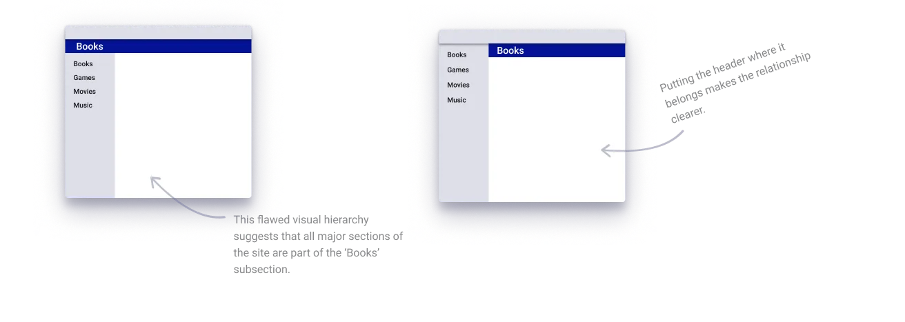
An important way to make your product easy to grasp in a hurry is to make sure that the appearance of things on the page accurately portray the relationships between the things on the page.
- The more important something is, the more prominent it is
- Things that are related logically are related visually
- Things are “nested” visually to show what’s part of what