
Forms & Controls
Form Structure
Overview
To help you build consistent forms in your product, the Thales Design System is providing a set of on-the-shelf components in the “Form Elements” section. This dedicated patterns section is made to help you correctly build with those elements, avoid common mistakes and give some empirically proven good practices.
We have dedicated documentation for each component to help you use them well at their component level. If you need to refer to a specific component’s documentation please check the right page.
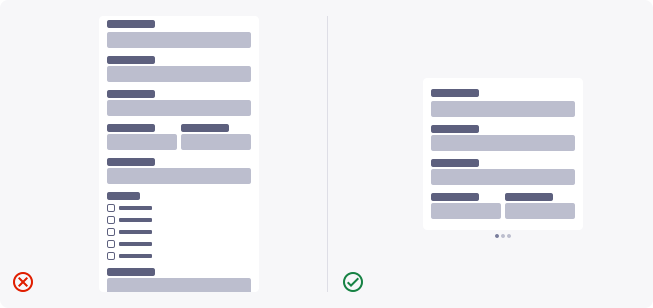
Prefer multi-step forms over single step forms
Sometimes, you need to gather lots of data from your users. This might end up in very long forms. To avoid strain and frustration, you can easily create sub-forms of related contents to slice your form into a multi-step pattern. Doing this will increase form completion in B2B and Business related environments.
- First impression matters, so a first small form will always be less intimidating
- By asking for sensitive data (i.e financial) at the end of a multi-step form, users are more likely to finish the form (rather than losing all the previous steps). It’s a cognitive bias know as “sunk cost fallacy”)
- Seeing a progress indicator help users to be more motivated to complete the form. This is, again, based on numerous proven cognitive biases such as “the endowed progress effect”.
Provide the related progress indicator
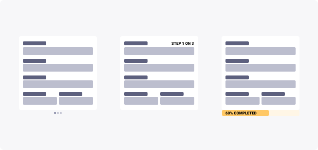
If you are doing a multi step form, you need to provide the user a way to understand where they are in the process, and also what is coming next. Depending on the situation, several progress indicators can be used such as:
- Steppers
- Progress bars
- Progress headers/footers
Always choose the progress indicator that fits the most your product, there is no right or wrong component to choose in that case, only your users can tell.
Forms should be in one column
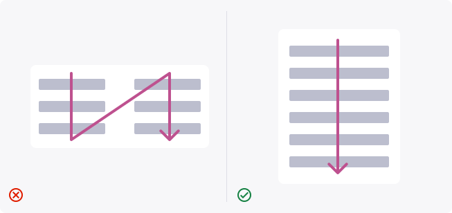
Google’s study on the subject showed that aligning labels above fields on the top-left side reduces form completion time because of the fewer visual fixations it requires to get the information. Also, as the eye scans from top to bottom, stacking your elements vertically will be more comfortable for the user. Multiple columns can have an unexpected and unwanted effect, and strain the user.
Always have readability in mind
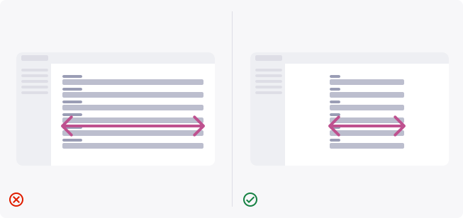
As mentioned in the Typography System in the Foundations, you should always set a consistent, maximum number of characters.
Long form fields tend to make things harder to read, and are visually unbalanced. You should always go with form inputs that can fit 40 to 80 characters.
Name your forms correctly
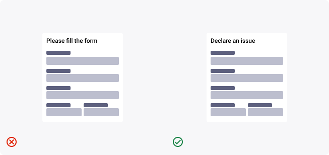
By giving your forms a clear title, you will help the user understand the goal and value of it. For example, if you are making a form for filling a Technical Issue ticket, you could clarify by naming it “Technical issue submission form” or “Declare a technical issue”.
Create groupings, and name them
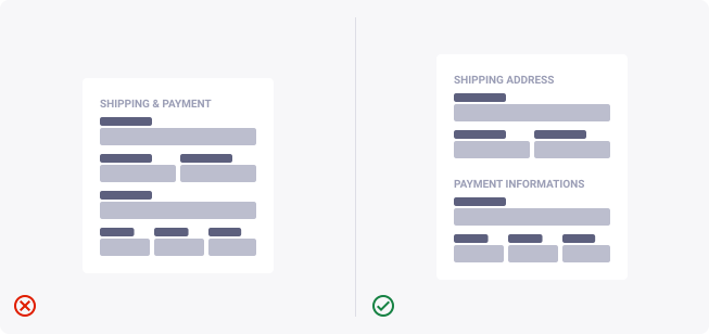
If you have several sections in your form (Personal information, billing address, payment details, …), you should always keep them in groupings. And of course, give a name to those groupings.
Form buttons must be specific to the task
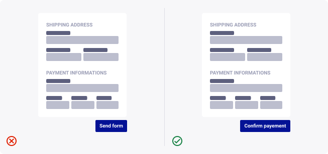
The “Submit” button at the end of your form should describe exactly the action it will invoke. Never confuse the user about what is going to happen when he clicks the button. You can also refer to our dedicated documentation on button labelling.
Create visual density in your forms
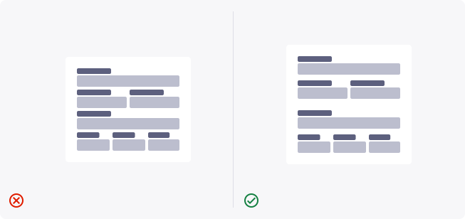
The form elements and text inputs are built with some natural spacing. But because a label is related to its field below and not the field before it in the form, you will always want to put more spacing between two form items than between the label and the field. This to follow Gestalt’s Law of Proximity and Similarity.
Form flow
Find the relative content directly into Figma.