Data Table Filtering
Introduction
These patterns cover how to approach and use filtering in the context of Data Tables.
Useful links
Find researches material and details about the Figma contribution process.
Common guidelines
Distinguishing filtering from sorting
Filtering
The process of narrowing down a larger set of data or content by applying one or more criteria or conditions, so that only items matching those criteria are displayed.
It hides items that do not match chosen criteria.
Sorting
The process of arranging data or items in a particular sequence or order based on defined criteria such as alphabetical, numerical, or chronological order.
It changes the order of the items without removing any.
Provide visual feedback
When designing filters, it is essential to provide clear and consistent visual feedback to users about the active filters and their effect on the displayed data. It is therefore important to provide a visual indication following user actions, such as update success, loading time, absence of results or possible errors.
Feedback should be delivered through means appropriate to context (such as color changes, inline messages, icons, or notifications) and should be discoverable and accessible to all users.
Allow users to adjust their search criteria
Allow users to easily add or remove filters to adjust their search criteria with options to select or unselect directly or use a “clear filters” quick action. Ensure real-time updates to the data when filters are adjusted, or provide an “apply” button for more complex scenarios/eco-design rules.
Responsive
Adapt the accessibility of your filters based on the device and available screen space. Avoid using floating sheets on touchscreens and overly intrusive filters on desktops or larger screens. Additionally, you may need to adjust the number of filters displayed on the page, making the prioritization of the order in which filters are shown a crucial aspect to address.
Ensure filter controls are easily tappable on touch devices, optimize loading times to enhance performance, and maintain clear visibility and usability of filter options without requiring excessive scrolling or zooming.
Make sure to test the filtering workflows on the targeted devices and viewport sizes where your user will perform the tasks.
Eco-design
Eco-design minimizes environmental impact by reducing data queries. For light datasets, use dynamic loading to apply filters instantly. For heavy datasets, an “Apply filters” button helps control queries. It groups modifications, reducing excessive server requests. This improves performance, lowers the carbon footprint, and enhances user experience.
As a developer, it is important to test the cost and weight of the data requests. As a designers, it is important to know those considerations upfront so you can implement the most relevant loading and data request approach and getting the right balance between UX / Cost / Eco-design.
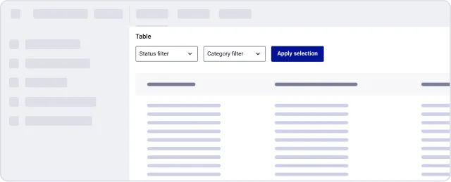
Accessibility
Be careful to make an accessible design. Test it with real users or use tools to simulate specific situations. Research and filtering in data table can be tricky. Here is the link to the internal accessibility guidelines.

Usage
Filters visibility & access
Filters in the content flow
Filters are part of the main page layout. They live alongside the content, typically in a sidebar, horizontal bar, or embedded within a results table. Even when collapsible, they are considered part of the main interface structure.
Characteristics:
- Always or mostly visible
- Minimal disruption when used
- Filters inputs are directly nearby the content
Examples:
- Dashboard filter bars above data tables / lists
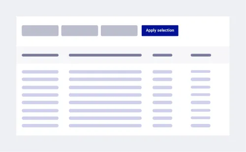
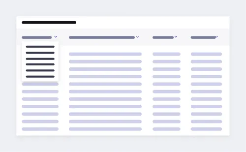
- Filters within columns in a data table
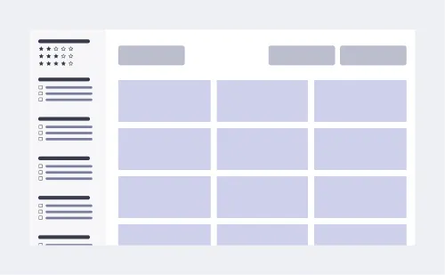
- Faceted navigation (e.g. Amazon desktop)
Off-canvas but non-obtrusive filters
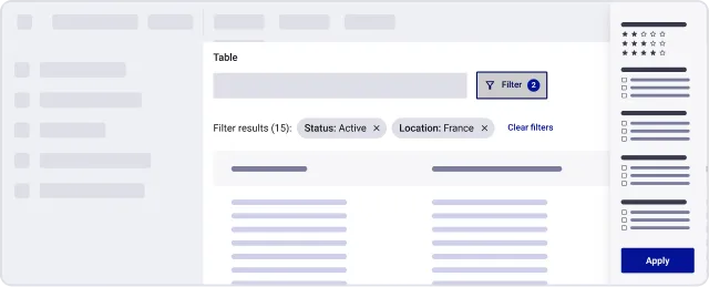
Filters are accessible through a toggleable side panel or area that slides or fades in, but does not block the main content. Users can interact with both the filters and the results at the same time.
Characteristics:
- Panel can be shown or hidden
- Does not hide content area — either resizes it or floats beside it
- Good for progressive disclosure: keep UI clean while retaining access
- Ideal for cases where filtering is useful, but not the primary task
Examples:
- Sliding panels
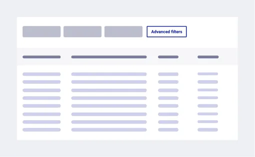
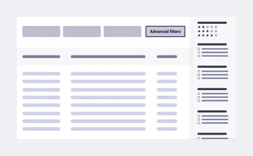
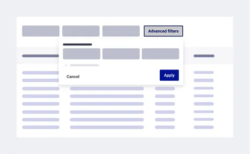
- Expandable filters on desktop with a floating sheet
Off-canvas and obtrusive filters
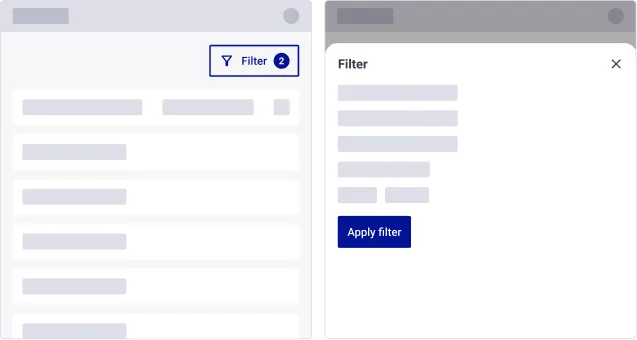
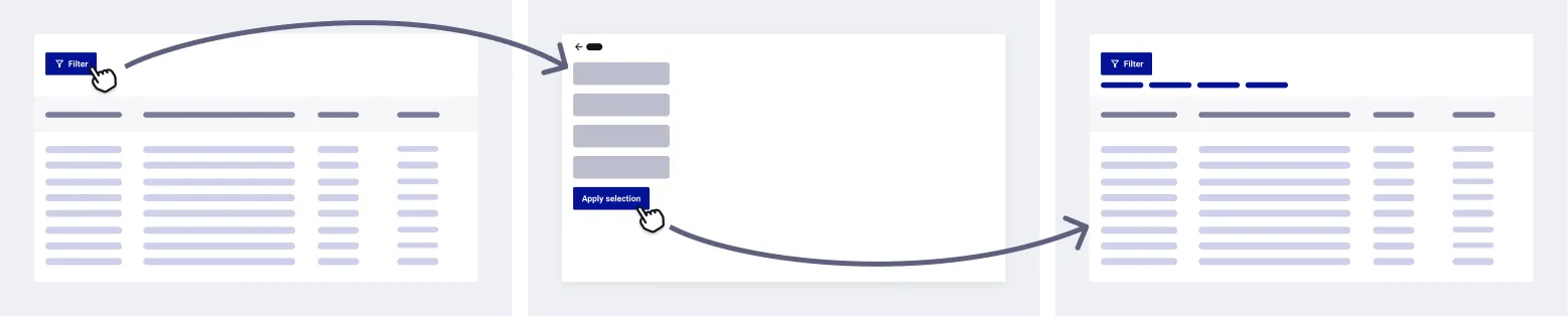
Filters are accessed through a modal or full-screen panel that fully or partially covers the content. Users must interact with the filters and apply them before returning to see the filtered results.
Characteristics:
- Used when space is constrained
- Filtering is a separate step in the flow
- Often includes “Apply” and “Cancel” buttons
- Useful when filters are complex or rarely adjusted
Layout examples:
- Dedicated page for filtering
Information
It is possible to combine these 3 types of access to filters. If you have both novice and expert users, you may need to display the most used and simplest filters within the content, and leave the advanced filters off-canvas in a collapsible panel or modal for example.
Summary
| Access | Best when | Advantages | Disadvantages |
|---|---|---|---|
| Filters in the content | - When the filters are essential to the content and often used | - Intuitive and spontaneous - Non-intrusive | -Limited space if too many options - Might visually overload the interface |
| Off-canvas but non-obtrusive | - When using filters is occasional but it is important to see both the filters and the filtered view | - Easy to access - Non-intrusive - Saves space when hidden | - Complex layout and responsive behaviour on small screens - Reduced screen legibility, especially if there are charts or tables |
| Off-canvas and obtrusive | - When using filters is occasional and/or when the space is constrained - For deep filtering on complex load of data with many dimensions | - Plenty of space for filters combination - Reduce distraction | - May cover the main content - Users might feel interrupted in their task |
Live filtering vs. applying filters on submit
Behaviour selection
| Behaviour | Description | When to use it |
|---|---|---|
| Live filtering | Results update automatically as the user selects or modifies filters, without requiring any additional action (like clicking an “Apply” button). | - Low number and not complex filters - Real-time feedback is important - Smaller datasets - Great for exploratory tasks where users iterate quickly |
| Submit to apply filters | Filters are only applied after user confirmation, typically by pressing a button labeled “Apply,” “Done,” or “Update.” | - For deep investigations in large datasets - For complex or multi-steps filters - Scenarios where performance is important - Gives more control and adjustments before committing |
Live filtering (auto apply)
Results update automatically as the user selects or modifies filters, without requiring any additional action (like clicking an “Apply” button).
Warning
Be mindful of performance impact, as each user interaction with instant filters can trigger a request to the database.

Submit to apply filters (manual filter validation)
Filters are only applied after user confirmation, typically by pressing a button labeled “Apply,” “Done,” or “Update”.
Place the Apply button in a consistent and accessible location to avoid risk of forgotten changes.

Loading states
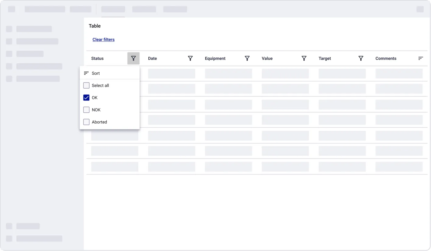
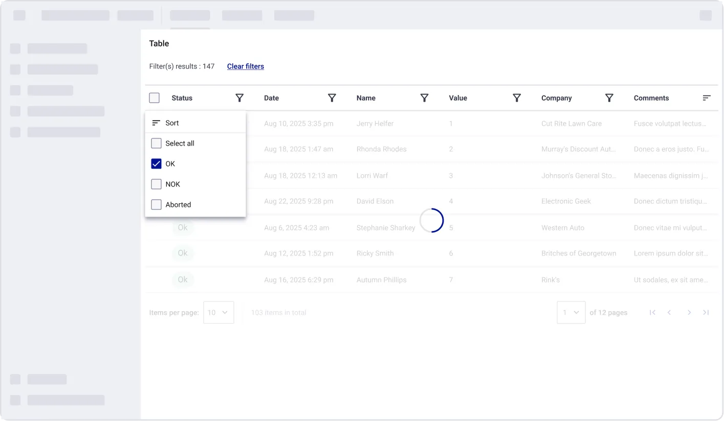
When the data is being loaded, it can take a long time to be displayed, so the user needs to be told that the table is being loaded. To do this, we recommend to display an explicit loading state depending of the development resources (time, finance), UX and performance relevancy
Examples:
Skeleton loading
Loading overlay
No Data scenarios
Error case
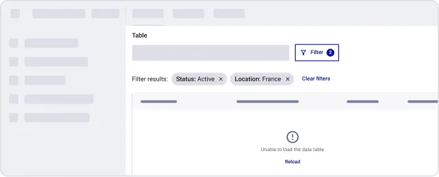
If a filtering request to the database fails, users should be informed clearly. Provide an error message indicating the failure and suggest actions such as retrying the filter, reloading the table (if so, with the same or previous filters ?), or refreshing the page. Ensuring clear error handling improves usability and prevents user frustration.
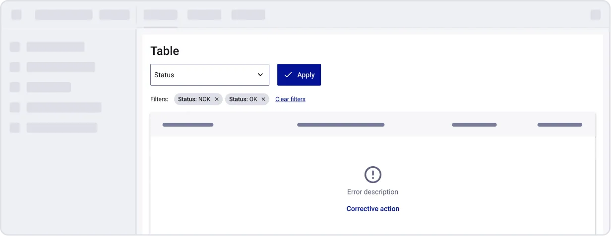
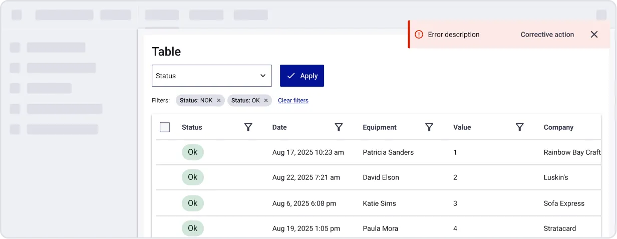
How to choose between the first option and the second option?
- If it is important to keep the filters generating the error and that replacing the previous working state is okay then no data is a relevant option.
- If it is important to preserve the previous working state and it is not bad to remove the error filters then the banner is a relevant option.
Warning
The following examples are non-exhaustive, and are intended only to inspire your future designs. In no way they represent the only truth.
No Results
An empty state can arise when a user searches for a product or item and no results are found. This may be due to misspellings, incorrect search criteria, the application of restrictive filters, or simply because the item does not exist in the catalog. Besides informing the user that no results were found, suggest they refine their search keywords or filters and verify their spelling.
- It is necessary to clearly indicate to the user when a query does not yield any results.
- Some tips can also be displayed, such as changing the filter or the value of the filters applied to the research.
Information
This component can display different messages like a loading error or simply the fact that the filters applied returned no results.
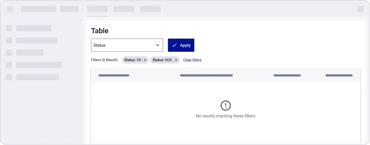
Example
Column filtering
Purpose: Allow users to narrow down table data by applying specific filters on one or more columns. Helps users find relevant rows quickly based on column-specific criteria.
Usage
When to use:
- For data table in which the users want to cross filters the different dimensions
- Enable a granular and immediate filtering without losing the sight of the data
- When you need independent and non obtrusive filtering by data table (i.e. dashboard view)
- When the data table is the focus of the experience (i.e. data sheets like Excel)
When not to use:
- If the number of columns is very high, filtering by columns could be tiring for the users
- When space is limited, especially if the area is too narrow for tactile interaction
Information
Refer to the previous sections for common guidelines, how to select between live filtering and submit to apply filters, loading states and no data usages.
Behaviour
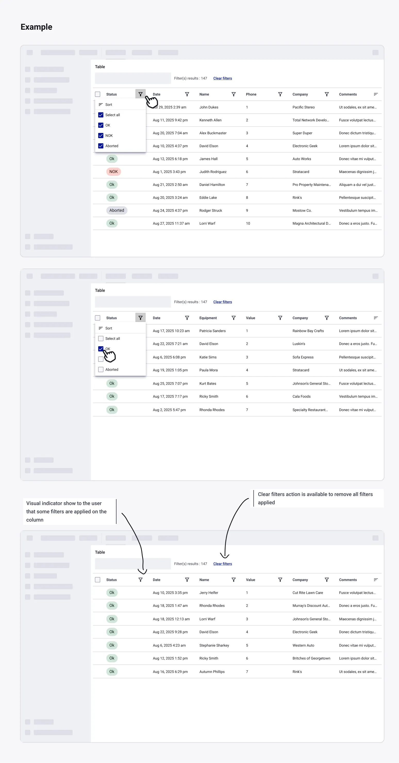
- Filter icon or component is placed in the column header
- When clicking on the component it will open contextual dropdown or modal
- All displayed options are values available in the column
- Active filters are highlighted (e.g.: colors, active indicator, checkbox…)
- Multiple filters can be applied in one column or across others columns at once
- Filter options in one column are dynamically updated based on filters applied in other columns. Only the values that remain valid after applying existing filters are displayed.
- An indicator is showed to the user to inform that some filter are applied (e.g. badge, coloured icon):
Warning
The following examples are non-exhaustive, and are intended only to inspire your future designs. In no way they represent the only truth.