Breadcrumb


Overview
A breadcrumb, or breadcrumb trail is a graphical control element frequently used as a navigational aid in user interfaces and on web pages. It allows users to keep track and maintain awareness of their locations within programs, documents, or websites.
The term is a reference to the trail of bread crumbs left by Hansel and Gretel in the German fairy tale of the same name. (Wikipedia)
Sources and references
- Breadcrumbs: 11 Design Guidelines for Desktop and Mobile - Nielsen Norman Group
- When You Should Use a Breadcrumb Navigation - UX Movement
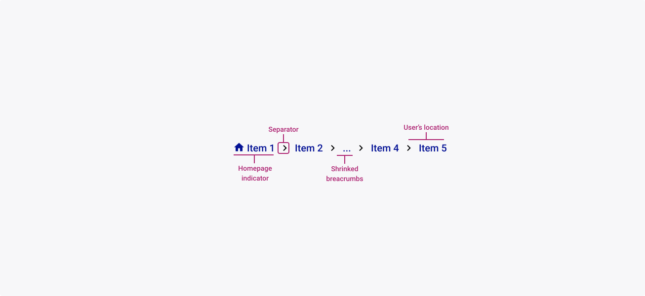
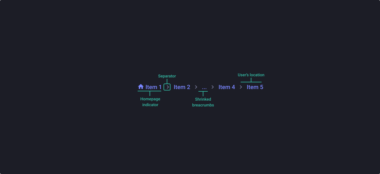
Anatomy
Properties
From the design point of view, each component has a number of options. These options and their names are platform agnostic, and each implementation should adapt these to fit into their framework. In Figma, these are defined as properties that help define each variant.
Heads up
A star or asterisk symbol (*) can be used as a prefix to some Figma component properties in order to inform that the corresponding property is only used that way on the design side (Figma component libraries).
◇❖ Component: Breadcrumbs
| Property | Values | Default |
|---|---|---|
| size | small / medium / large | medium |
| color | primary / neutral | primary |
| *itemNumber | 2 to 5 and more | 3 |
| separator | > / / | > |
❖ Sub-component: Breadcrumb item
| Property | Values | Default |
|---|---|---|
| size | small / medium / large | medium |
| color | primary / neutral | primary |
| *state | default / focused / hover / pressed | default |
| active | false / true | false |
| *hasIcon | boolean | true |
| icon | swap instance | home |
| label | text | Breadcrumb |
Behaviour
Sizes
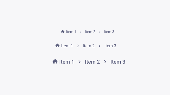
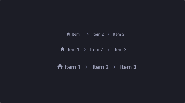
Breadcrumbs are available in three sizes to cater for the diverse range of use cases and devices that our business uses.
By default, the medium breadcrumbs are used typically for desktop/tablet devices. But for mobile devices, it is advised that you upscale the component, to increase the touch area.
For more information about target size, check out W3’s website.
Colour emphasis
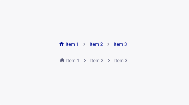
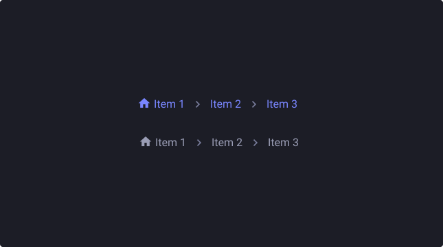
By default, breadcrumbs are not emphasized (primary theme). Providing a visual prominence that is optimal for a navigation system.
The neutral theme is more appropriate when you need to de-prioritize its focus on the screen.
Separator options
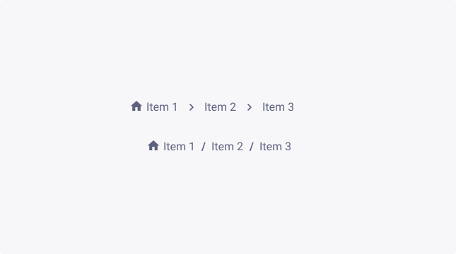
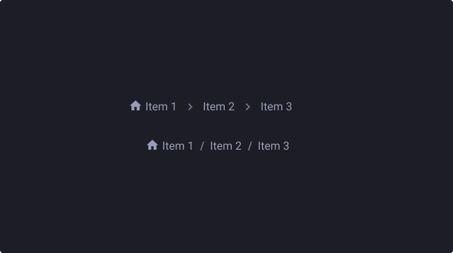
The breadcrumbs have 2 options of separators which are “/” and “>”. Prefer using the chevron as your separator because of the visual representation that indicates movement, and emphasize more on the content’s cascading structure.
Long breadcrumbs management
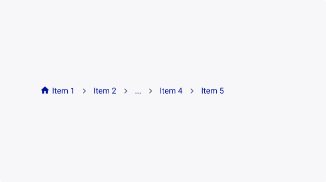
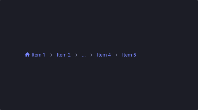
When you have a long breadcrumb trail, you should consider improving readability by shrinking the breadcrumb down to 5 items.
To make this happen, you can create a “…” item - already included in the “5 and more” item option - and insert the hidden items in a dropdown menu.
Icons option
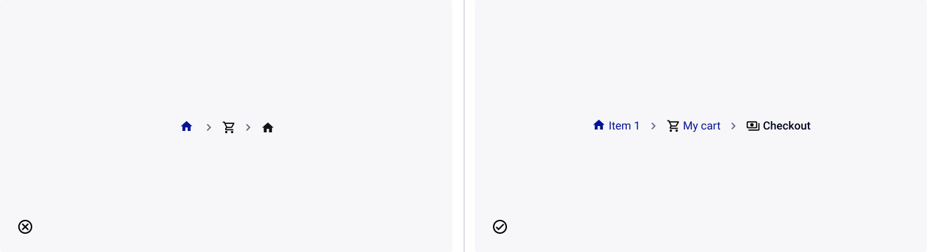
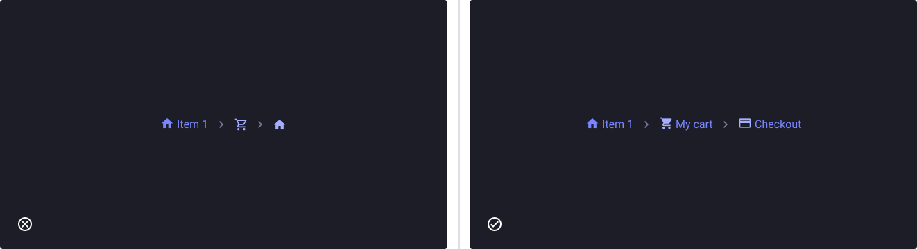
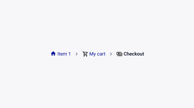
By default, the home link has an included icon. You can also add icons on every label, but need to use them properly (cf. usage guidelines on this)

Usage Guidelines
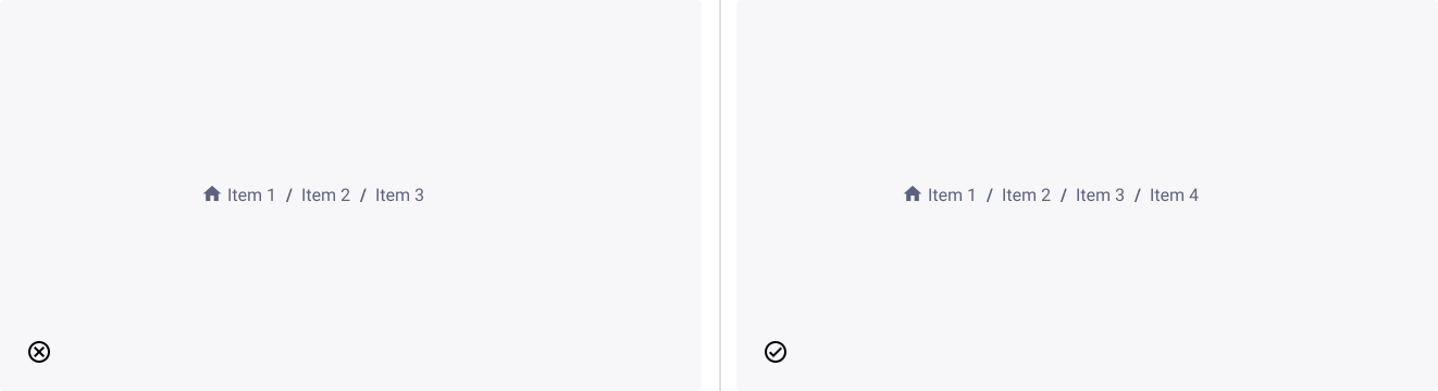
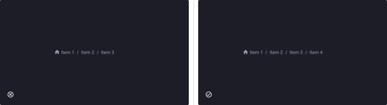
The first item must be the home page
- Don’t: put a first item that is not the starting point.
- Do: display the starting point as first item to recognize hierarchy.
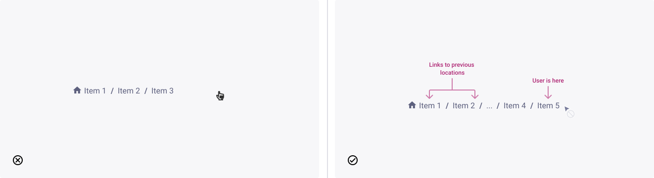
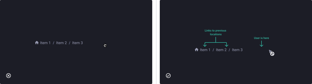
The last item is where the user is, so it should not be clickable
- Don’t: let the user click the last item (current location). This will prevent an unnecessary page refresh.
- Do: keep it recognizable, but different from the others.
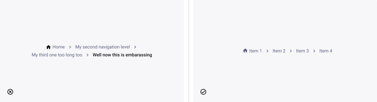
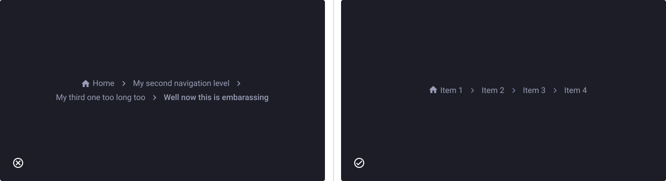
Keep your labels short to avoid wrapping issues
- Don’t: clutter your breadcrumbs with too long page titles. If you see your breadcrumbs have wrapping issues, this might be the chance to consider cleaning up your page names.
- Do: keep it short and efficient.
Icons are not page links.
- Don’t: use icons only as links in your breadcrumbs.
- Do: always have a label when using icons to ensure readability and understandability.