Checkbox


Overview
Checkboxes allow users to select multiple options from a list, or to mark an individual item as selected. They are often familiar to users, as checkboxes originated on paper forms and are incredibly useful for scanning a list of items before making one or more selections.
Usage
When to use:
- Select one or more options from a list
- Present a list containing sub-selections
- Turn an item on or off
Anatomy


Properties
From the design point of view, each component has a number of options. These options and their names are platform agnostic, and each implementation should adapt these to fit into their framework. In Figma, these are defined as properties that help define each variant.
Heads up
A star or asterisk symbol (*) can be used as a prefix to some Figma component properties in order to inform that the corresponding property is only used that way on the design side (Figma component libraries).
◇❖ Component: Checkbox
| Property | Values | Default |
|---|---|---|
| size | small / medium / large | medium |
| items | 2 to 10 | 3 |
| color | primary / neutral | primary |
❖ Component: Checkbox
| Property | Values | Default |
|---|---|---|
| size | small / medium / large | medium |
| color | primary / neutral | primary |
| state | default / hover / focused / pressed | default |
| checked | false / true | false |
| indeterminate | false / true | false |
| error | false / true | false |
| disabled | false / true | false |
| *hasLabel | boolean | true |
| label | text | “Label” |
| *hasCaption | boolean | false |
| *caption | text | “Caption” |
Behavior
Sizes
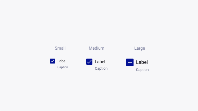
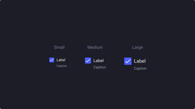
Checkboxes are available in three sizes to cater for the diverse range of use cases and devices that our business uses.
By default, the medium checkbox is used typically for desktop/tablet devices. But for mobile devices, it is advised that you upscale the checkbox, to increase the touch area.
For more information about target size, check out W3’s website.
Selection
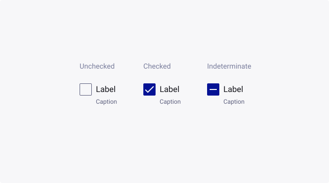
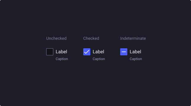
Checkboxes can be unchecked, checked, or in an indeterminate state.
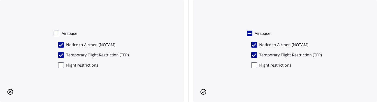
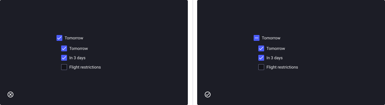
The indeterminate state is used when a value is neither selected or unselected. For example, a parent checkbox showing several checkbox children, with some checked and some unchecked.
Emphasis
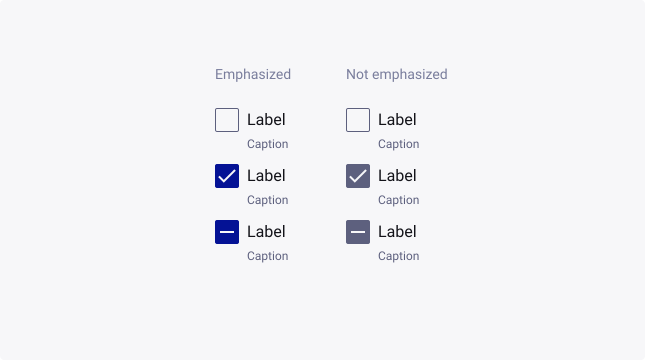
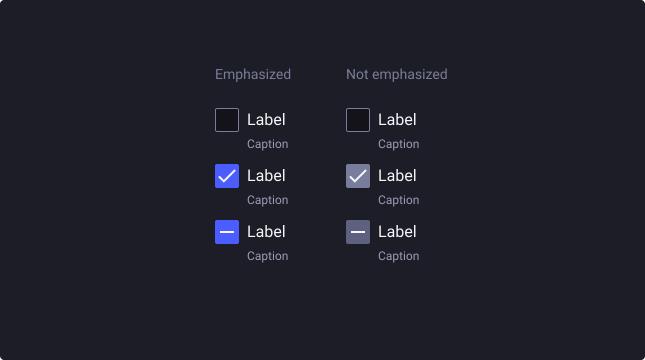
By default, checkboxes are emphasized (primary theme). Providing a visual prominence that is optimal for forms, settings, lists or grids of assets, and other situations where a checkbox is required.
For visual components, like application panels, where a checkbox shouldn’t be a standout element, choose the neutral theme to de-emphasize its visual presence on the screen.
Error
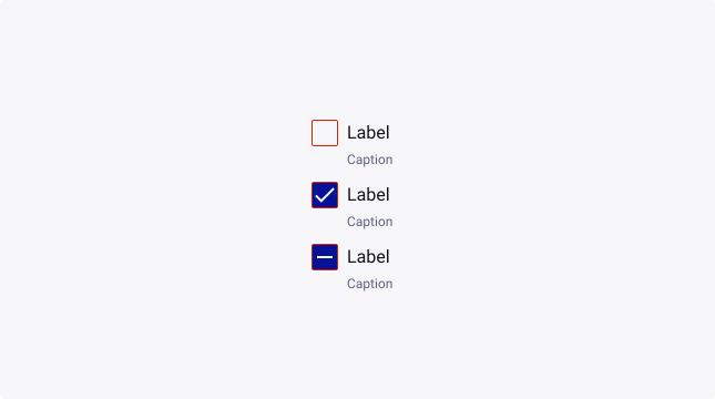
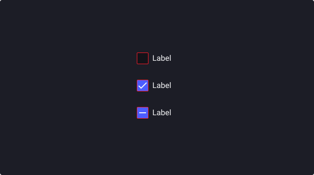
Checkboxes can also have an error state to show that a selection needs to be made in order to move forward, or that a selection that was made is invalid.
Text overflow
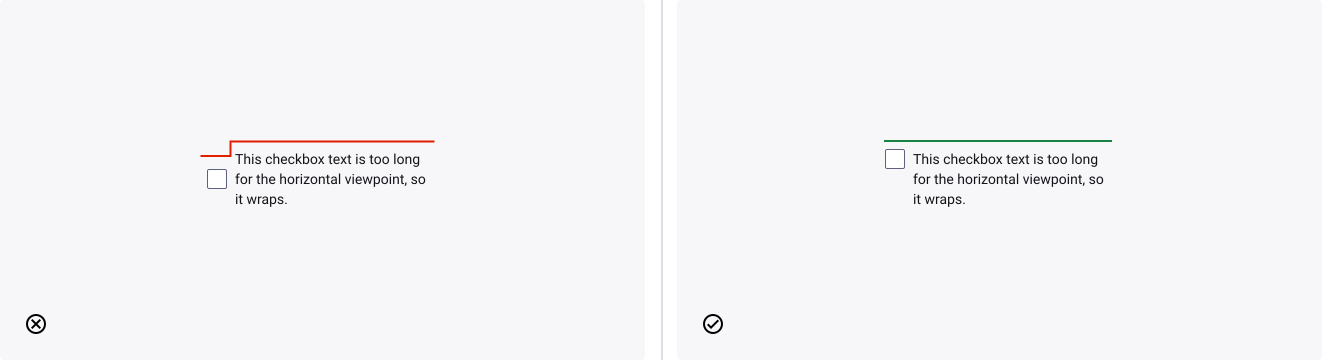
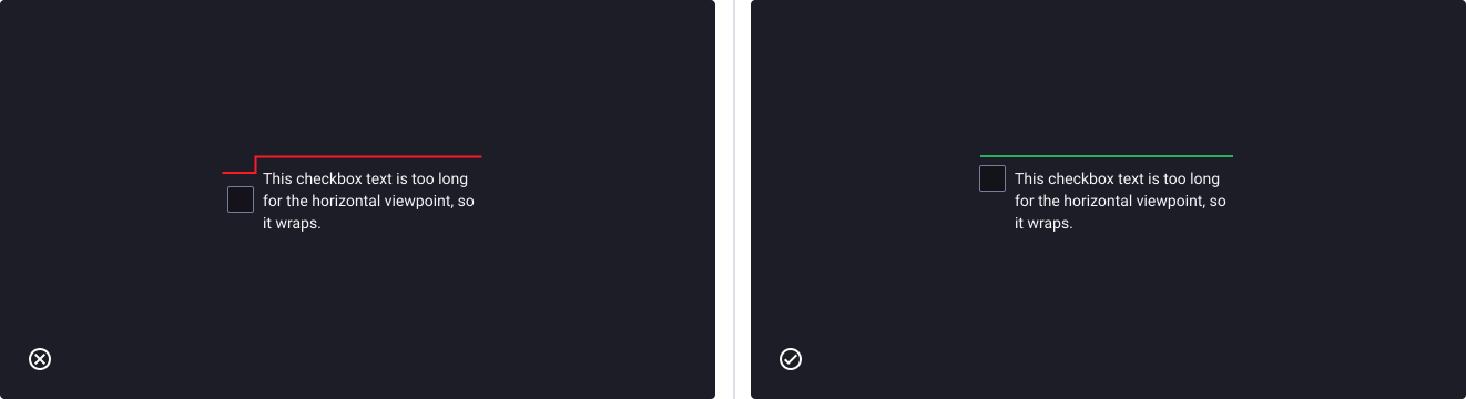
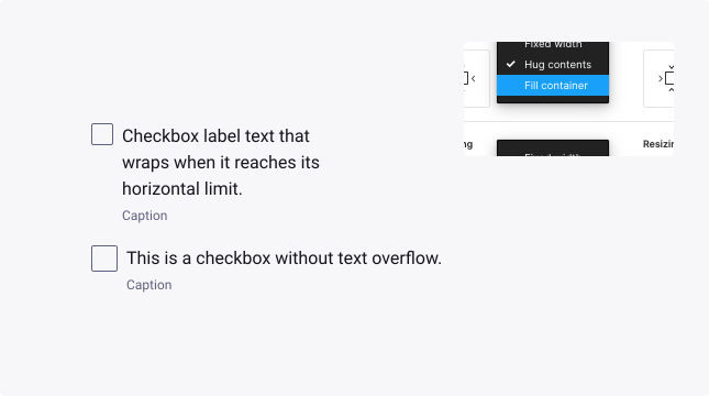
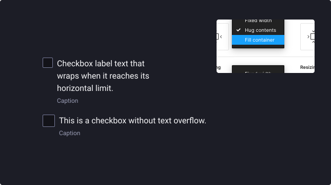
When the label is too long for the horizontal space available, it can be wrapped to form another line. Use the following steps in order to configure the TDS component to do this:
- Set ‘Label Base’ layer to fill container (horizontally).
- Set ‘input-and-label’ layer to fill container (horizontally).
- Set ‘Checkbox - Base’ layer to fill container (horizontally).
- Set ‘Checkbox’ layer to fill container (horizontally).
- As a result of changing the layer in step 4 you will need to reset the ‘Checkbox - Base’ layer to fill container (horizontally).
Internationalization
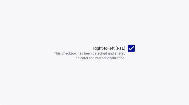
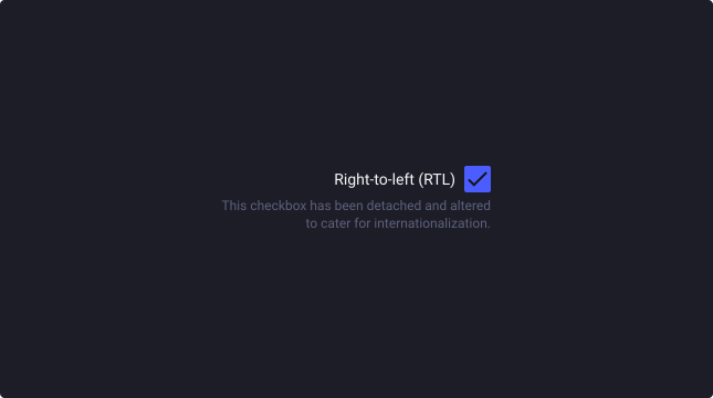
For RTL (right-to-left) languages, the layout of the checkbox is mirrored. The checkmark is placed on the right side of the text.
To build your own (BYO) version of this, either detach the Checkbox component or use the Checkbox Input component with the correct font scale and spacing as seen in the LTR version.
Usage Guidelines
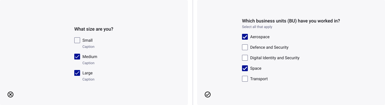
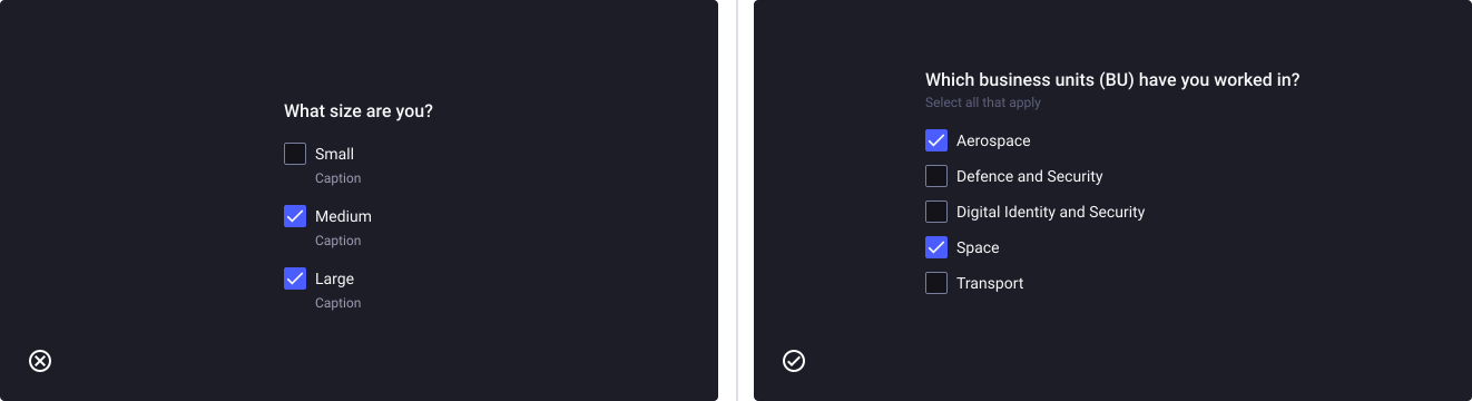
When to choose a checkbox over radio buttons
- Don’t: use checkbox groups if the selection only requires a single option from a list of mutually exclusive options.
- Do: use checkboxes when a user needs to select as many options as desired.
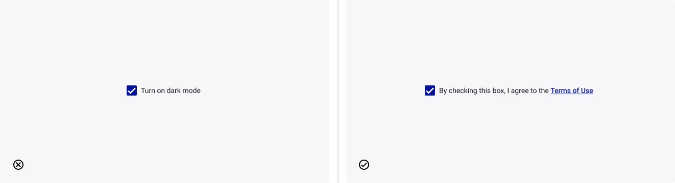
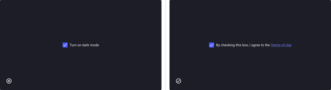
When to choose a checkbox over a switch
- Don’t: use a checkbox to communicate activation (e.g. on/off states) as they can have an error state and this could confuse users about the action they’re about to take.
- Do: use a checkbox for communicating selection.
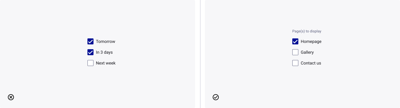
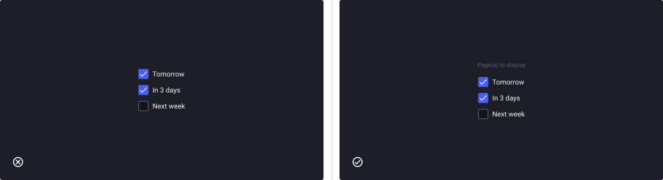
Label groups of related checkboxes
- Don’t: expect the users to understand a group of checkboxes, if they are not provided with a header or caption text.
- Do: provide a label with your checkboxes to describe what the list of options represents and guides the users in what to do. Especially for those using a screen reader.
Representing mixed values
- Don’t: use the unchecked state for mixed state for sub-items.
- Do: use the indeterminate state to represent a mixed state for sub-items.
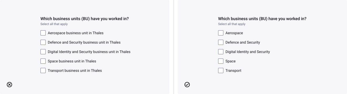
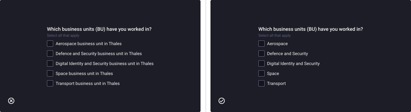
Concise labelling
- Don’t: use complicated labels.
- Do: use explicit and concise labels.
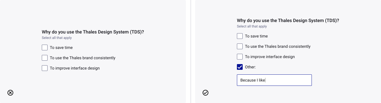
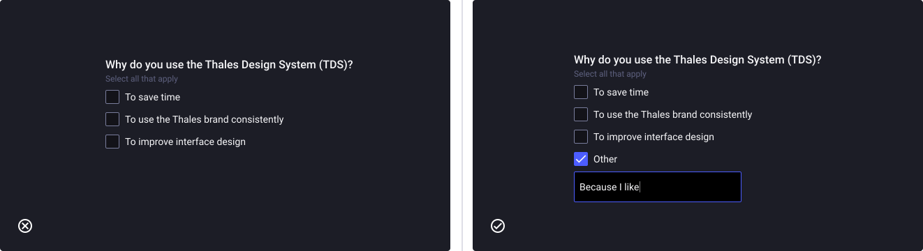
Using the “other option”
- Don’t: force the user to choose an option they don’t want to.
- Do: add the input field component to support the “other option” if not all options are available in the list.
Text wrapping
- Don’t: not vertically centre wrapped text with the checkbox.
- Do: let the text wrap beneath the checkbox so the control and the label are top aligned.