Floating Button
Overview
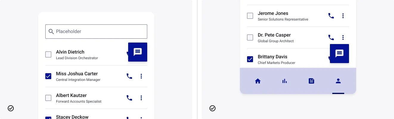
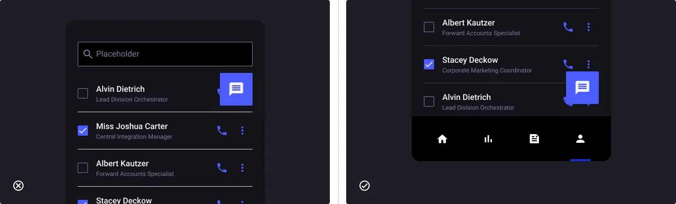
A Floating Action Button (FAB) emphasizes the main action of the page. It is an action button placed in the foreground of the interface. It can also be used in specific situations such as map navigation or multi edition.
You can refer to our documentation about Shadows & Elevation to understand how to embed it well in your interfaces.
Usage
When to use:
- To simplify access to the main action of the page
- To provide a panel of common actions of several items
- To keep a fixed action despite a scroll
When not to use:
- As a secondary action: if there are already some actions in the interface
- By putting several FABs on the same interface
Sources
Floating Action Button by Material Design.
Anatomy
Properties
From the design point of view, each component has a number of options. These options and their names are platform agnostic, and each implementation should adapt these to fit into their framework. In Figma, these are defined as properties that help define each variant.
Heads up
A star or asterisk symbol (*) can be used as a prefix to some Figma component properties in order to inform that the corresponding property is only used that way on the design side (Figma component libraries).
❖ FAB - Button Filled / Outline / Flat
| Property | Values | Default |
|---|---|---|
| size | small / medium / large / xlarge | medium |
| color | primary / success / warning / danger / neutral | primary |
| *state | default / hover / focused / pressed | default |
| disabled | false / true | false |
| label | text | Download |
| *hasLeftIcon | boolean | true |
| leftIcon | instance swap | swap_horiz |
| *hasRightIcon | boolean | false |
| rightIcon | instance swap | swap_horiz |
❖ FAB - Icon button Filled / Outline / Flat
| Property | Values | Default |
|---|---|---|
| size | small / medium / large / xlarge | medium |
| color | primary / success / warning / danger / neutral | primary |
| *state | default / hover / focused / pressed | default |
| disabled | false / true | false |
| leftAnnotation | boolean | false |
| rightAnnotation | boolean | false |
| icon | instance swap | swap_horiz |
❖ FAB - Icon buttons stack Primary / Neutral
| Property | Values | Default |
|---|---|---|
| color | primary / neutral | primary |
| size | small / medium / large | medium |
| items | 2 / 3 / 4 / 5 / 6 / 7 | 7 |
| showAnnotations | false / true | false |
| textPosition | none / left / right | none |
| isOpen | boolean | false |
Behaviour
Sizes
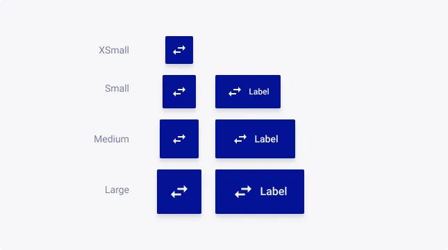
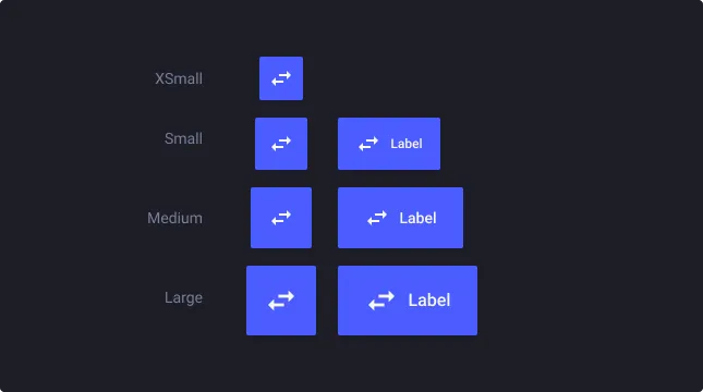
FAB supports four sizes:
- Small (S) for very small layouts
- Medium (M) as default for desktop devices
- Large (L) as default for tablet and smartphone devices
Note: we recommend to avoid to use individually the XSmall size because it is designed for the Icon Buttons Stack as a sub-item.
Style variations
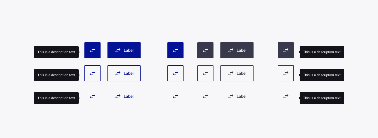
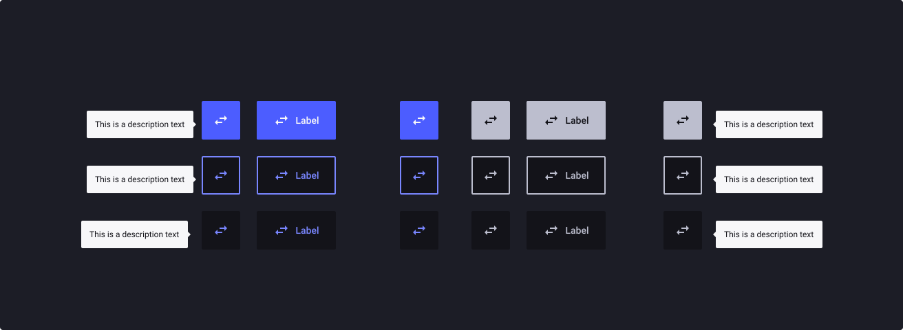
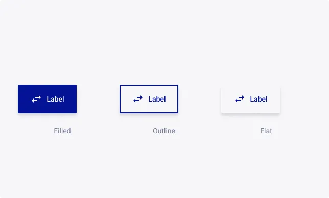
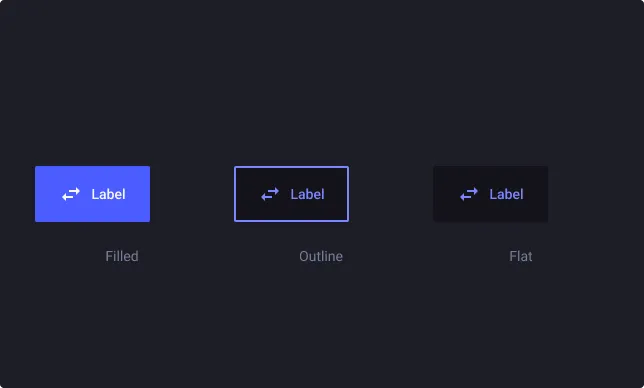
The Floating Action Button is available in 3 styles: Filled, Outlined and Flat.
Filled style is appropriate to emphasize one main action or open the sub-actions stack. It will pop on your screen if your interface is mainly light-themed. If it is not the case we recommend to use the Outlined version which will be more visible in colourful screens.
Eventually you can use the Flat one as a sub-action when an overlay is active. We do not recommend this use as a main action due to the lack of contrast in that case.
Severity
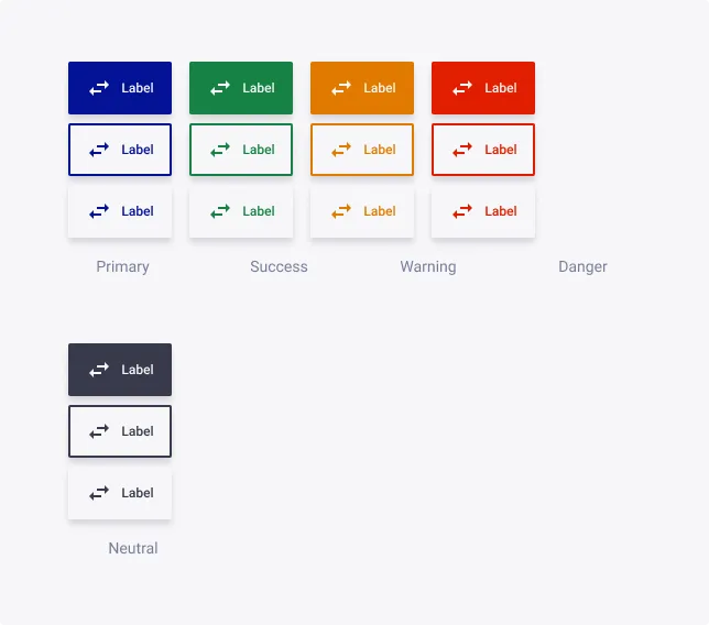
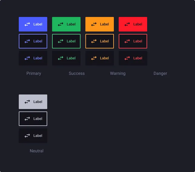
Primary FAB buttons represent the main action or primary call to action on a page. It should be used sparingly to draw attention to important actions.
Success FAB buttons represent successful actions or completion of a task. This could include actions that result in a successful operation or confirmation message.
Warning FAB buttons represent potentially harmful or irreversible actions. This could include actions that delete data or cancel a process, or that require additional caution and confirmation.
Danger FAB buttons represent potential issues or warnings. This could include actions that require additional confirmation or that might result in data loss or other negative consequences.
Use Neutral FAB for action that doesn’t need to grab too much user attention.
FAB Types
We provide you three types of Floating Action Button:
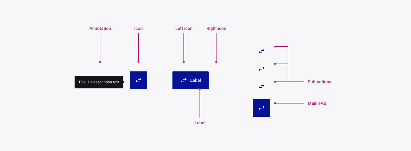
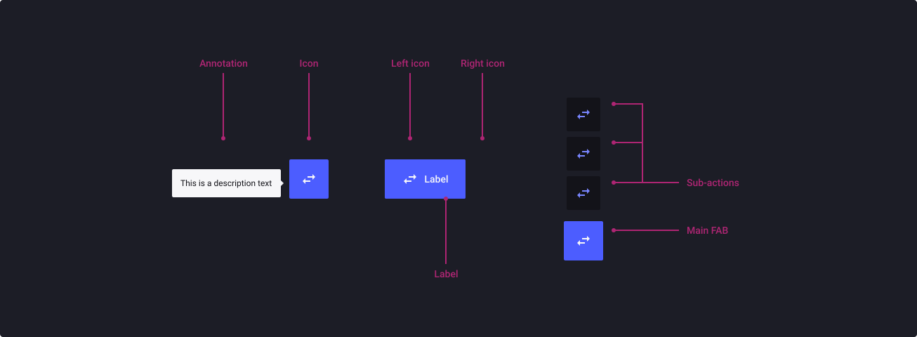
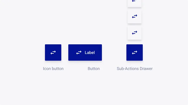
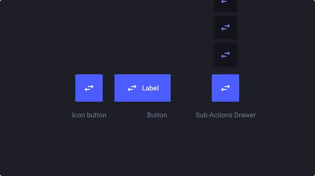
FAB - Icon Button which is the well-know FAB. We advise to use it in small interfaces such as Smartphone or Tablet app for an individual usage. In the case of applications with a full screen display, this FAB can also be used to provide different interactions to the users (i.e. mapping tool)
FAB - Button: more explicit, it allows the same uses as the FAB - Icon Button with a textual description. Be careful to ensure that the label is not too long in restricted interfaces.
FAB - Sub-Actions Drawer has a particular use because it allows to display several actions at the trigger of the main button. This stack gather actions consistently with the context and hideable by triggering once again the main button. Furthermore, we advise you to add an overlay behind your FAB to put the light on these sub-actions.
FAB Icon: Annotation
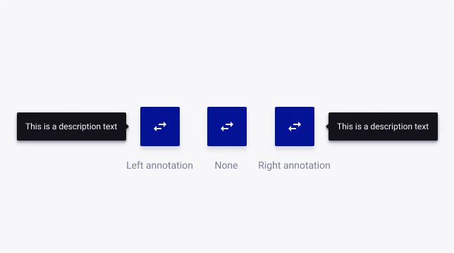
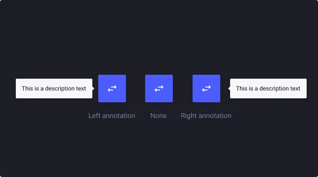
You can display additional text to your FAB - Icon Button in case you want to add context to your action.
We recommend hover usage for a FAB - Icon Button and permanent display for a FAB - Sub-Actions Drawer.
Usage Guidelines
Chose one action to emphasize
- Don’t: stack multiple FAB over your content.
- Do: choose one main action or store them in a FAB - Drawer.

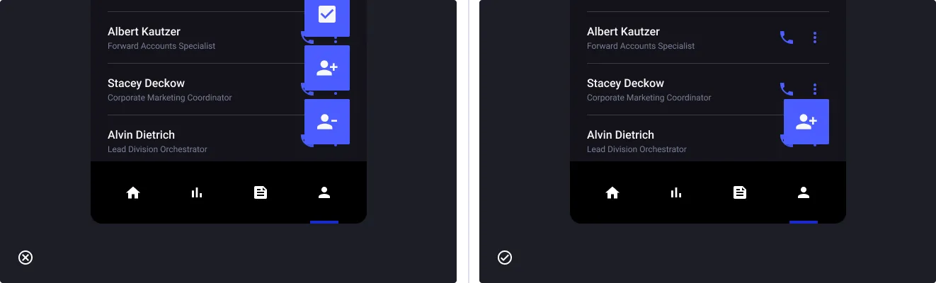
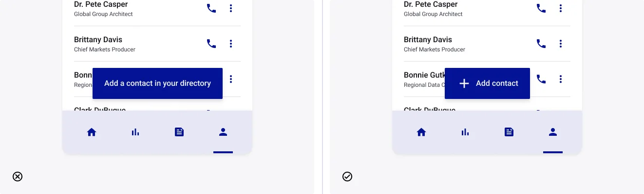
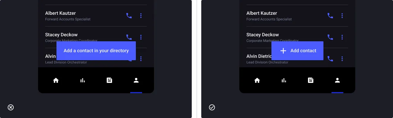
Be as concise as you can
- Don’t: write very long sentences for your actions.
- Do: either chose wisely one icon or shorten your text to be direct.
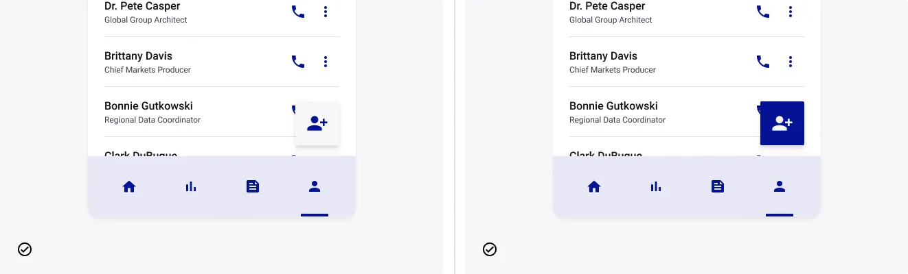
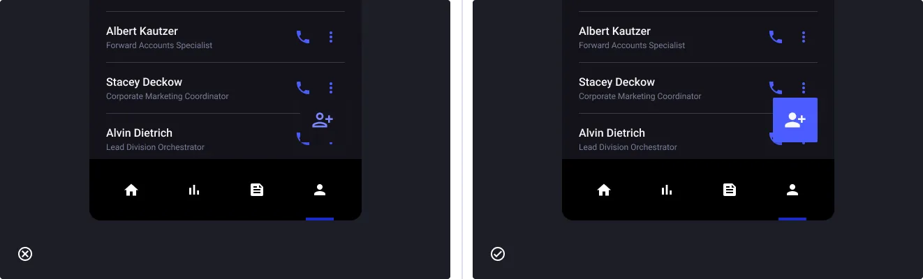
Select a color that contrast with your interface
- Don’t: chose a FAB with a background close to your interface’s theme.
- Do: accentuate the contrast by choosing a color that your users will see without effort.
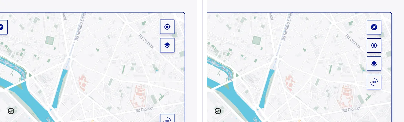
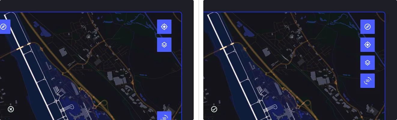
Gather FAB to minimize eye strain
- Don’t: scatter actions and force the user to navigate the entire screen.
- Do: bring everything together in one place with consistent actions.
Isolate FABs to avoid confusion
- Don’t: displaying a FAB near another action area, making it difficult to access.
- Do: put the FAB in an area where it is easily recognizable.