Tabs


Overview
Tabs organize content into multiple sections and allow users to navigate between them. The content under tabs should be contextual to the page it sits within.
When to use tabs:
- Locally navigate between content at the same level of your navigation hierarchy.
- To alternate between views within the same context.
Want to learn more? Jakob Nielsen describes how to use tabs - the right way.
Anatomy
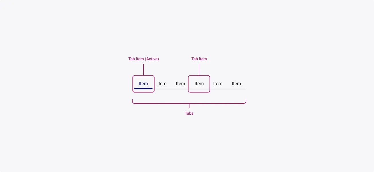
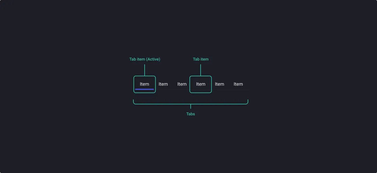
Elements highlighted below can be configurable by you within the component itself. To find out how to customize these elements, please visit the Customization page where it introduces you to the variants that define the make up of the Tabs.
Properties
From the design point of view, each component has a number of options. These options and their names are platform agnostic, and each implementation should adapt these to fit into their framework. In Figma, these are defined as properties that help define each variant.
Heads up
A star or asterisk symbol (*) can be used as a prefix to some Figma component properties in order to inform that the corresponding property is only used that way on the design side (Figma component libraries).
◇❖ Component: Tabs
| Property | Values | Default |
|---|---|---|
| size | small / medium | medium |
| items | 2 to 8 | 8 |
| fluid | false / true | false |
| fullHeight | false / true | false |
| *iconOnly | false / true | false |
| *iconPosition | none / left / right / top / iconOnly | none |
| tabDirection | horizontal / vertical | horizontal |
| divider | false / true | true |
Component: Tab Item
❖ Sub-component: Tab Item
| Property | Values | Default |
|---|---|---|
| size | small / medium | medium |
| state | default / hover / pressed / focused | default |
| active | true / false | true |
| disabled | true / false | true |
| *hasLabel | boolean | true |
| label | text | “Item” |
| *hasIcon | boolean | true |
| icon | instance swap | layers |
| *hasLeftIcon | boolean | true |
| *leftIcon | instance swap | settings |
| *hasRightIcon | boolean | true |
| *rightIcon | instance swap | expand_more |
Behaviour
Sizes
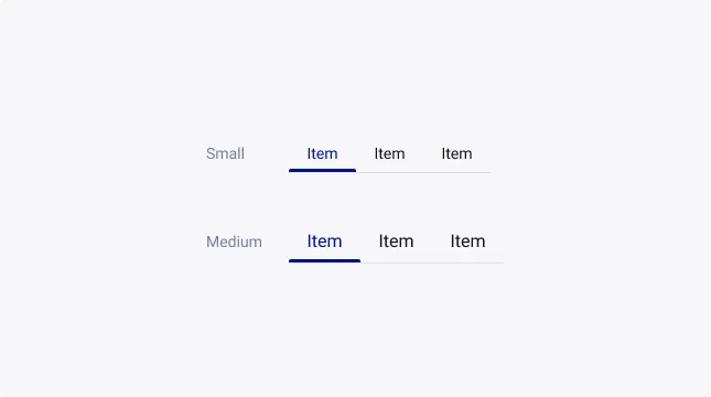
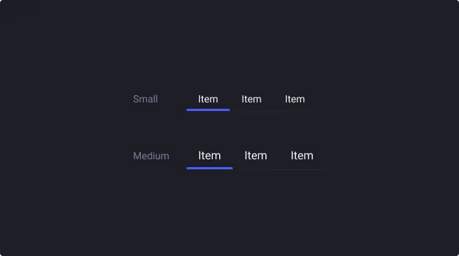
Tabs exist with 2 different sizes, small and medium.
States
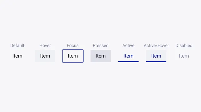
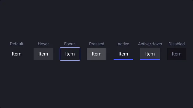
A tab has several interactive states - Default, Hover, Focused, Pressed, Active, Active & Hover, Disabled.
Icons
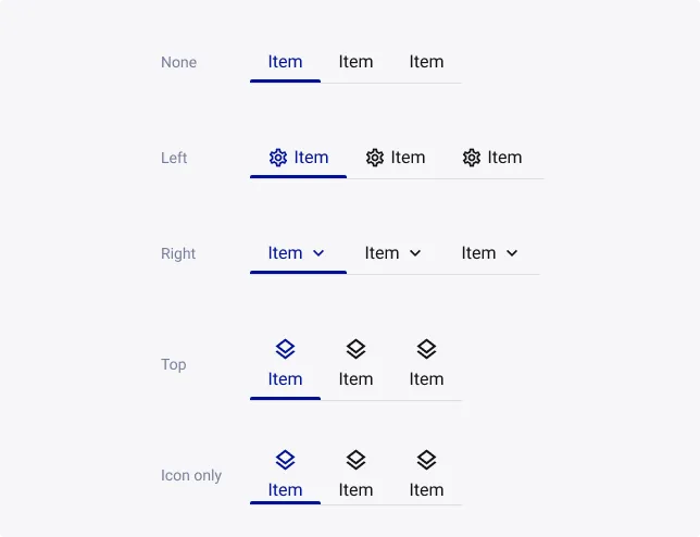
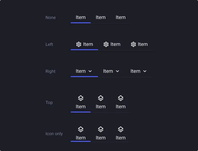
Icons can be used in tab items, but should only be used when it is absolutely necessary.
Icons should not be used just as decoration. If the tab item does not have a visible label, it must still have a tooltip to disclose the label.
Icons in tabs can make information easier to find and scan. We recommend to place the icon on the left of the label so users can see it first. Putting the icon to the right of the label won’t help the users scan the button. However, right icon can be set for right-to-left reading usages.
Divider
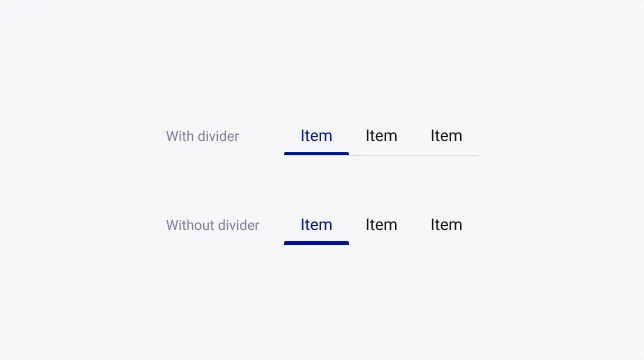
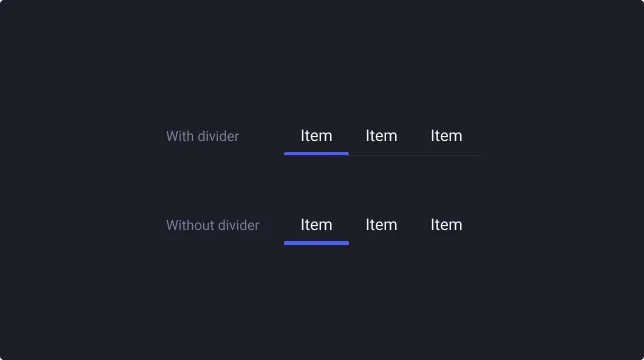
By default, tabs have a divider that spans across all tab items. This style works as a way to anchor them to the page. These types of tabs are best used at the top of a page, as a top-level navigation.
Alternatively, tabs can be used without a divider. These should be used as sub-level navigation or for containers.
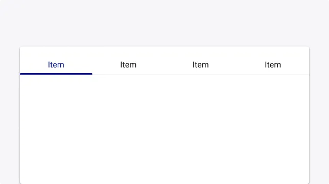
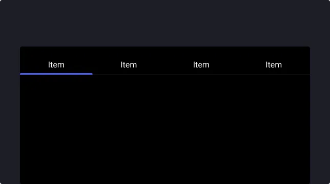
Fixed tabs
Fluid fixed tabs (Container based)
Fixed tabs have equal width, which can be calculated either as:
- The width of the screen divided by the number of tabs
- The width of the widest tab label
When using fixed tabs, ensure they can all be seen on mobile, without truncating their text. Don’t use more than four fixed tabs at once.
Clustered fixed tabs (Content based)
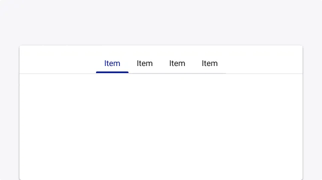
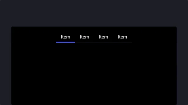
Clustered fixed tabs aren’t divided equally across the screen. The tabs can be centred, right-aligned, or left-aligned.
Clustered fixed tabs should be used in wide horizontal layouts, such as landscape mode on tablets or desktops.
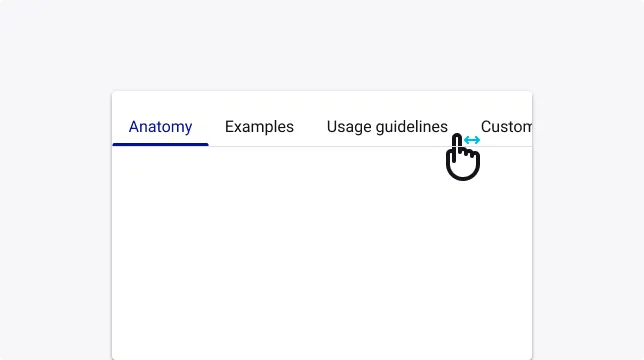
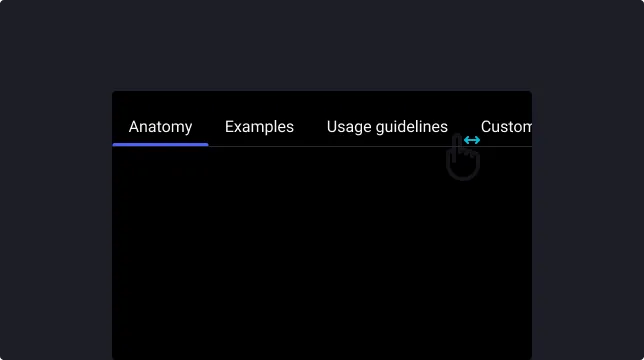
Scrollable tabs
When a set of tabs cannot fit on the screen, use scrollable tabs.
Scrollable tabs can use longer text labels and a larger number of tabs. They are best used for browsing on touch interfaces.
Usage Guidelines
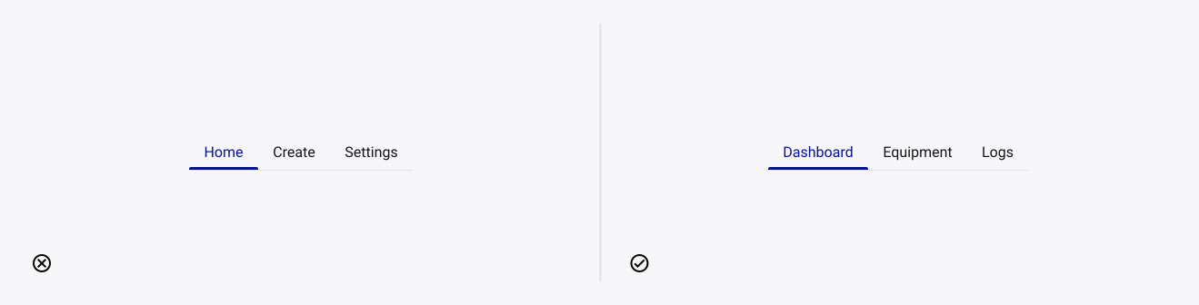
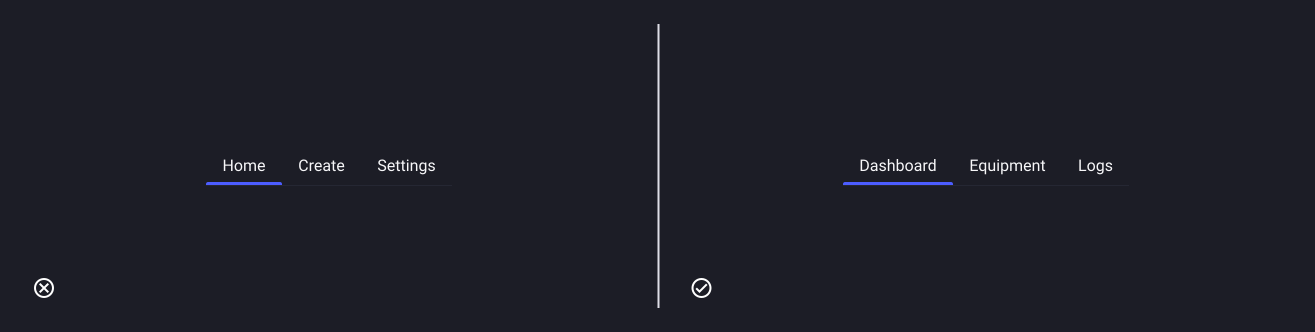
Equal level of importance
- Don’t: use tabs for varying levels of importance.
- Do: use tabs for organizing content of equal importance.
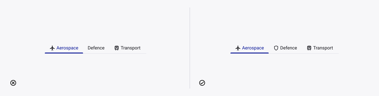
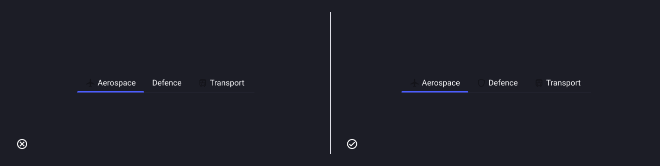
Consistent icon usage
- Don’t: mix the use of icons in tabs, as navigation controls require a clear spacial relationship to one another.
- Do: use consistent and relevant icons for tabs to establish a clear visual balance and presence for each tab item.
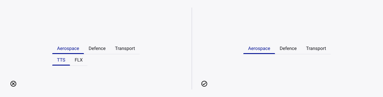
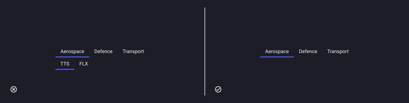
Avoid nesting of tabs
- Don’t: nest a tab within another tab.
- Do: use single-level tabs.
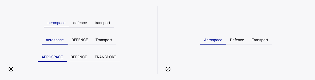
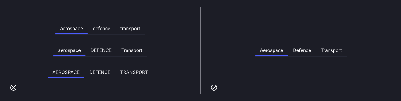
Sentence case
- Don’t: use anything else, unless bespoke design decisions warrant a change.
- Do: use sentence case for tab items.