Progress Bar
Overview
A progress bar is a progress indicator, either determinate (indicating a percentage of progression) or indeterminate (indicating a state of loading).
Usage
When to use:
- When managing action like download, upload, retrieval of data, …
- When the system is temporarily disabled, to block the screen
- When the processing takes more than a few seconds
- Generally, to provide feedback to the user about progression.
Sources and references
Anatomy
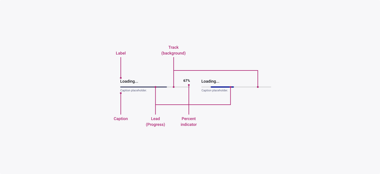
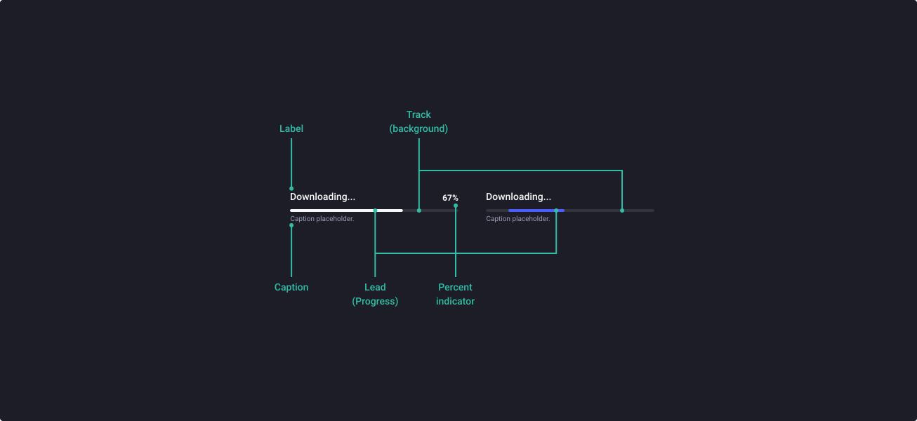
Properties
From the design point of view, each component has a number of options. These options and their names are platform agnostic, and each implementation should adapt these to fit into their framework. In Figma, these are defined as properties that help define each variant.
Heads up
A star or asterisk symbol (*) can be used as a prefix to some Figma component properties in order to inform that the corresponding property is only used that way on the design side (Figma component libraries).
❖ Component: Progress Bar
| Property | Values | Default |
|---|---|---|
| variant | determinate / indeterminate | determinate |
| size | small / medium / large | medium |
| color | primary / neutral | primary |
| state | loading / error / success | loading |
| *animated | false / true | true |
| animation | none / load (determinate) / bounce (indeterminate) / loop (indeterminate) | load (determinate) |
| value | N/A / 1% / 17% / 34% / 67% / 100% | N/A |
| *label+value | boolean | true |
| *hasLabel | boolean | true |
| *label | text | Downloading |
| showValue | boolean | true |
| *hasCaption | boolean | true |
| *caption | text | Caption placeholder |
Behaviour
Determinate & Indeterminate
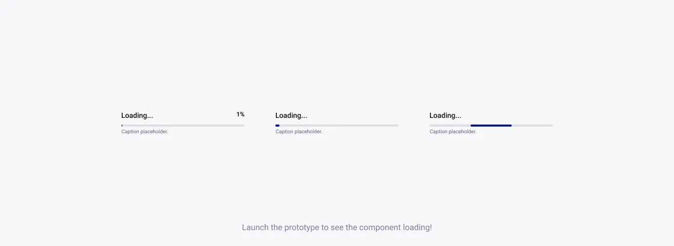
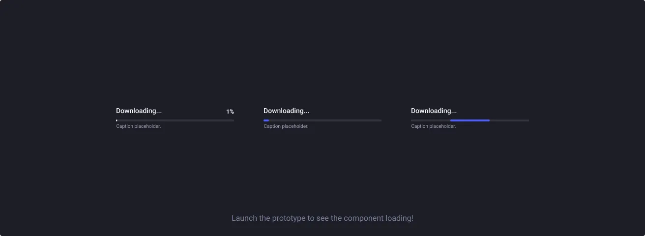
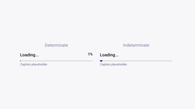
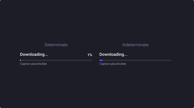
The progress bar comes in two different variants:
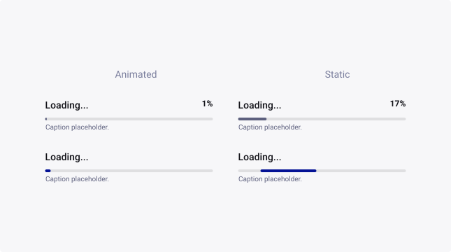
The determinate type, when progress can be calculated against a target (download, upload, know sizes, …)
The indeterminate type, when there is progress but the completion cannot be determined (connection to a server, retrieving unknown amount of data, …)
Sizes
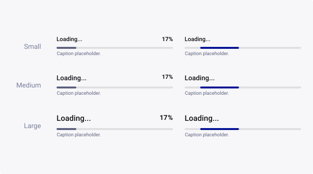
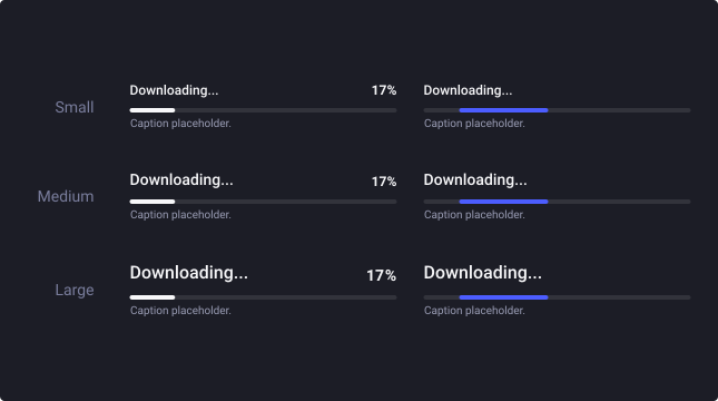
Progress bars are available in three sizes to cater for the diverse range of use cases and devices that our business uses.
Progress
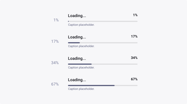
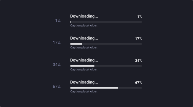
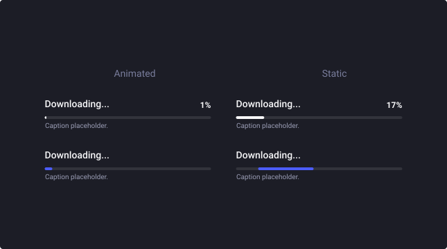
Different percentage indications are available in the variants to be chosen. Percentages are 1%, 17%, 34% and 67% for the static component.
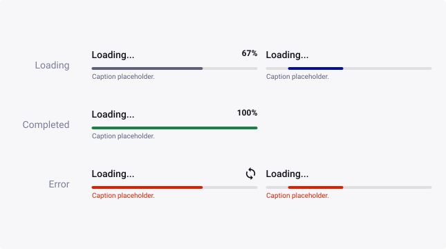
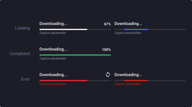
State
By default, the progress bar is in Loading state.
We recommend using the Completed state to emphasize the end of the progress. We also recommend using the Error state to make it obvious when the loading is encountering some issues.
Color
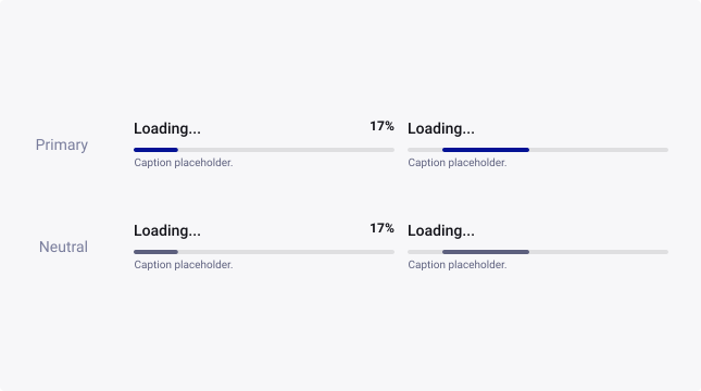
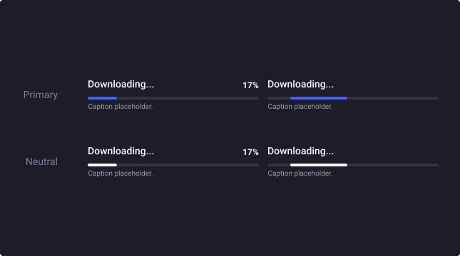
By default, progress bars are emphasized (primary theme). Providing a visual prominence.
For visual components, like application panels, where a checkbox shouldn’t be a standout element, choose the neutral theme to de-emphasize its visual presence on the screen.
Animation
The progress bar is animated by default thanks to the Interactive Components feature on Figma. If you would like to remove this capacity, uncheck the “animate” property.
All animations can be manually overwritten if you need other timings.
Animation type
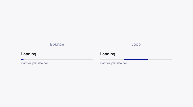
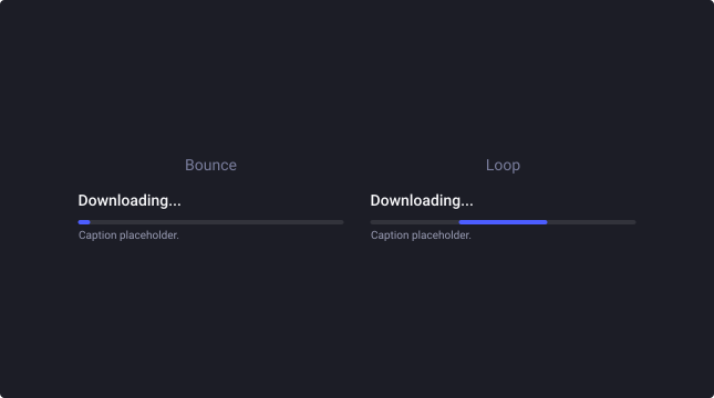
The indeterminate variant comes either as a bar bouncing from left to right or as an infinite loop. You can select each one in the property menu of the component.
Usage Guidelines
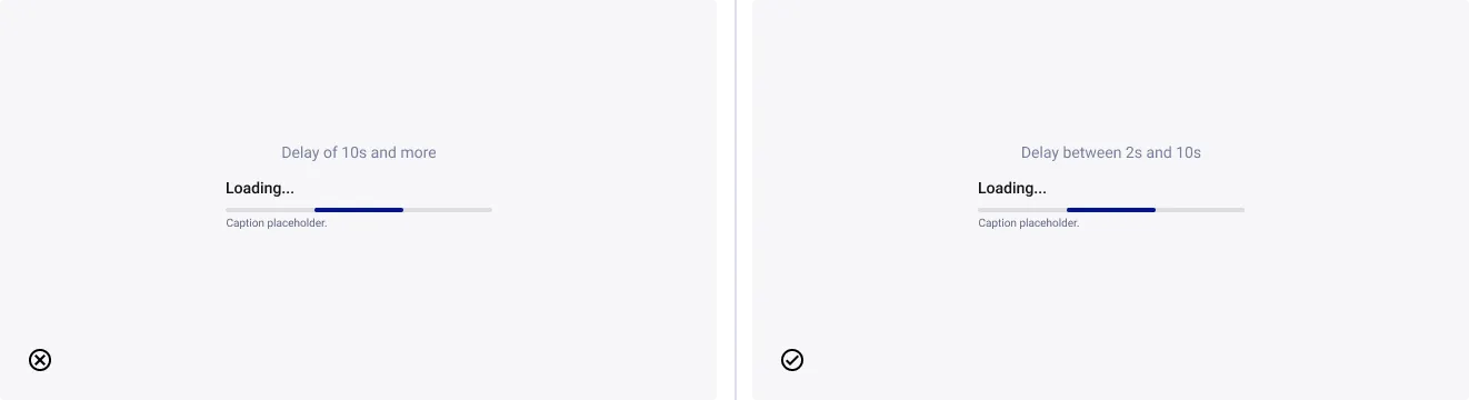
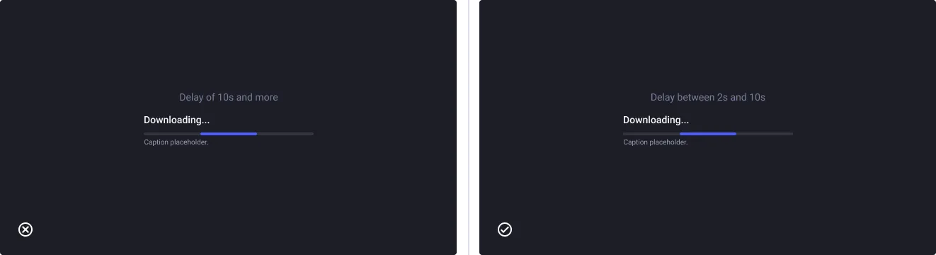
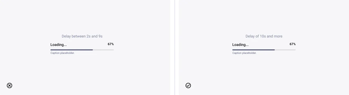
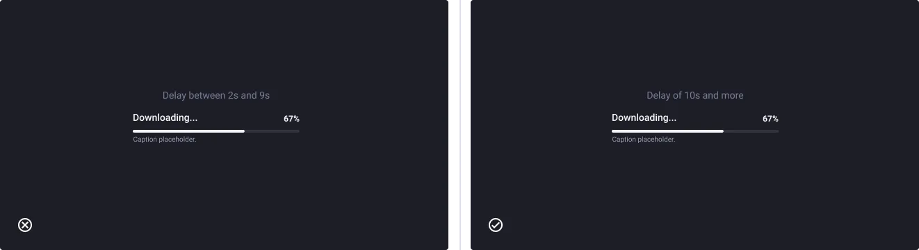
Use percentage based progress bar for longer loading delays.
- Don’t: use percentage based progress bar for delays between 2 and 9 seconds
- Do: use percentage based progress bar for delays > 10 seconds
Use loop based progress bar for shorter loading times.
- Don’t: use loop based progress bar for delays over 10 seconds
- Do: use loop based progress bar for delays < 10 seconds