Modal Dialog
Overview
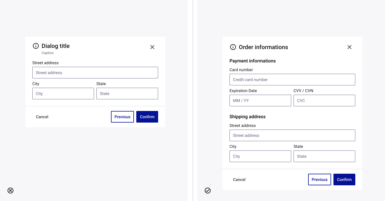
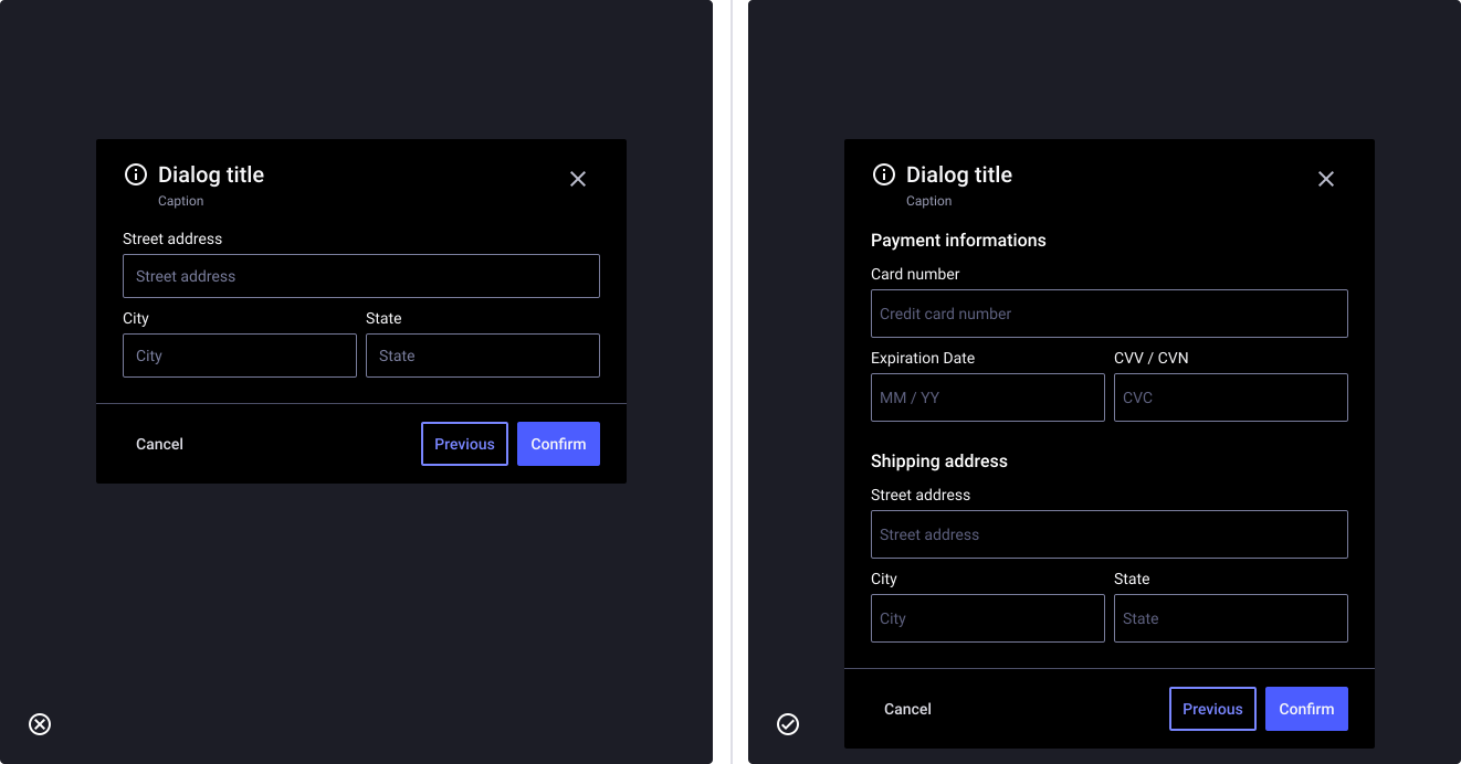
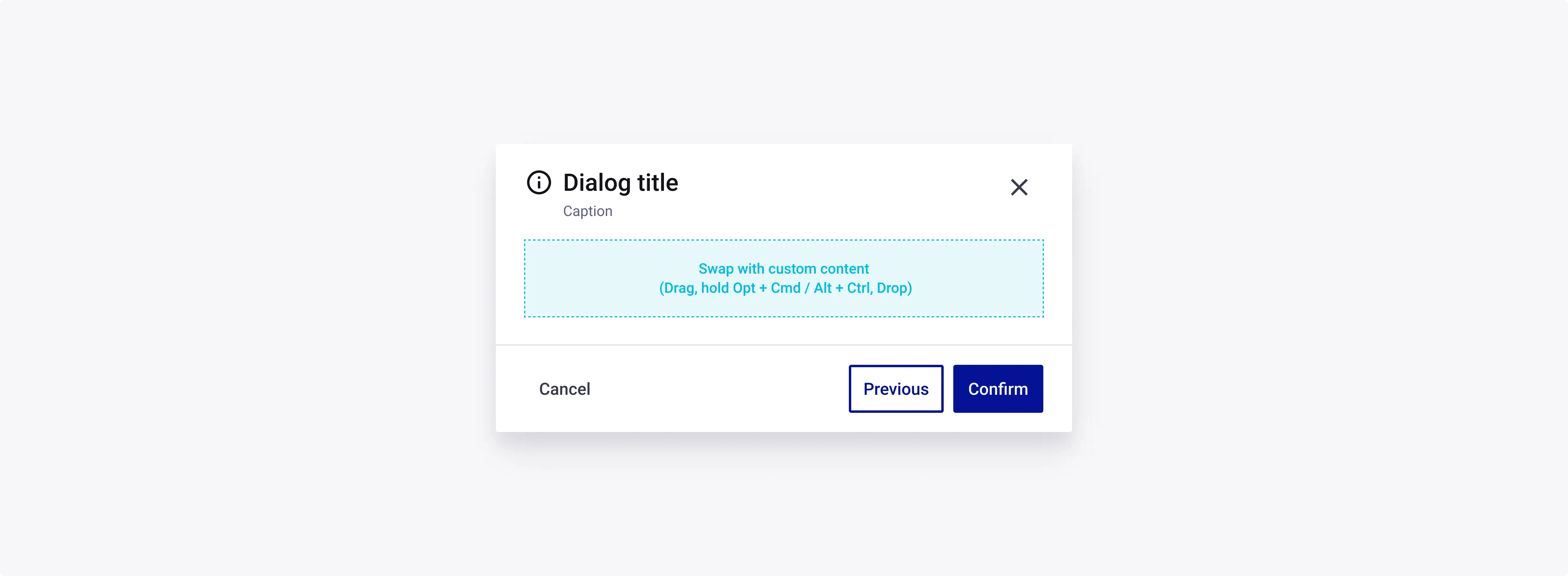
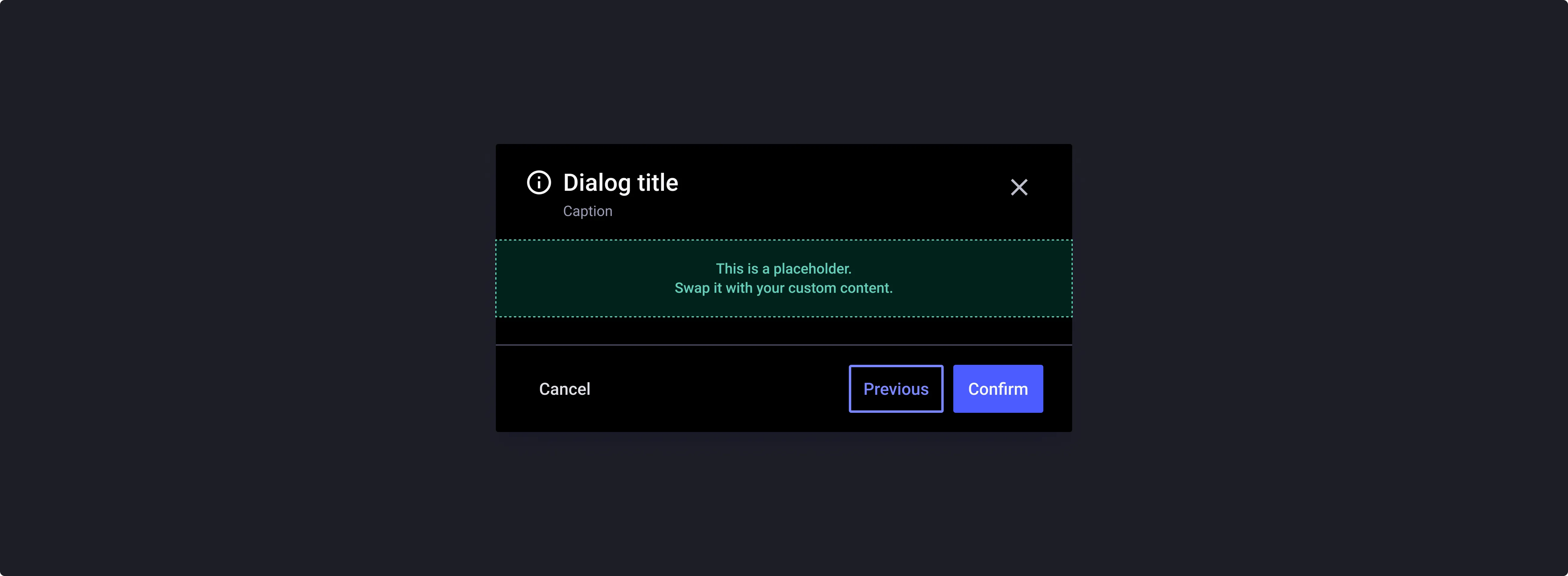
A Modal Dialog focuses the user’s attention exclusively on one task or piece of information via a window that sits on top of the page content. It does this by disabling the main content until the user explicitly interacts with the modal dialog.
- Modal dialog should be used when you need to:
- Grab the user’s attention
- Get input from the user
Usage
When to use :
- Grab the user’s attention
- Get input from the user
Anatomy
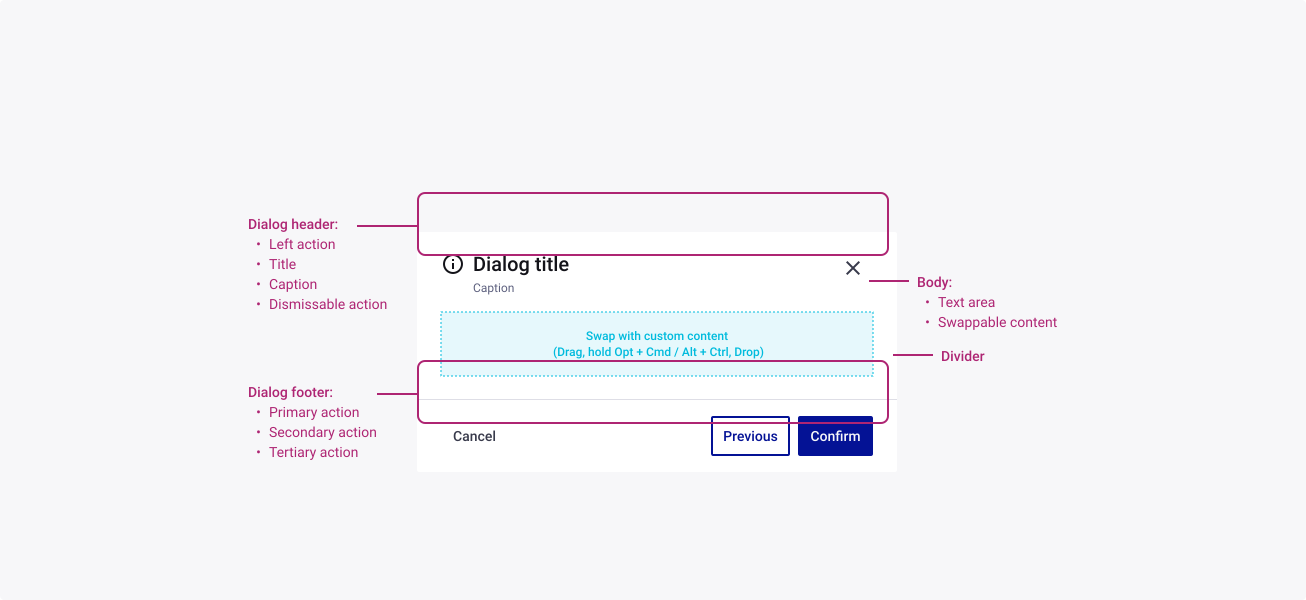
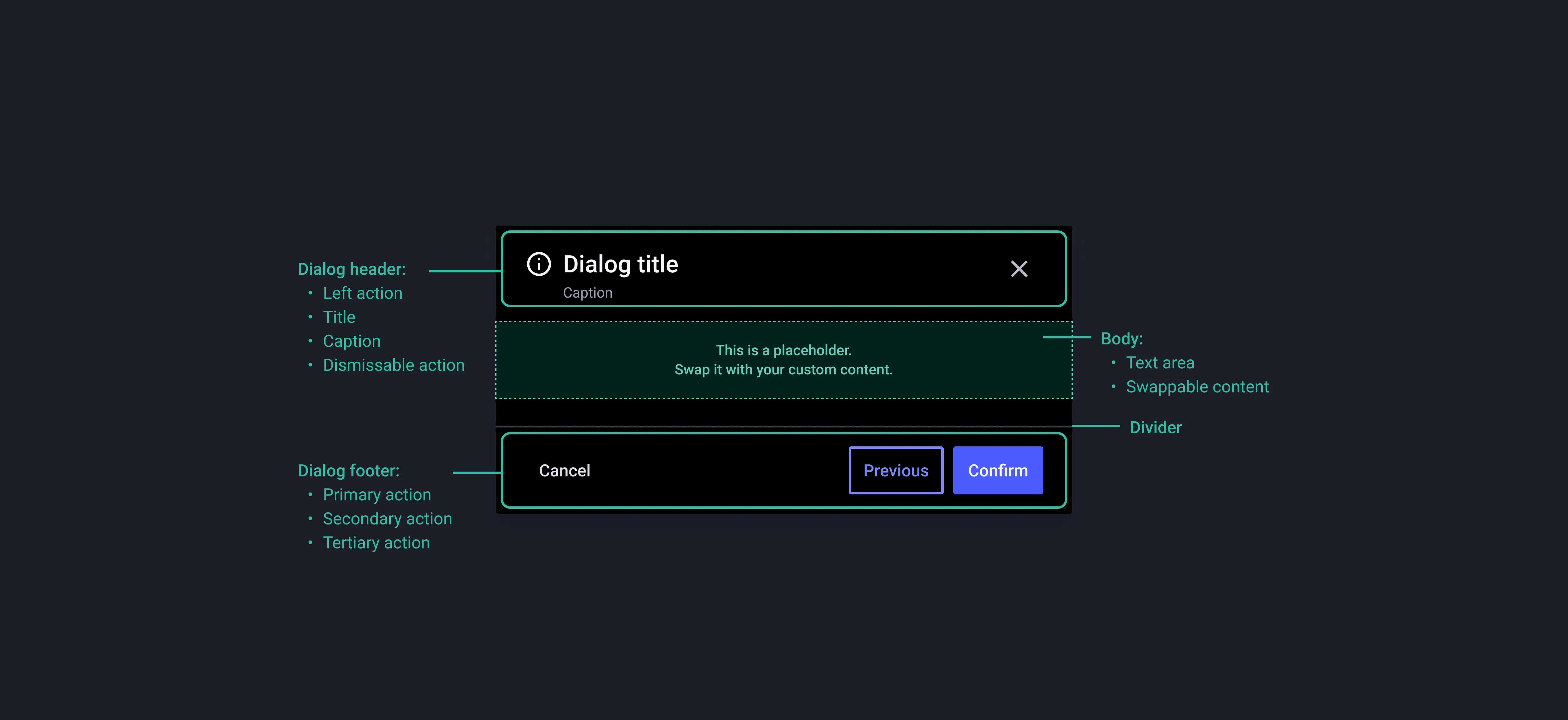
Properties
From the design point of view, each component has a number of options. These options and their names are platform agnostic, and each implementation should adapt these to fit into their framework. In Figma, these are defined as properties that help define each variant.
Heads up
A star or asterisk symbol (*) can be used as a prefix to some Figma component properties in order to inform that the corresponding property is only used that way on the design side (Figma component libraries).
◇◇❖ Component: Dialog Box
| Property | Values | Default |
|---|---|---|
| size | small / medium / large | medium |
| content | custom / textArea | custom |
| verticalResizing | true / false | false |
❖ Sub-Component: Header
| Property | Values | Default |
|---|---|---|
| size | small / medium / large | medium |
| hasLeftIcon | boolean | true |
| hasCaption | boolean | true |
| dismissible | boolean | true |
❖ Sub-Component: Footer
| Property | Values | Default |
|---|---|---|
| size | small / medium / large | medium |
| alignment | horizontal / vertical | horizontal |
| divider | boolean | true |
| primaryAction | boolean | true |
| secondaryAction | boolean | true |
| tertiaryAction | boolean | false |
Behaviour
Choosing an escaping pattern
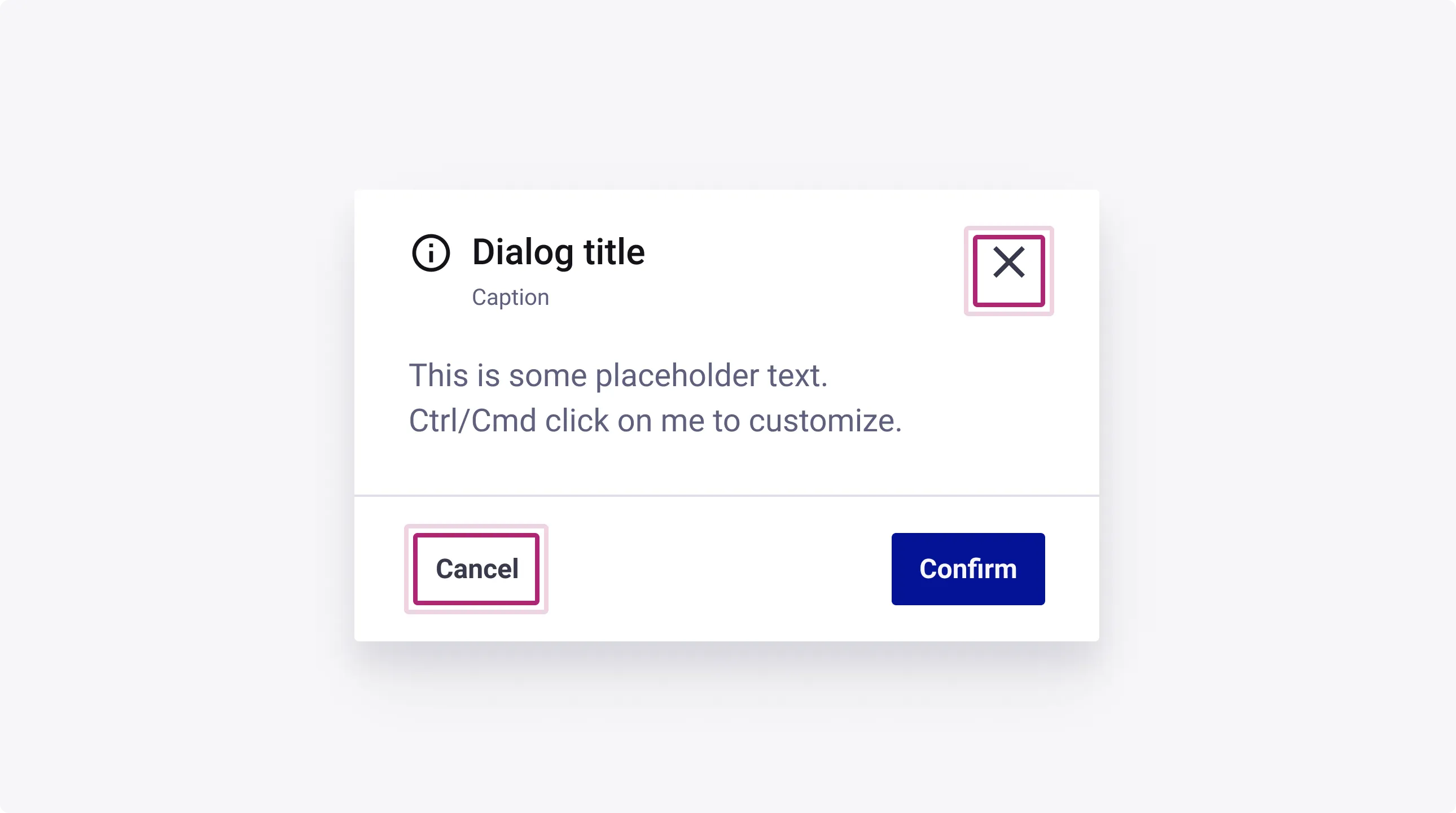
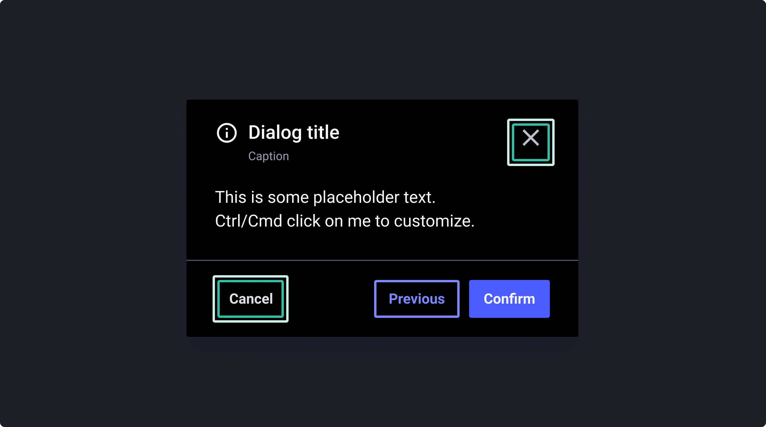
The header is customizable and you can easily turn on and off the presence of the close button. By doing so, you must consider choosing and documenting in your designs the right escape pattern:
- Pressing ‘x’ button
- Pressing ‘ESC’ on the keyboard
- Clicking outside of the dialog box
- Using a ‘Cancel’ option
Customize content
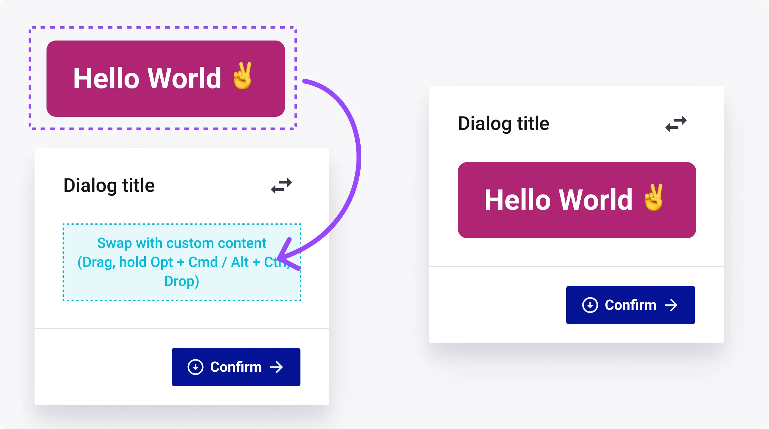
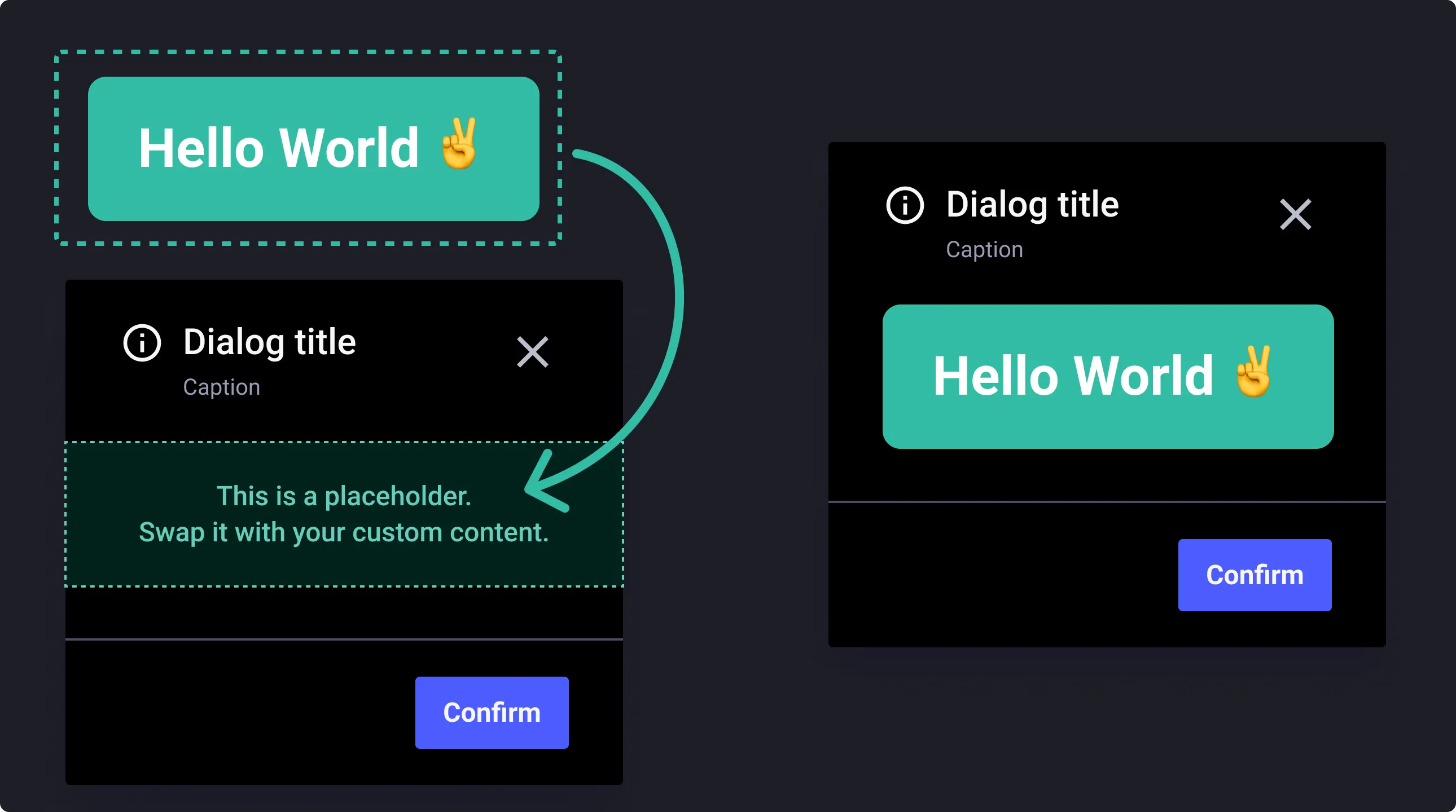
To swap the default content with your own, follow these simple steps:
- Create your composition in a frame and apply Auto layout to it
- Create a local component with this frame
- Drag & drop it from your assets panel while pressing CTRL+ALT or CMD+OPT to swap the default content
- Make sure to apply the right constraints for resizing the lower components in the content area
Action buttons group
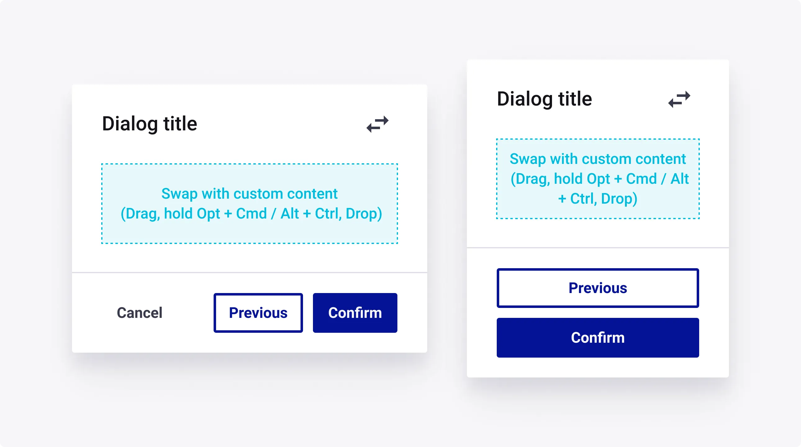
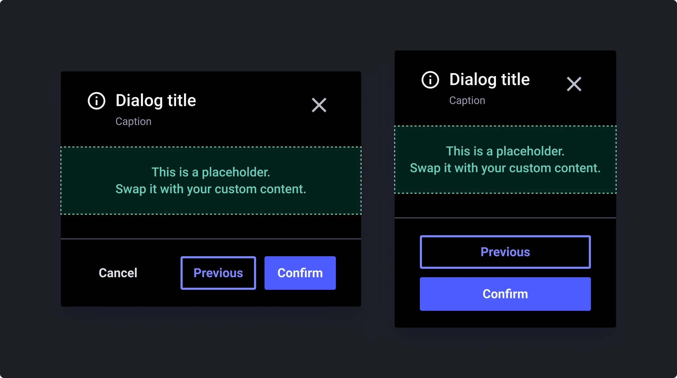
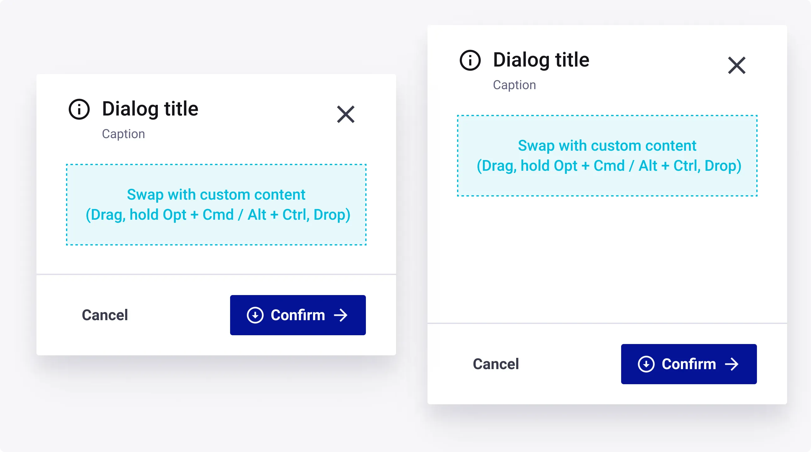
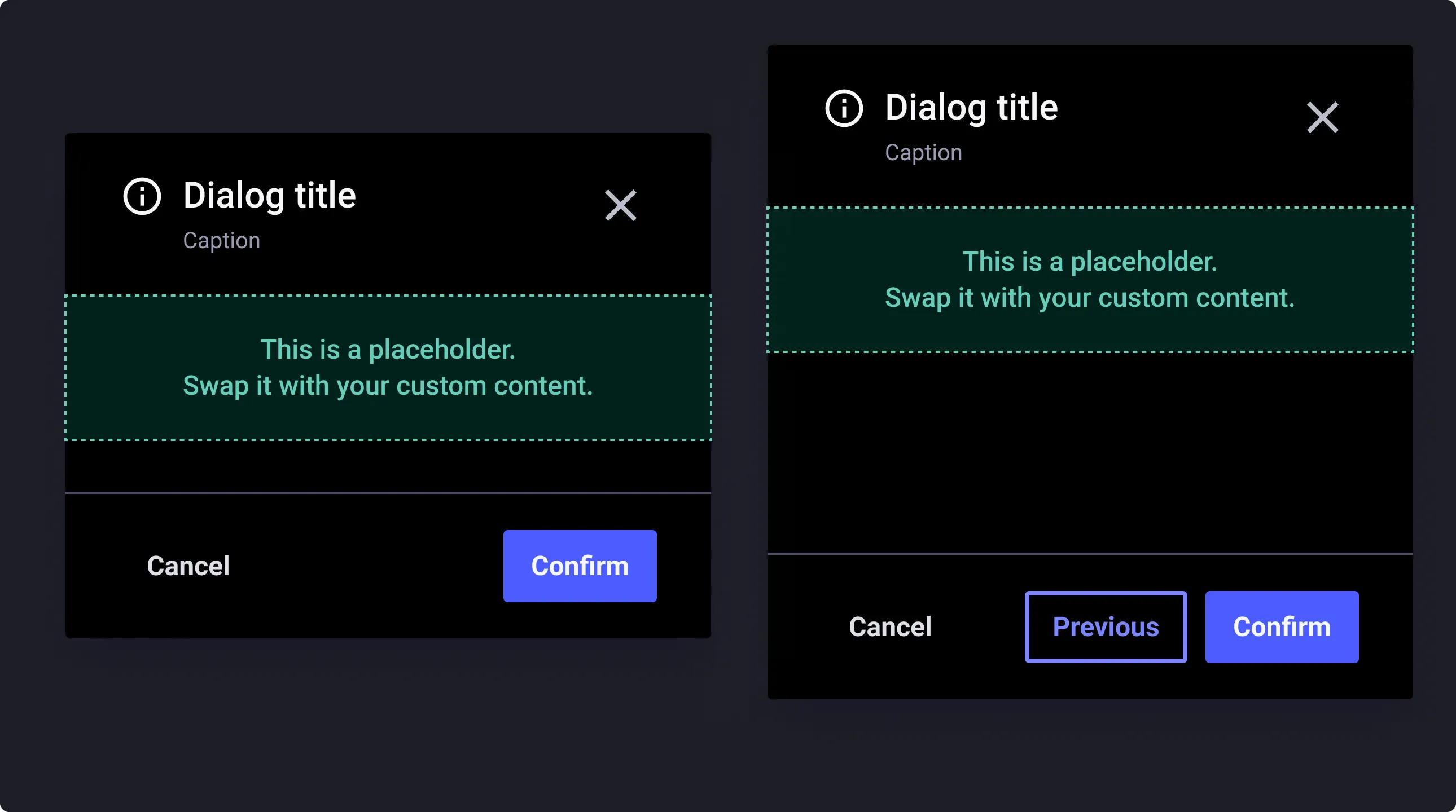
A dialog can have up to 3 buttons in its footer compartment.
When horizontal space is limited, button groups stack vertically. They should appear in ascending order based on importance, with the most critical action at the bottom.
Manual resizing (Vertical)
The modal component comes in 2 versions when it comes to resizing:
- Automatic sizing based on the content you will put in the swap zone. (default)
- Manual override to manage yourself the vertical size of the dialog box.
Overlay or Scrim
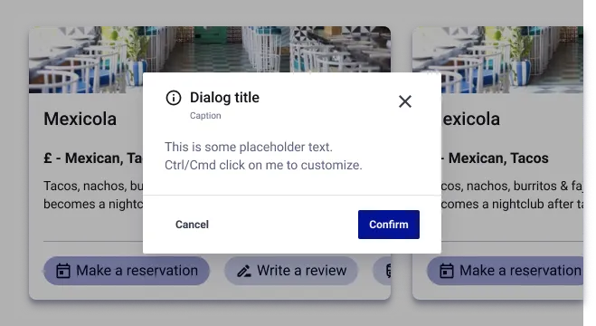
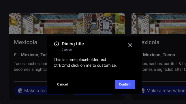
To focus the attention on the modal and indicate that any interaction with the main content behind is disabled, the modal includes an overlay or scrim layer. The overlay sits right behind the modal and cover the full page.
The overlay uses the color black-30: black color with a transparency of 30%.
Usage Guidelines
Naming your dialog
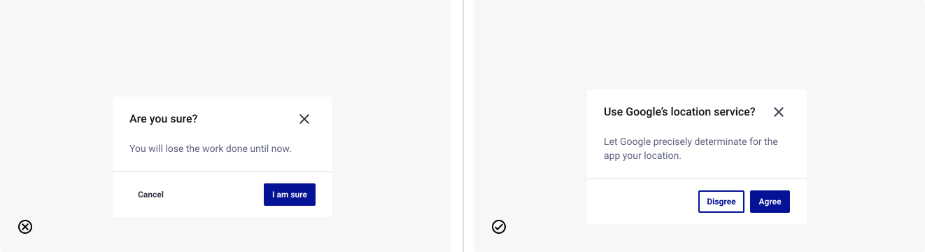
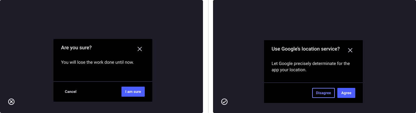
- Don’t: use dialog titles that pose an ambiguous question to the user.
- Do: name a dialog with a specific question or statement that concisely explains what’s involved in the request, and provides clear actions.
Naming your actions
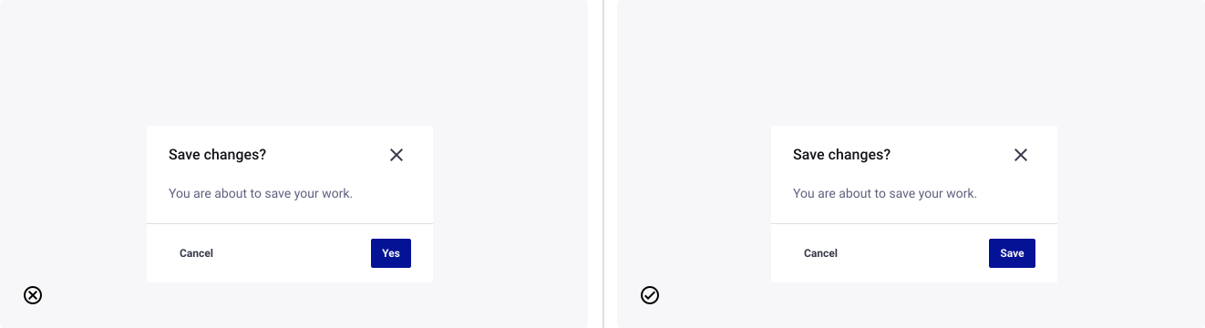
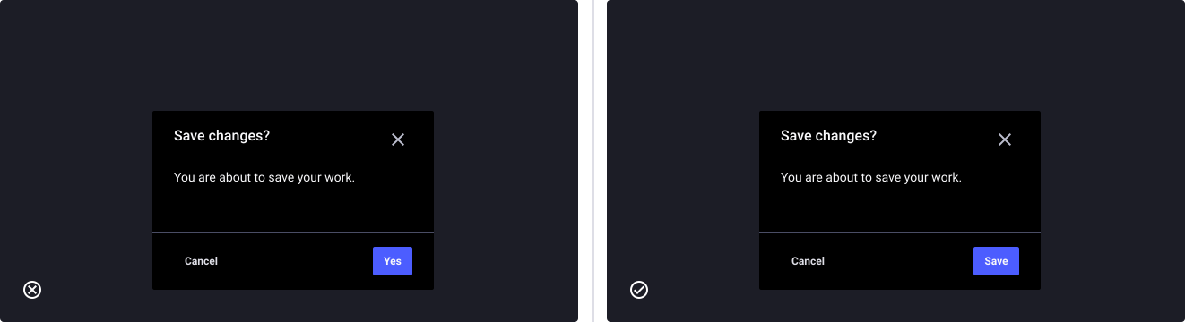
- Don’t: name your actions with ambiguous words, otherwise it creates a sense of doubt to the user.
- Do: name actions with specific and actionable words, allowing the user to make a confident decision.
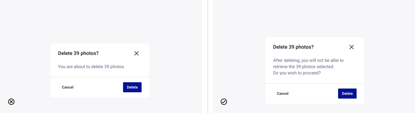
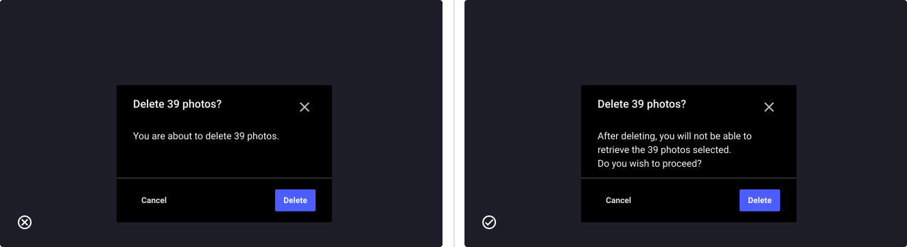
Provide important information
- Don’t: make things unclear about the impact for the user.
- Do: clearly state what the action taken will impact from the user’s perspective.
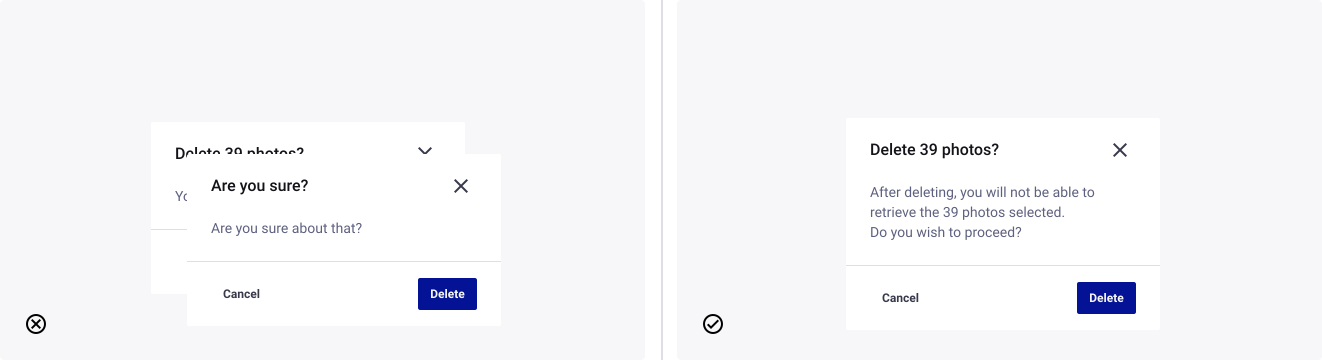
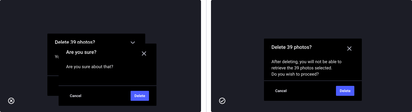
Don’t stack dialog boxes
- Don’t: make a dialog appear on top of another.
- Do: avoid visual complexity by sticking to one dialog at a time.
Avoid multiple steps dialog
- Don’t: do multi step dialog. If the interaction is complex enough to have this many inputs or information to retrieve, it might be worth having its own page.
- Do: consider making it a dedicated page in the process.