Divider


Overview
Dividers help you bring rhythm and clarity to your interfaces by separating elements. Separation of elements also comes in pair with the grouping of ones, thus a powerful tool to raise your information architecture.
Anatomy


Properties
From the design point of view, each component has a number of options. These options and their names are platform agnostic, and each implementation should adapt these to fit into their framework. In Figma, these are defined as properties that help define each variant.
Heads up
A star or asterisk symbol (*) can be used as a prefix to some Figma component properties in order to inform that the corresponding property is only used that way on the design side (Figma component libraries).
❖ Component: Divider
| Property | Values | Default |
|---|---|---|
| size | small / medium / large | medium |
| orientation | horizontal / vertical | horizontal |
| shape | rounded / sharp | rounded |
Behaviour
Sizes
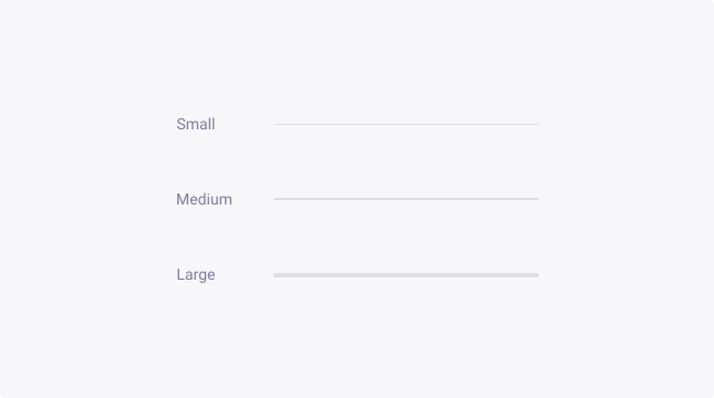
The divider comes in three sizes to cater for the diverse range of use:
- Small
- Medium
- Large
By default, the divider comes in Medium size but should always be adapted to match the layout density of your interfaces.

Orientation
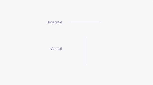
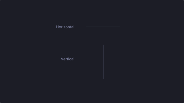
The divider can be used in two main directions:
- Horizontal - to separate items on the vertical axis
- Vertical - to separate items on the horizontal axis
Shape
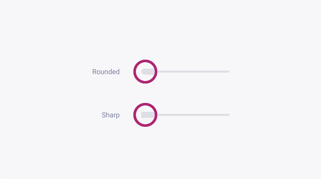
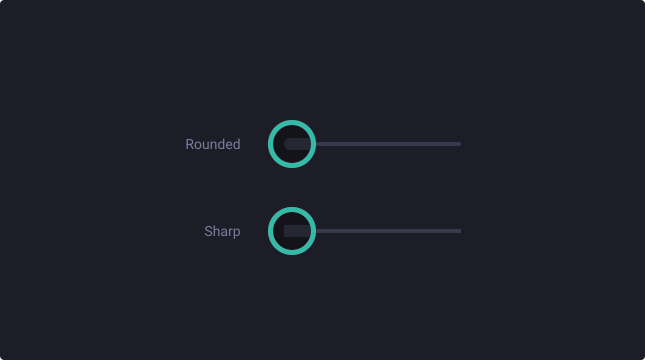
The divider can be used in two main shapes:
- Rounded - should be used when the divider is not 100% of the height/width of its container
- Sharp - should be used when the divider is 100% of the height/width of its container
Usage Guidelines
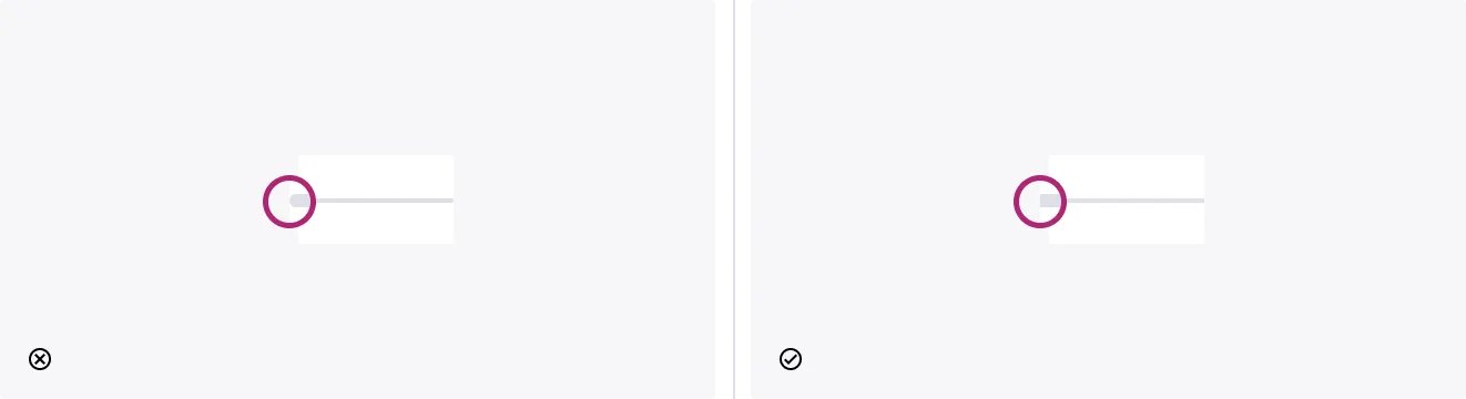
Don’t use rounded dividers edge on edge
- Don’t: let rounded edge touch container edges.
- Do: use sharp variant instead.

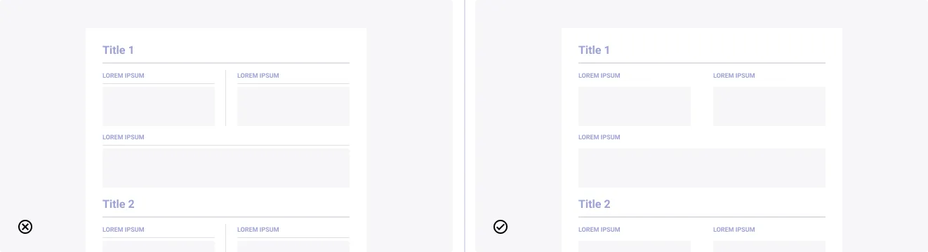
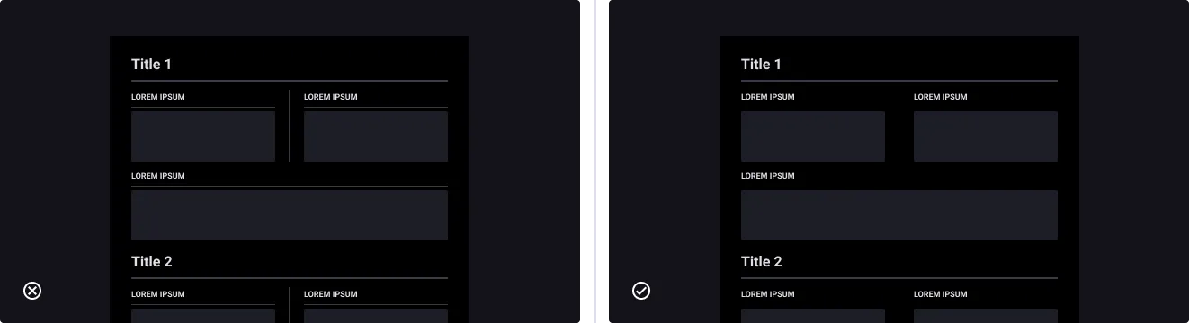
Overuse of dividers
- Don’t: add too much noise by overusing dividers.
- Do: use them sparingly to highlight your information architecture.