Toggle Switch

Overview
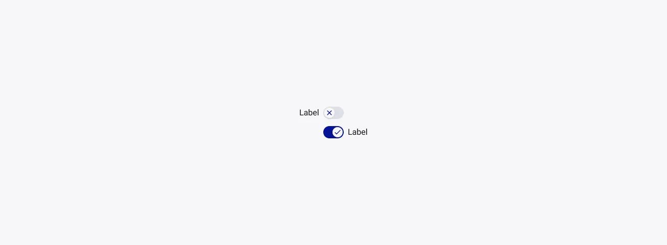
Toggle Switch are On/Off switches. They are meant to ask the user to choose between two mutually opposed options, and always have a default value, whether it’s off or on.
Toggles, and in that case switches, always have a direct impact and provide immediate results.
Anatomy

Properties
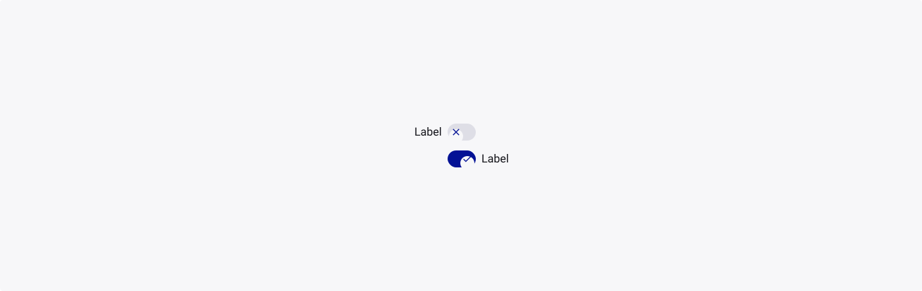
From the design point of view, each component has a number of options. These options and their names are platform agnostic, and each implementation should adapt these to fit into their framework. In Figma, these are defined as properties that help define each variant.
Heads up
A star or asterisk symbol (*) can be used as a prefix to some Figma component properties in order to inform that the corresponding property is only used that way on the design side (Figma component libraries).
❖ Component: Toggle switch
| Property | Values | Default |
|---|---|---|
| size | small / medium / large | medium |
| color | primary / neutral | primary |
| state | default / pressed / focused | default |
| checked | false / true | false |
| disabled | false / true | false |
| labelPosition | left / right | right |
| hasLabel | boolean | true |
| labelOn | text | “Label” |
| labelOff | text | “Label” |
| displayIcon | boolean | true |
| iconOff | instance swap | check |
| iconOn | instance swap | check |
Behaviour
Sizes
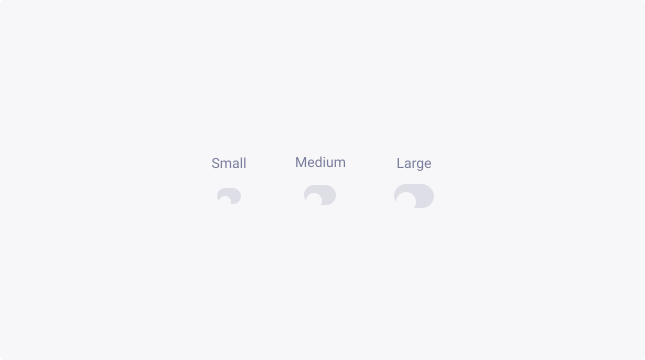
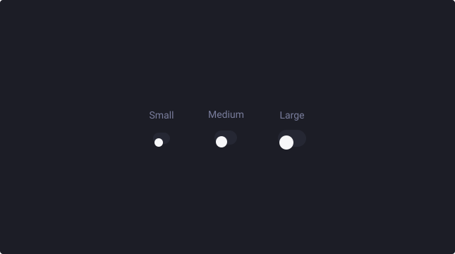
Switches are available in three sizes to cater for the diverse range of use cases and devices that our business uses.
By default, the medium switch is used typically for desktop/tablet devices. But for mobile devices, it is possible that you need to upscale the switch, to increase the touch area.
For more information about target size, check out W3’s website.
Switch activation
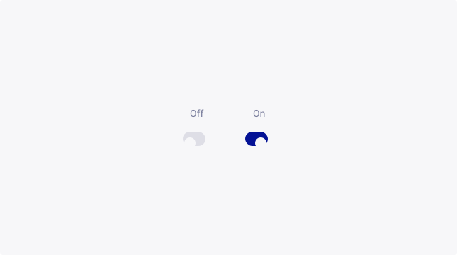
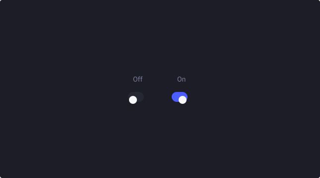
The “activated” parameter allows you to easily switch from off to on and the other way around with a simple press of a button.
Label
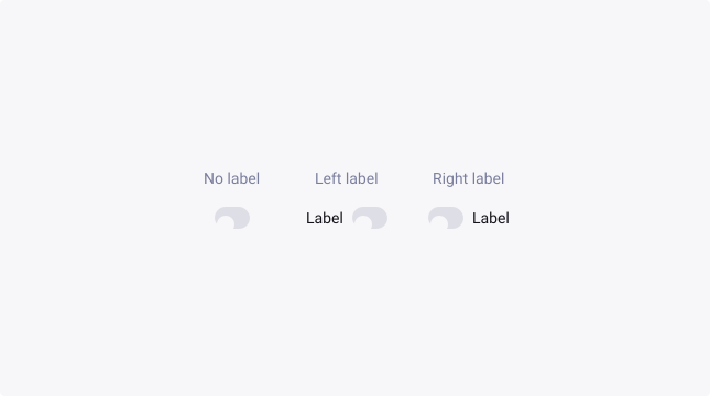
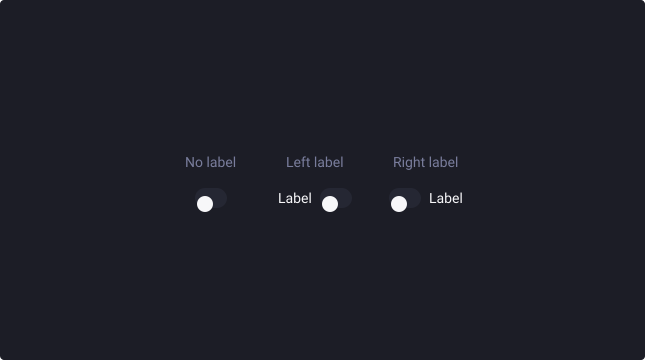
For flexibility purposes, you can choose to integrate a switch without label.
Therefore, the toggle labels should describe what the control will do when the switch is on and a toggle should always indicate to the user the impact.
Emphasis
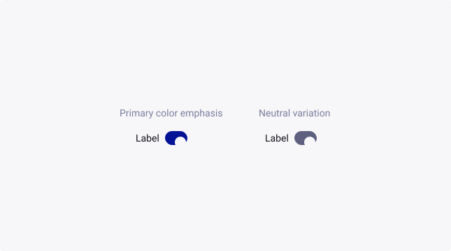
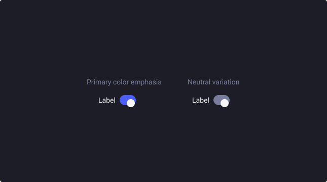
By default, switches are emphasized (primary theme). Providing a visual prominence that is optimal for forms, settings, lists or grids of assets, and other situations where a switch is required.
For visual components, like application panels, where a checkbox shouldn’t be a standout element, choose the neutral theme to de-emphasize its visual presence on the screen.
Resizing to fit
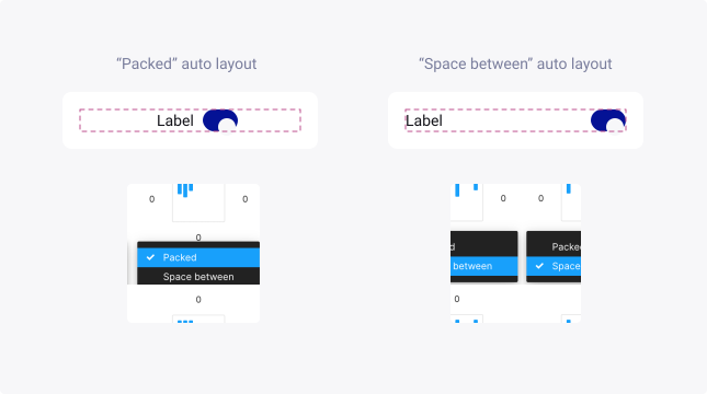
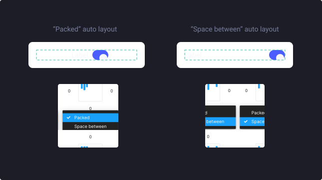
Sometimes, you will need to change the base auto-layout model from “Packed” to “Space between” in order to make your component horizontally fit its container. You can change this setting directly at the top level of the component in the auto-layout panel
Text overflow
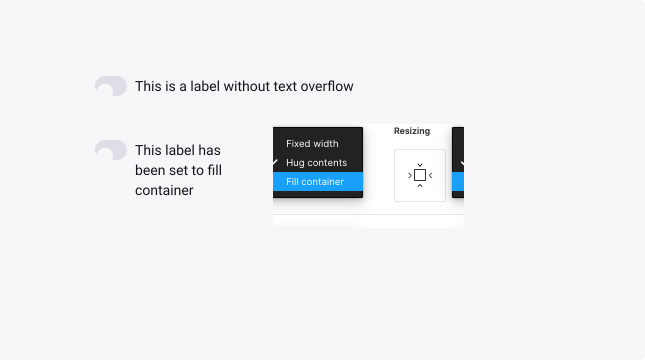
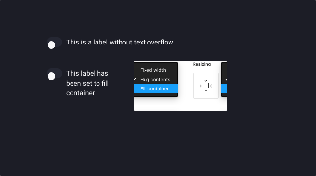
When the label is too long for the horizontal space available, it can be wrapped to form another line. Use the following steps in order to configure the TDS component to do this:
- Set ‘Switch label’ text layer to fill container (horizontally).
- Resize the main component to the right width.
Usage Guidelines
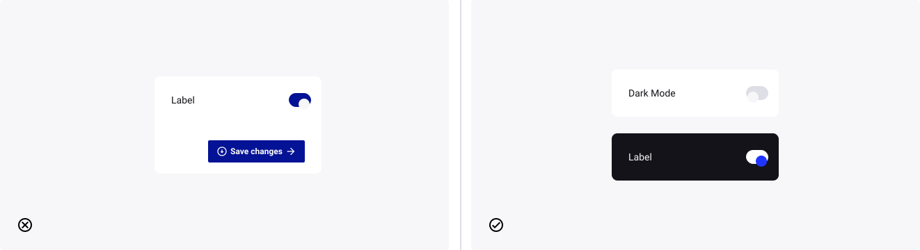
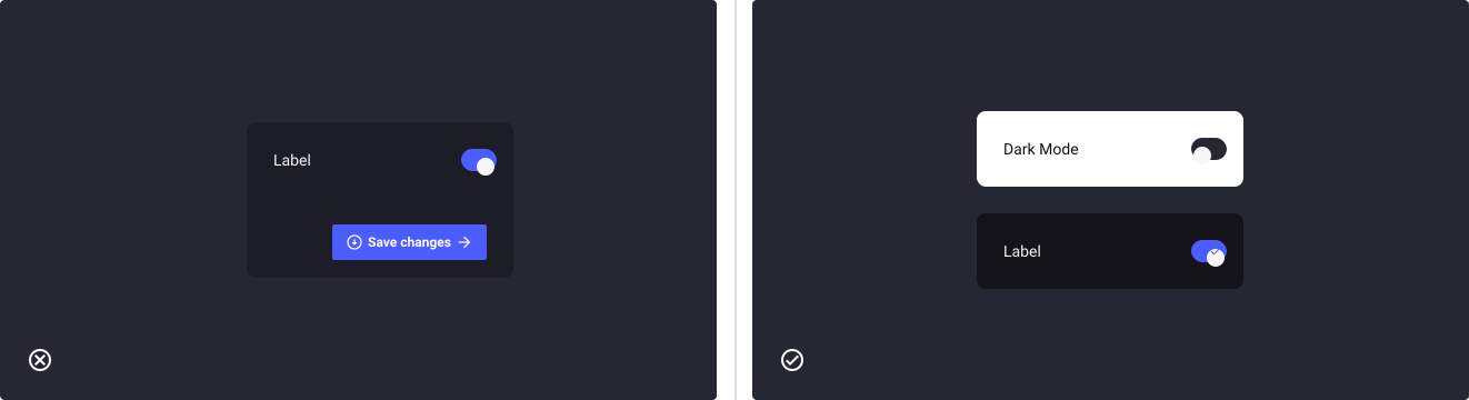
Deliver immediate results
- Don’t: ask the user to save the changes or apply changes when switching a toggle.
- Do: deliver immediate effect on your interfaces.
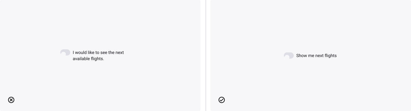
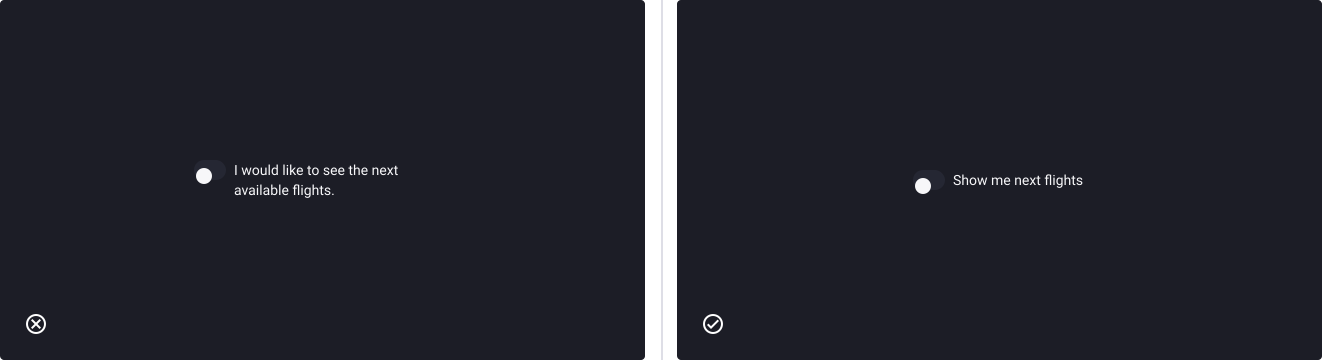
Use concise and clear labels
- Don’t: write labels like “Do you want to see the next flights?”
- Do: write “Show next flights” instead
Choosing a switch over a checkbox
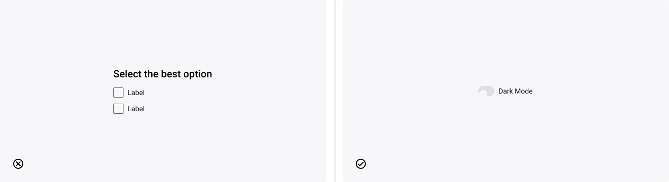
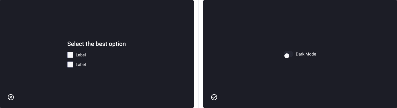
- Don’t: use a checkbox to ask the user to choose between two exclusive and mutually opposed options, implying an on/off state.
- Do: use a toggle switch instead