Split Button
Overview
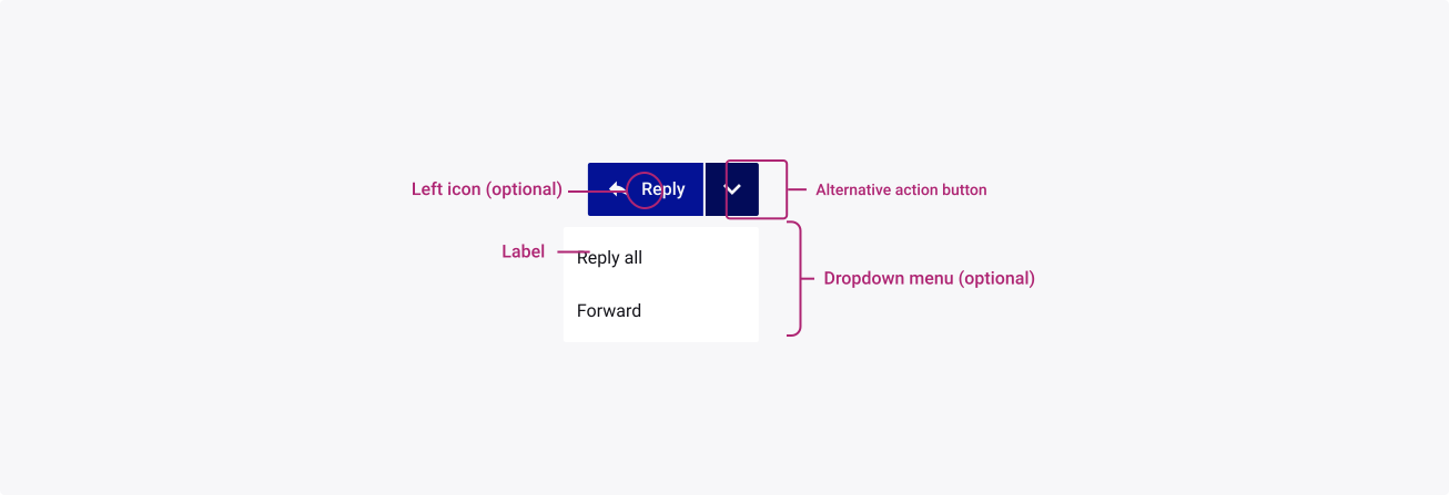
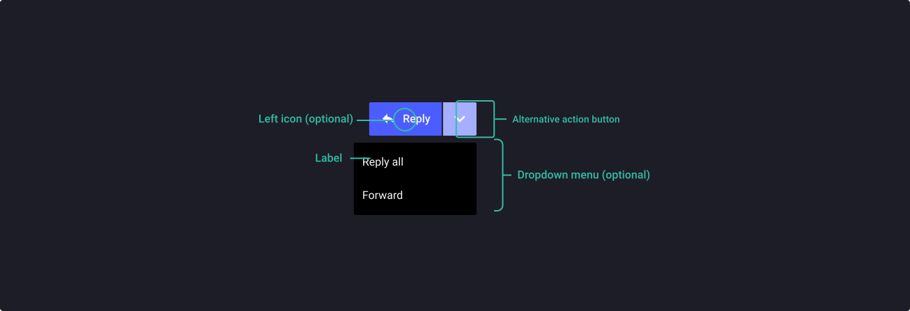
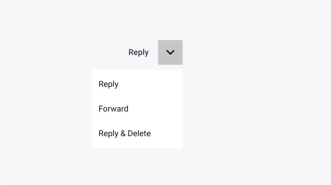
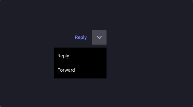
Split Buttons are dual-function menu buttons with two components: a label and an arrow; clicking on the label selects a default action, and clicking on the arrow opens up a list of other possible actions: the alternatives.
Usage
When to use:
- To offer a default action as well as the possibility of choosing a different action by selecting from a set of alternatives.
- In complex applications, to not visually overwhelm users with too much cognitive load.
- For repeat-use interfaces with a large number of commands that need to be consolidated.
When not to use:
- If default action and alternatives don’t have a strong relationship.
- Proposing too much alternatives and struggling with choice paralysis.
- Using split buttons for navigation menus on websites.
Sources
- Split Buttons: Definition by Nielsen Norman Group
- Split Buttons: Documentation by ArcGIS Developer
Anatomy
Properties
From the design point of view, each component has a number of options. These options and their names are platform agnostic, and each implementation should adapt these to fit into their framework. In Figma, these are defined as properties that help define each variant.
Heads up
A star or asterisk symbol (*) can be used as a prefix to some Figma component properties in order to inform that the corresponding property is only used that way on the design side (Figma component libraries).
◇◇❖ Component: Split Button
| Property | Values | Default |
|---|---|---|
| size | small / medium / large | medium |
| *hasIcon | false / true | true |
| visible | false / true | false |
| placement | none / bottom-left / bottom-center / bottom-right / top-left / top-center / top-right | none |
❖ Sub-component: Dropdown Menu Item
❖ Sub-component: Button
Behaviour
Sizes
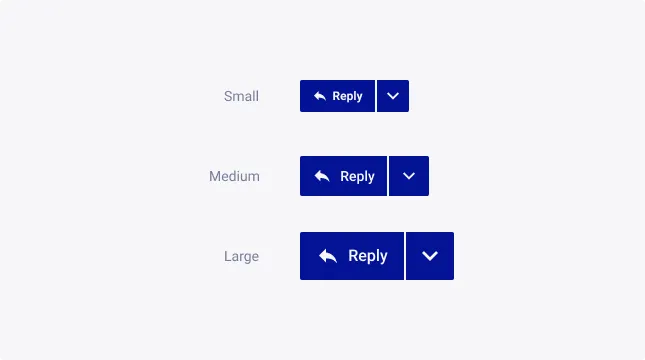
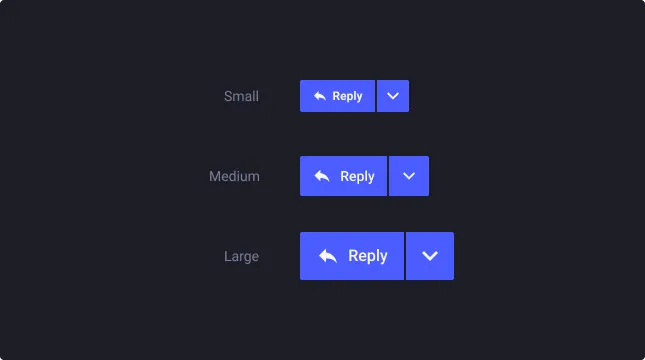
Split buttons exist with 3 different sizes: small, medium and large.
Icons
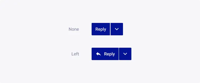
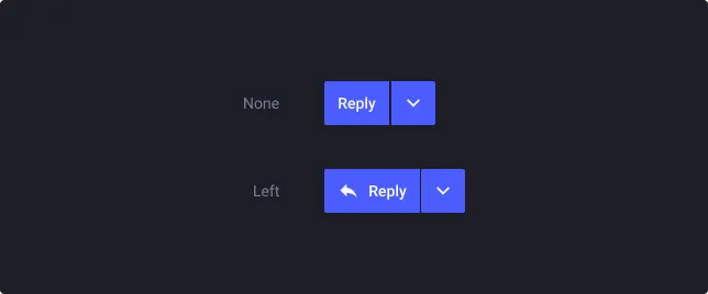
Icons can be used in split buttons items, and should be used as often as possible to add clarity and context.
Icons in split buttons can make information easier to find and scan. The only option is to place the icon on the left of the label so users can see it first. Putting the icon to the right of the label won’t help the users scan the button.
Menu (dropdown)
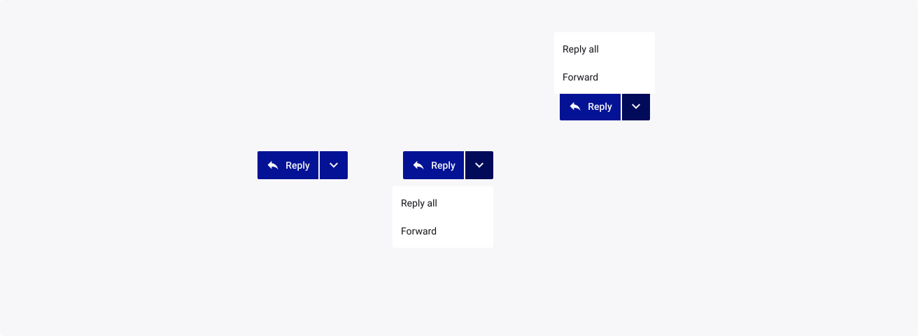
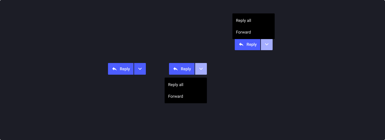
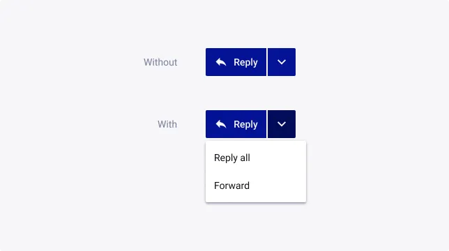
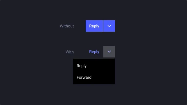
By default, split button doesn’t have an open menu to show alternatives.
Alternatively, the open state can be used to show alternatives or to animate prototypes.
Menu position
By default, split button’s menu is closed. The open state allows the user to choose the menu’s position to fit perfectly with their unique context.
As the menu is a dropdown component, it offers all the possible customizations with this element.
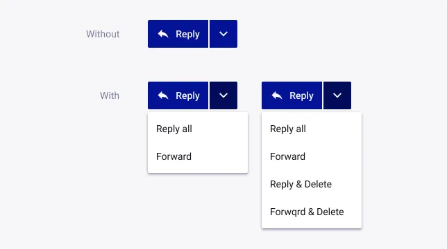
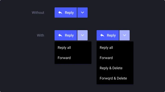
Color variations
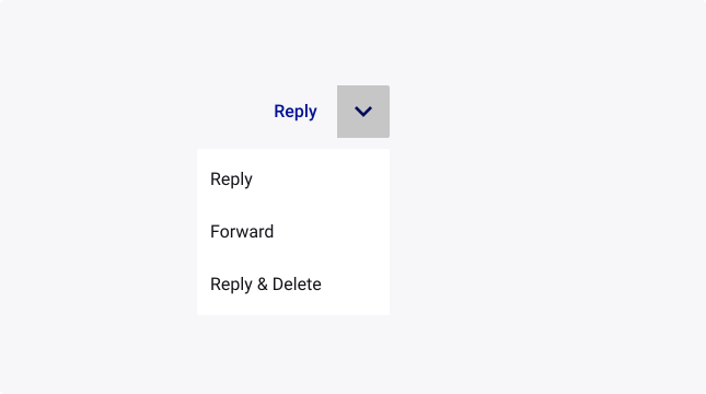
Ghost split button
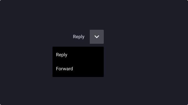
Ghost Neutral split button
Usage Guidelines
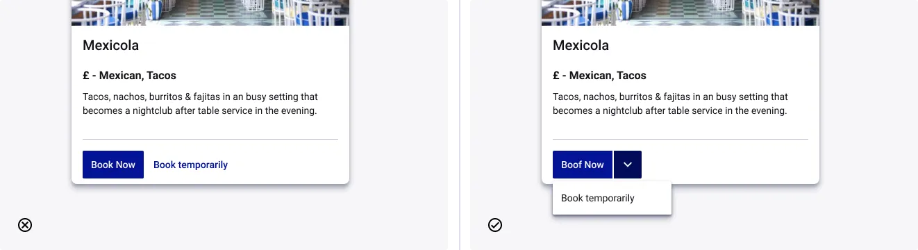
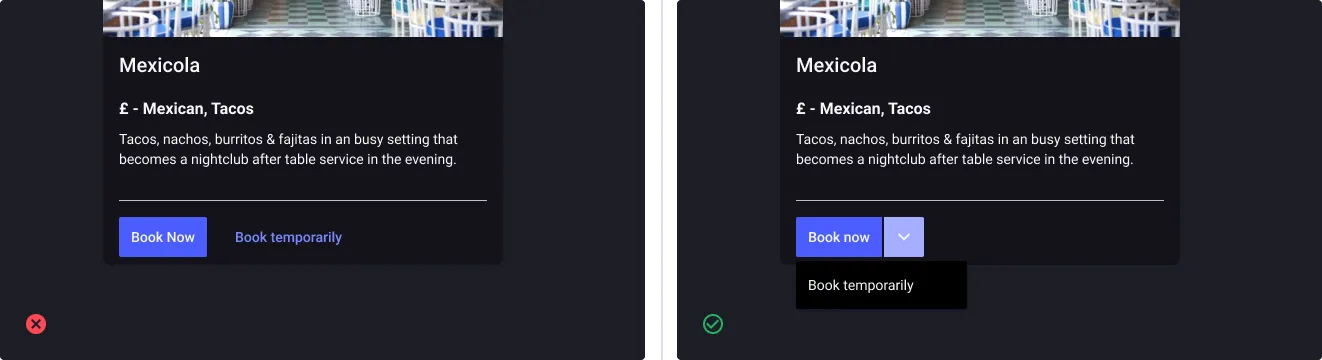
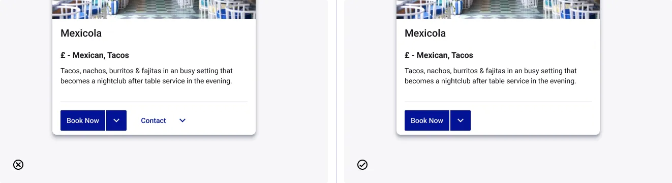
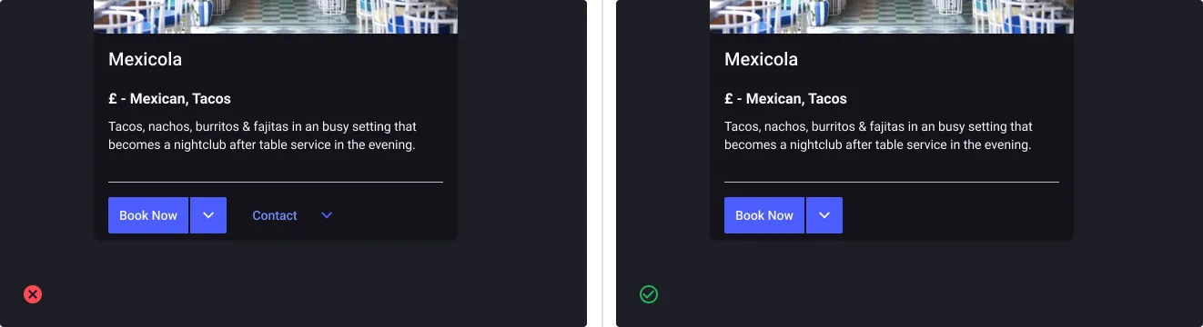
Use split buttons to combine relevant button actions
- Don’t: use multiple primary actions at the same place
- Do: combine them in a split button when relevant
Use split buttons not as a group
- Don’t: use split buttons if the intention is to use it as a group
- Do: use them if the intention is to use it as a single element
Propose related alternatives
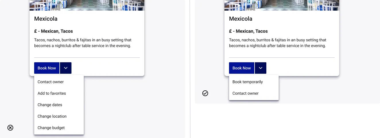
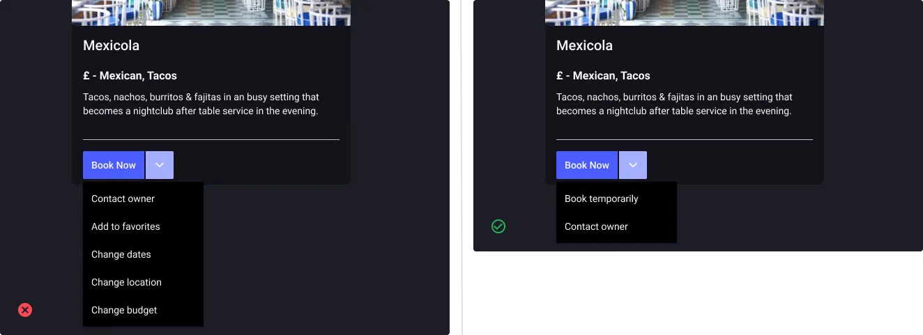
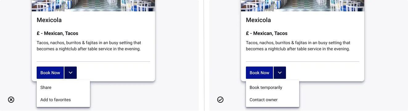
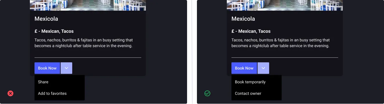
- Don’t: use split button for proposing unrelated alternatives
- Do: choose wisely the alternatives to avoid cognitive overload
The lesser the better
- Don’t: use split button for proposing a huge amount of alternatives
- Do: choose wisely the alternatives to avoid cognitive overload and impact on the time to make a choice - Hick’s law