Rail


Overview
Navigation rails increase the level of product’s discoverability by letting the user know exactly where they are in the product, and taking them to where they want to go quickly and effortlessly. It is often used as a first level of navigation.
Usage
When to use:
- Navigating between unrelated destinations
- Your product has five or more top-level destinations (single-level)
For more information about layout and when/how to choose between a Navigation rail and a Navigation drawer, please visit the dedicated section in Foundations / Grids & Layout.
Anatomy
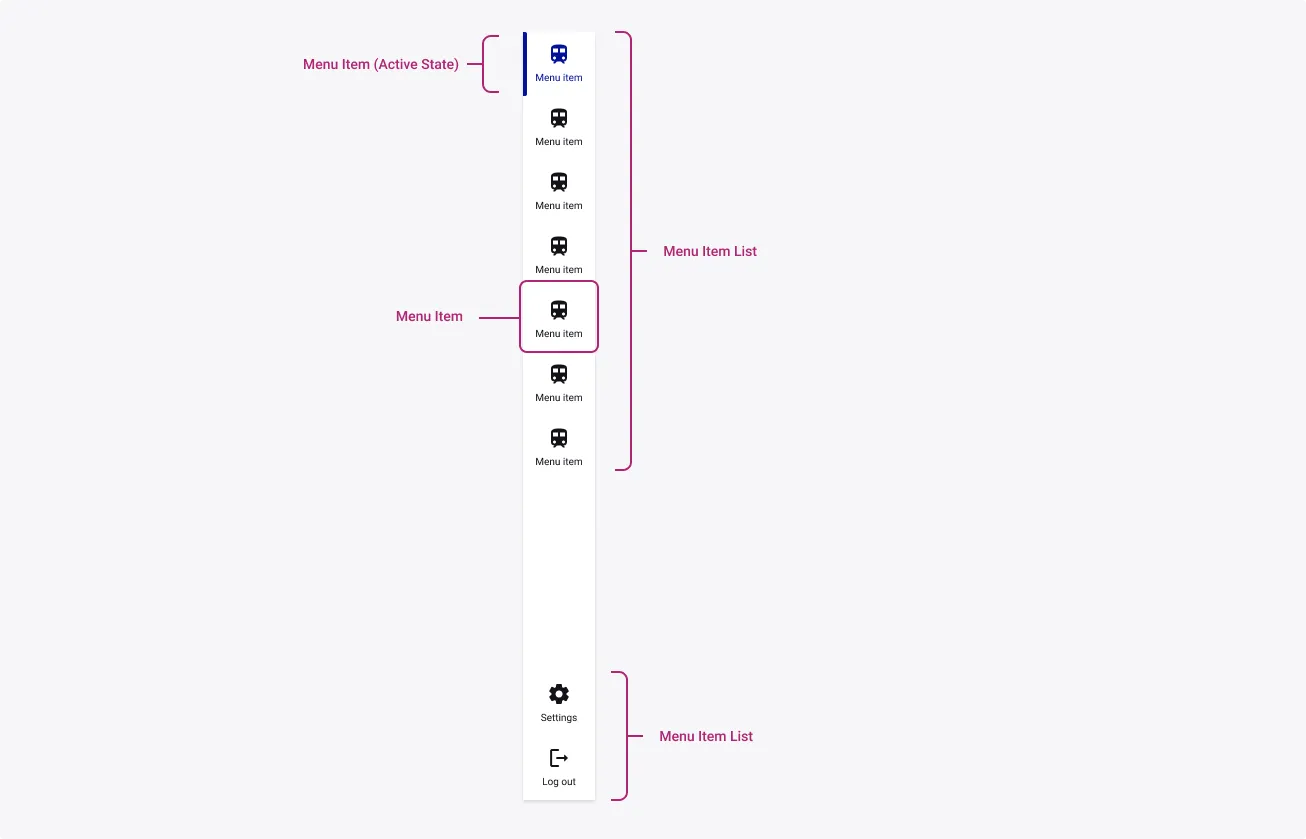
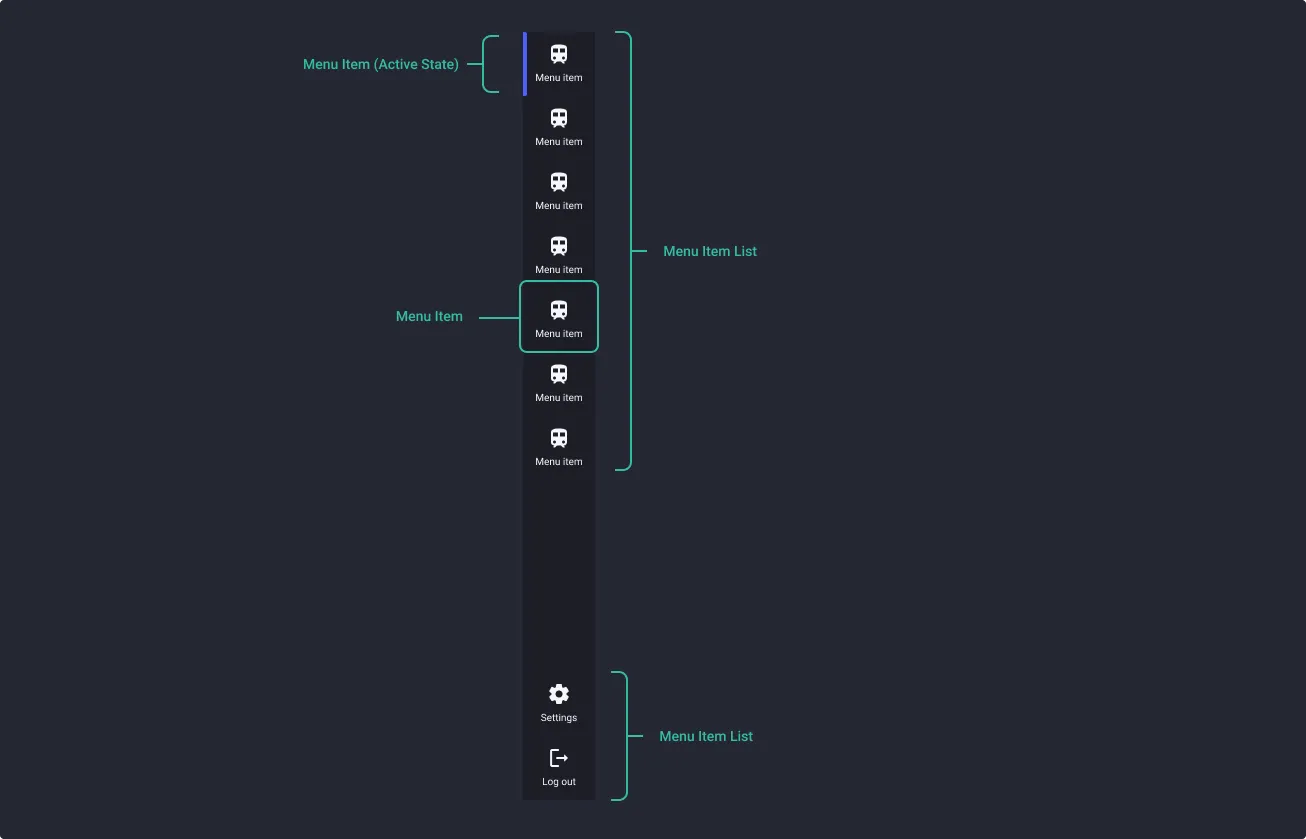
Elements highlighted below can be configurable by you within the component itself. To find out how to customize these elements, please visit the Customization page where it introduces you to the variants that define the make up of the Navigation Rail.
Properties
From the design point of view, each component has a number of options. These options and their names are platform agnostic, and each implementation should adapt these to fit into their framework. In Figma, these are defined as properties that help define each variant.
Heads up
A star or asterisk symbol (*) can be used as a prefix to some Figma component properties in order to inform that the corresponding property is only used that way on the design side (Figma component libraries).
◇❖ Component: Rail
| Property | Values | Default |
|---|---|---|
| size | small / medium / large | medium |
| bottom menu | true / false | true |
❖ Sub-Component: Menu Item
| Property | Values | Default |
|---|---|---|
| size | small / medium / large | medium |
| state | default / hover / focused / active (ltr) / active (rtl) / active + hover (ltr) / active + hover / active + pressed (ltr) / active + pressed (rtl) / disabled | default |
| icon | swap instance | train |
| hasLabel | true / false | true |
| label | text | “menu item” |
◇❖ Sub-Component: Menu Item List
| Property | Values | Default |
|---|---|---|
| size | small / medium / large | medium |
| no. of items | 1 to 8 | 5 |
Behaviour
Icon and label
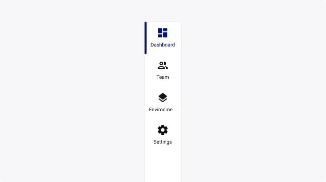
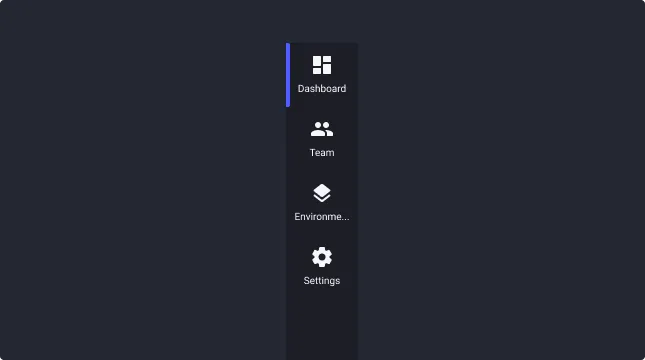
You can use the icons and labels option to ensure good reading to your end user. Labels will help the end user contextualize the icon. When writing labels, always consider the length of your word. If the word is too long the end should be truncated with “…”
Icon only
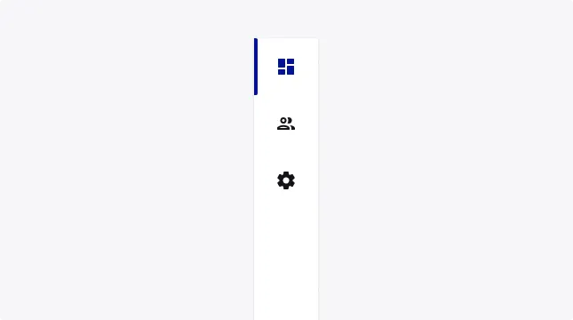
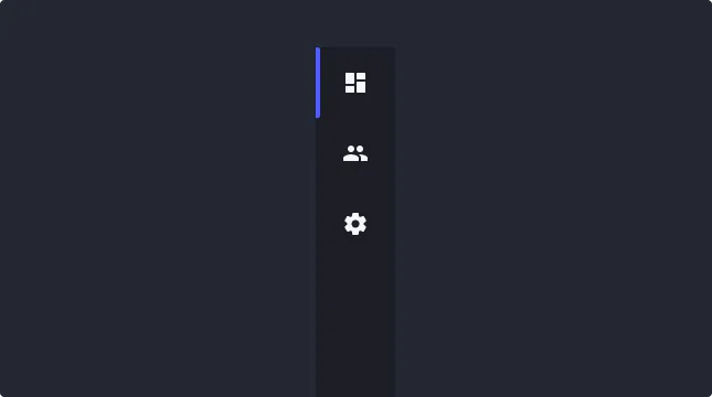
Even if it’s not recommended to use this pattern, you can use an icon only rail. If you choose to do so, make sure to use icons that indicate explicitly the feature behind, and make sure you have the right alternative text for browser readers.
Usage Guidelines
Navigation items
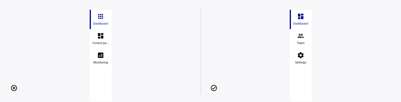
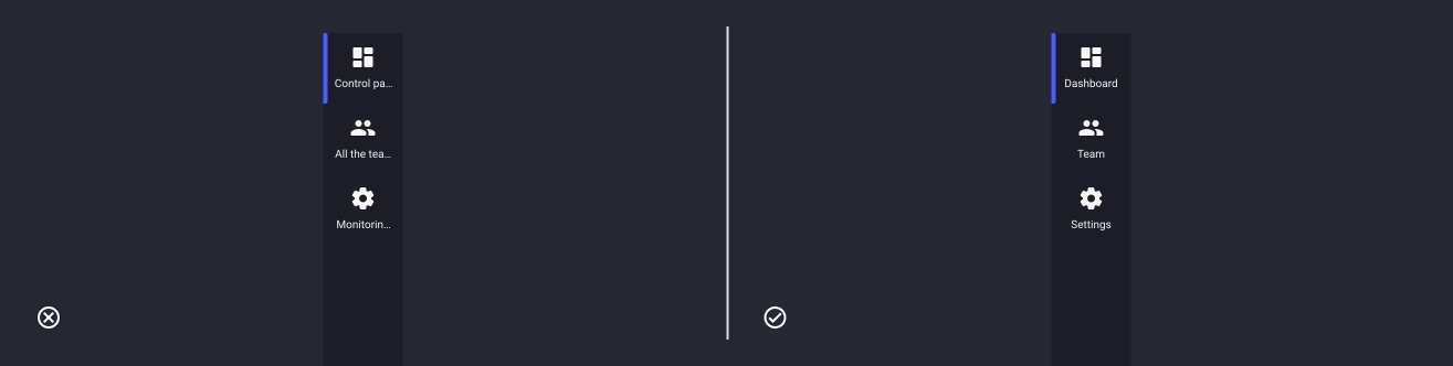
- Don’t: include navigation item names that are irrelevant or may seem redundant alongside other items
- Do: make information easier to find with navigation items names that are meaningful, concise and consistent.
Sentence case
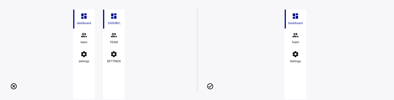
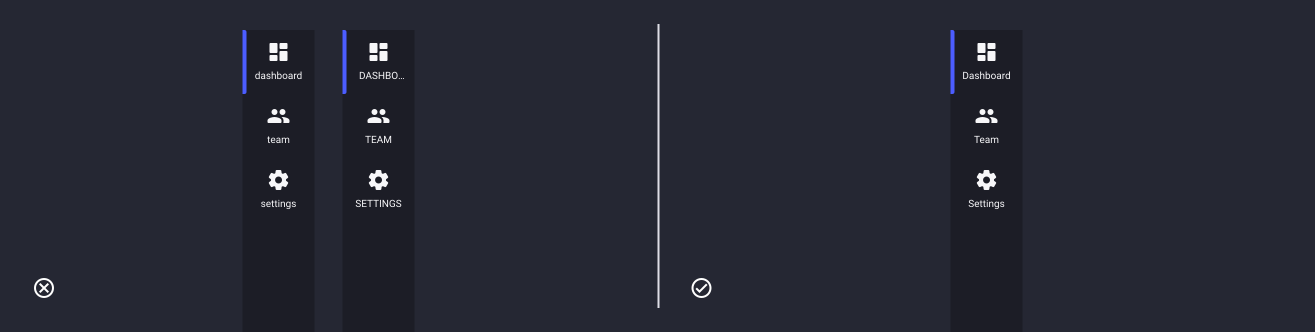
- Don’t: use anything else, unless bespoke design decisions warrant a change.
- Do: use sentence case for menu items.
Icon and labels usage
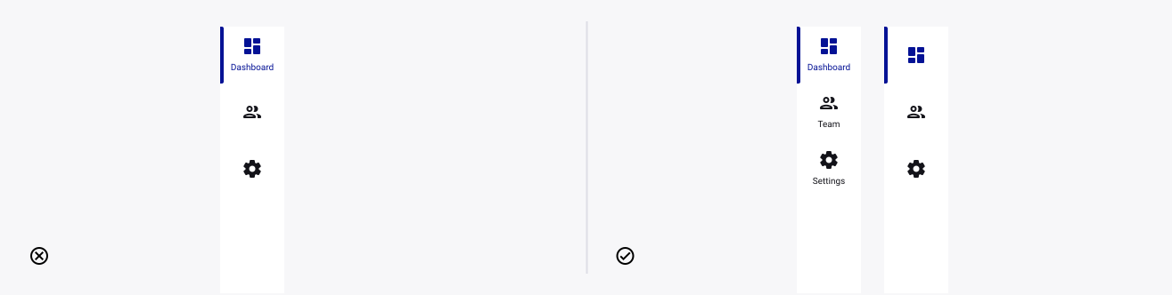
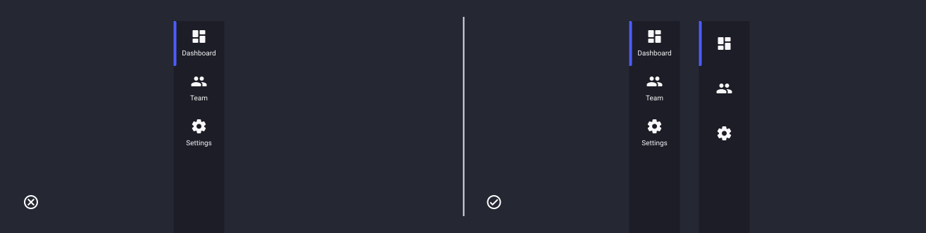
- Don’t: alternate the usage of icon and text-only menu items in the same sections. Try to choose one consistent pattern for your navigation zones.
- Do: use icon and labeled items in a consistent fashion to keep a clear hierarchy.