Text Input
Overview
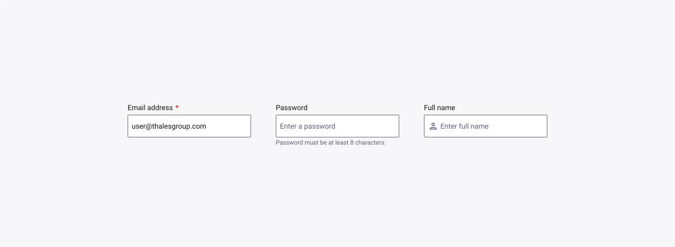
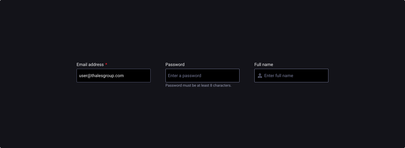
Text Inputs are box-shaped input fields that helps the user enter data to communicate to the machine, a system or a product. Various options exist in the Thales Design System and are presented in this documentation.
Anatomy
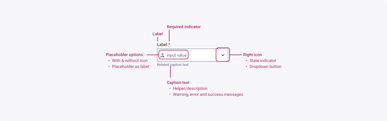
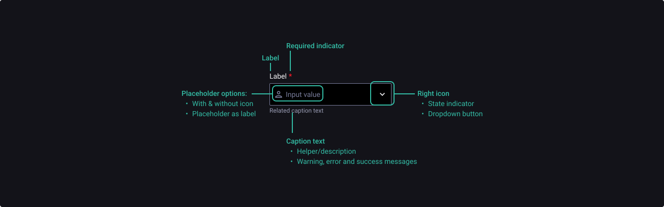
Elements highlighted below can be configurable by you within the component itself. To find out how to customize these elements, please refer yourself to the properties table at the end of this section.
Properties
From the design point of view, each component has a number of options. These options and their names are platform agnostic, and each implementation should adapt these to fit into their framework. In Figma, these are defined as properties that help define each variant.
Heads up
A star or asterisk symbol (*) can be used as a prefix to some Figma component properties in order to inform that the corresponding property is only used that way on the design side (Figma component libraries).
❖ Component: Text Input
| Property | Values | Default |
|---|---|---|
| size | small / medium / large | medium |
| state | default / hover / active / filled | default |
| severity | default / success / warning / error | default |
| disabled | false / true | false |
| hasLabel | boolean | true |
| label | text | “Label” |
| required | boolean | true |
| hasLeftIcon | boolean | true |
| leftIcon | instance swap | person |
| placeholder | text | “Placeholder” |
| hasRightIcon | boolean | true |
| rightIcon | instance swap | expand_more |
| successIcon | instance swap | check_circle |
| warningIcon | instance swap | warning |
| errorIcon | instance swap | error |
| hasCaption | boolean | true |
| caption | text | “Caption” |
Behaviour
Minimum width
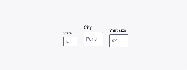
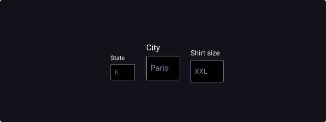
To ensure that small text fields are easily readable and touchable on screen devices, we recommend a minimum width of 1.5x the height of the button. This means 48px (small), 60px (medium) and 72px (large)
Label usage
Text inputs can be used either with a label on top of the field, or inside as a placeholder. If you use the second option, make sure your label is explicit enough for the user to understand the data they should enter. You can also use icons to help guide the user.
Required and optional options
Depending on your forms structure, you might need to present “Required” or “Optional”. We recommend using the dedicated asterisk for the labelled input, and the caption for the placeholder label option.
Use required and optional correctly
In a complete form, you will always have required and optional fields. To decrease cognitive load, always indicate the less frequent option and mark them. For instance, if most of the fields are optional, only mark the required with an asterisk. If most of the fields are required, only mark the few optional ones with “(optional)” in the label.
Validation and error states
To help guide the user in the completion of the form, you can use the embedded validation states. Available today are:
- Success
- Warning
- Error The semantic text temporarily replaces the help text underneath the text input, as the language should be more specific to how to user can resolve the error.
Icon usage
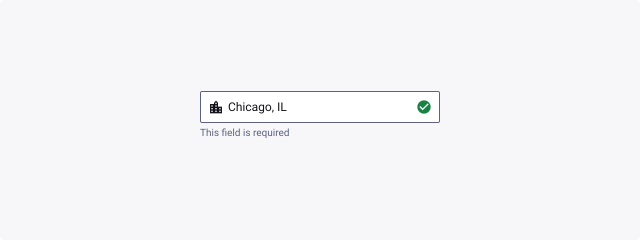
The icon placeholders can help the user understand the expected input even more. You should use left OR right icons to illustrate the label/placeholder. Using both icons is a unique use case and is only reserved for the following use cases:
- Validation
- Dropdown arrow button

Usage Guidelines
Choose the best type in your context
- Don’t: mix top label and placeholder label in the same form.
- Do: make the one choice that fit the most your product.
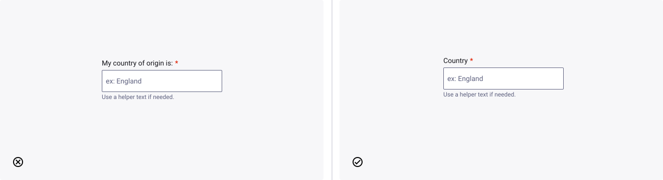
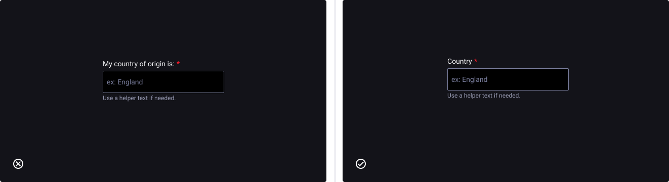
Keep labels short and precise
- Don’t: describe too much within the label.
- Do: stay clear, precise and explicit.
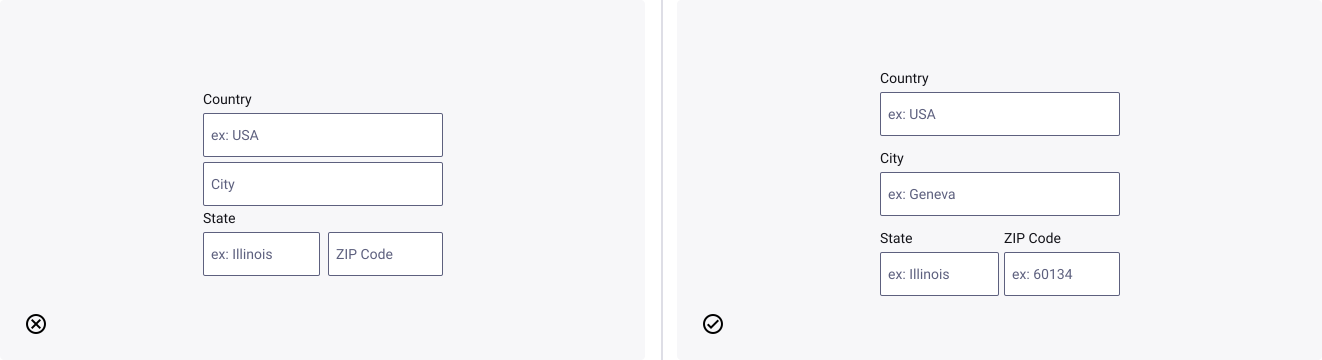
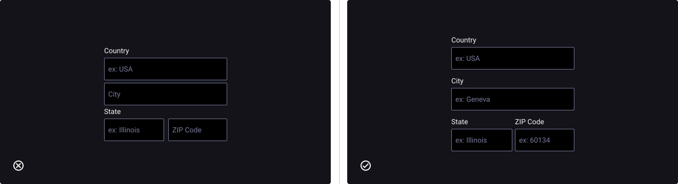
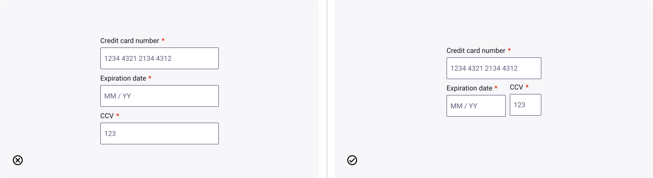
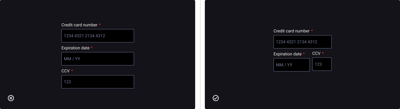
Adapt length and related groups relatively to the data
- Don’t: employ same length for very different data input sizes.
- Do: adapt and create related groups of data inputs.
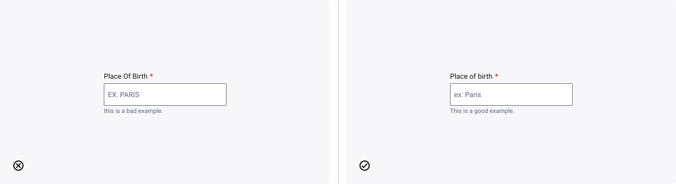
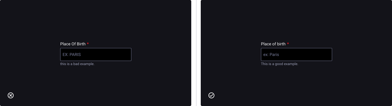
Use sentence case for everything
- Don’t: Mix or use different types of cases than sentence case, exception is made for acronyms.
- Do: use sentence case for everything.