Tooltip
Overview
Tooltips are contextual, non-actionable and informative floating labels. They can be activated by hover, focus, or even click to display additional information to help the users understand something. They should always be non-essential to the global understanding.
Usage
When to use:
- When you want to display additional information for an interface element.
- To describe an icon when it is not labelled, such as the menu items in the Rail.
When not to use:
- Don’t use tooltips to display crucial information. This kind of information should always be accessible without any interaction from the users.
- To propose new actions: tooltips must always be informative only, and never actionable
Anatomy
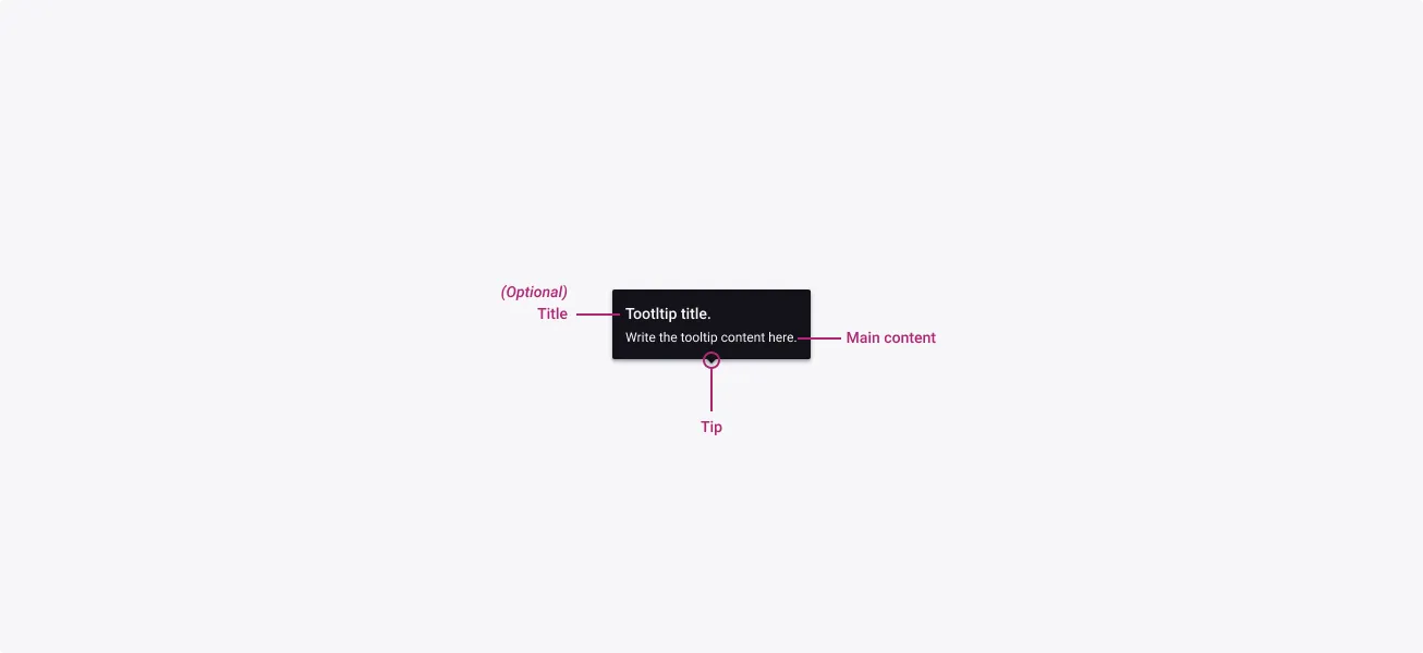
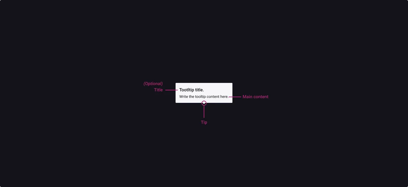
Properties
From the design point of view, each component has a number of options. These options and their names are platform agnostic, and each implementation should adapt these to fit into their framework. In Figma, these are defined as properties that help define each variant.
Heads up
A star or asterisk symbol (*) can be used as a prefix to some Figma component properties in order to inform that the corresponding property is only used that way on the design side (Figma component libraries).
❖ Component: Tooltip
| Property | Values | Default |
|---|---|---|
| size | small / medium / large | medium |
| orientation | left / right / bottom / top | left |
| tipPosition | start / center / end | center |
| lowContrast | true / false | false |
| *hasTitle | boolean | true |
| *title | text | “Tooltip title.” |
| content | text | “Write the tooltip content here.” |
Behaviour
Sizes
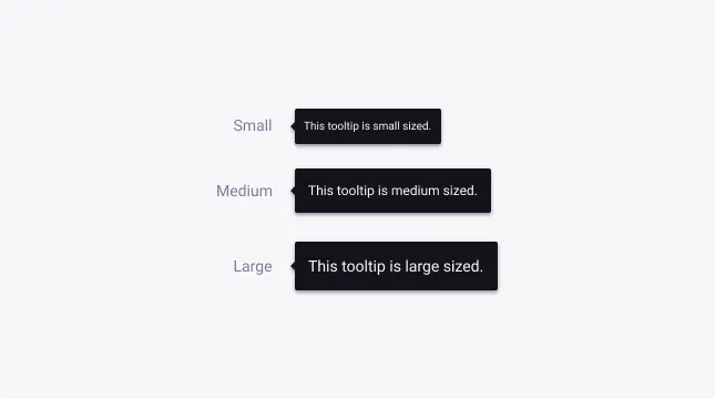
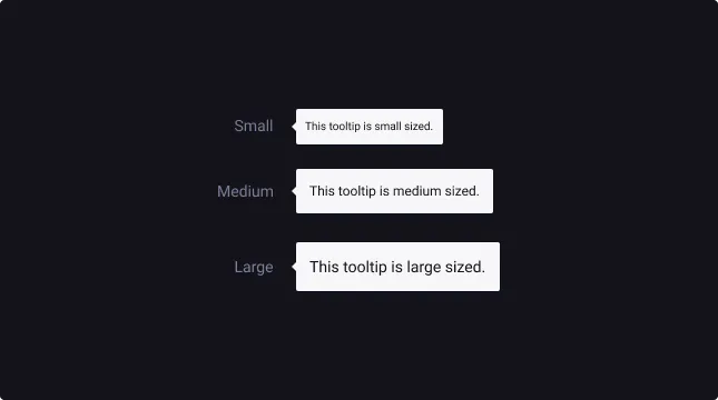
Tooltips are available in three sizes to cater for the diverse range of use cases and devices that our business uses.
By default, the medium tooltip is used typically for desktop. But for mobile devices, it is advised that you upscale the tooltip, to maximize the visual impact.
For more information about text sizes and readability, check out W3’s website.
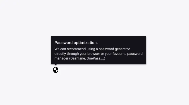
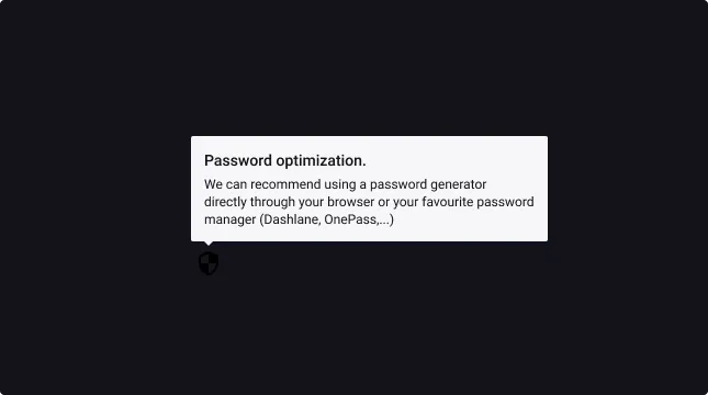
Tooltip title
Use the title property if you need to summarize a long description.
Therefore, we strongly recommend being as concise as possible to not strain the attention of the user in their business context.
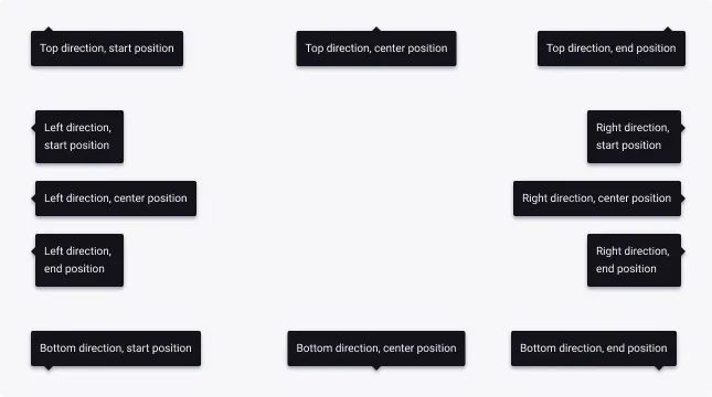
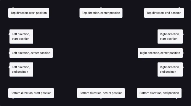
Tip direction
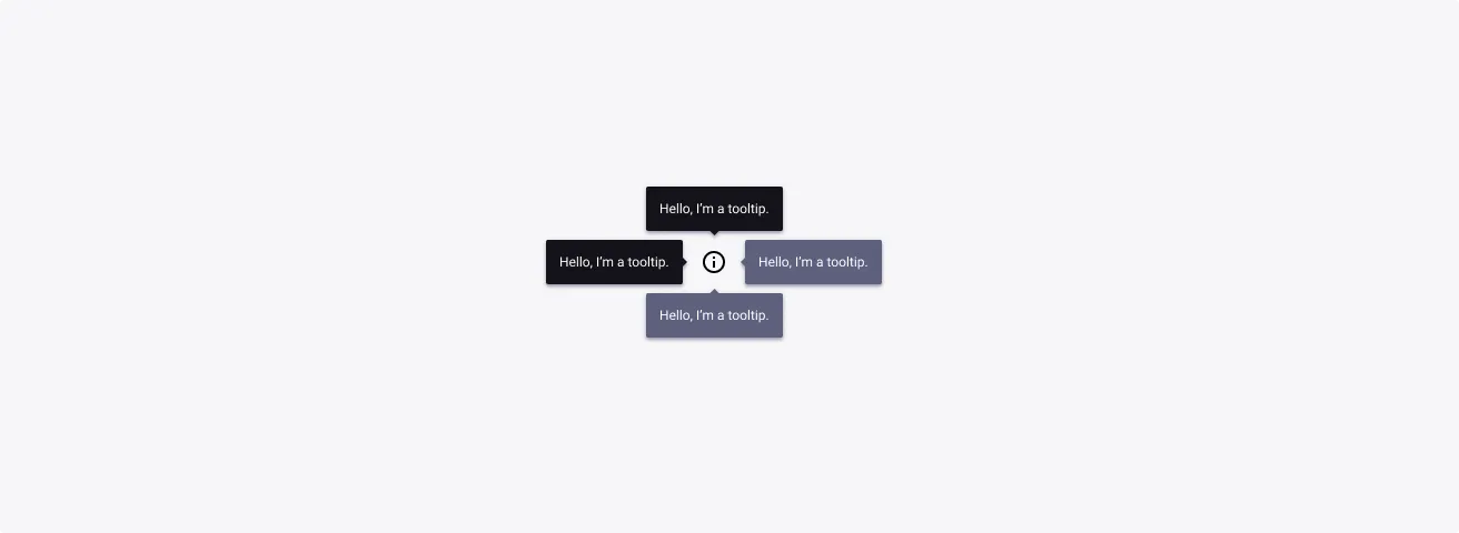
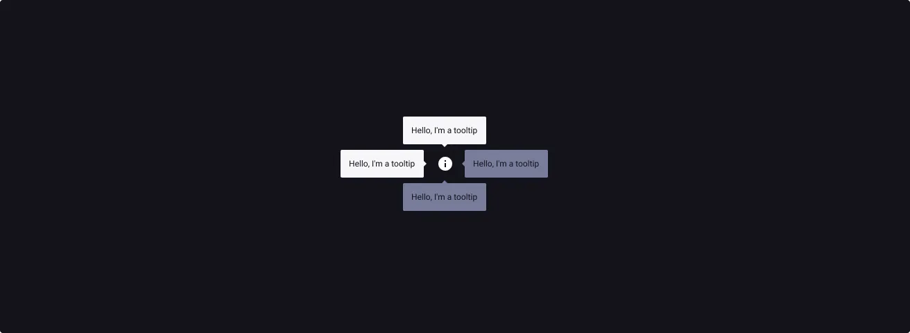
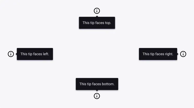
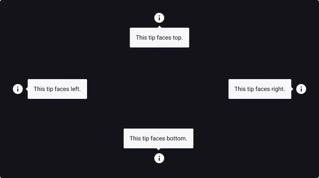
The tooltip component should always be positioned according to its target. The tip direction variants help you initiate this orientation.
Coupled with the tip position, this component caters for the diverse range of use cases and positions you might need to contextualize it.
Main directions include:
- Bottom
- Top
- Left
- Right
Tip position
The tooltip component should always be positioned according to its target. The tip position variants help you complete the tip direction variant to be even more precise.
For all directions, the tip position options are:
- Start
- Center
- End
Low contrast option
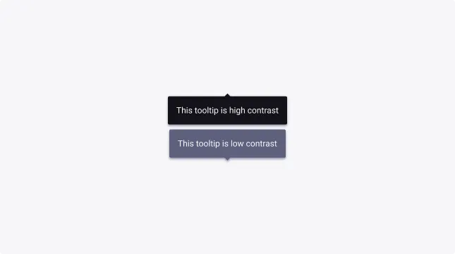
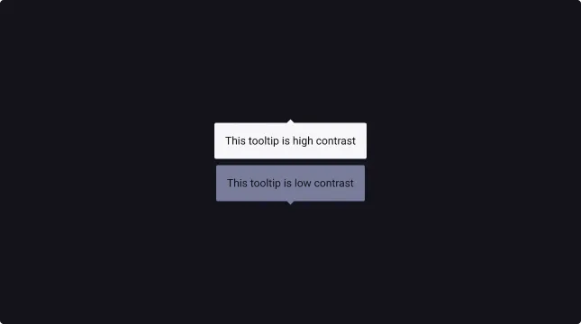
To lower the visual emphasis on the tooltip component, you can activate the Low contrast option. This option will apply a lighter background to the tooltip while remaining always accessible.
Usage Guidelines
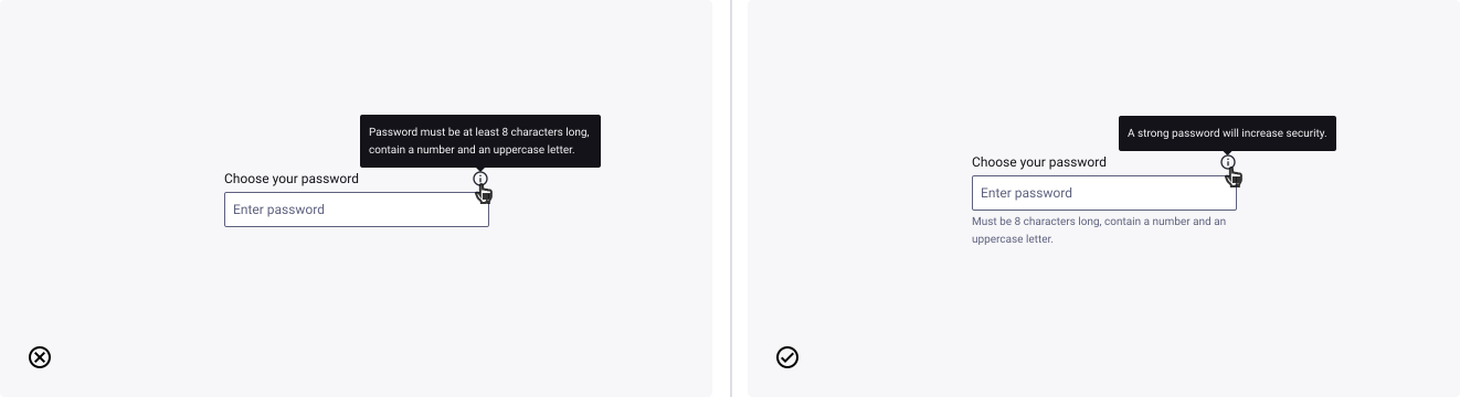
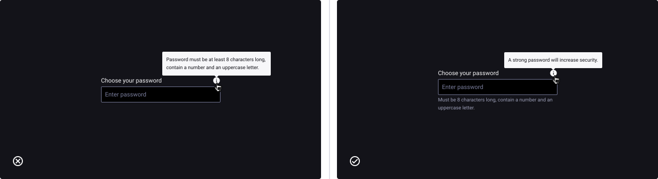
Tooltips aren’t made for crucial information.
- Don’t: hide information that is crucial to the experience.
- Do: always make them visible instead and use tooltip for additional information.
Be as concise as possible
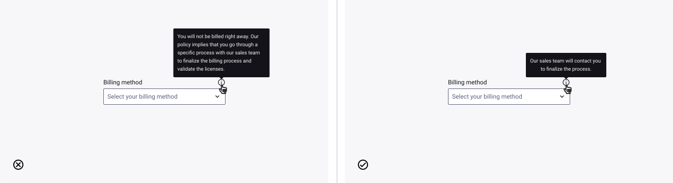
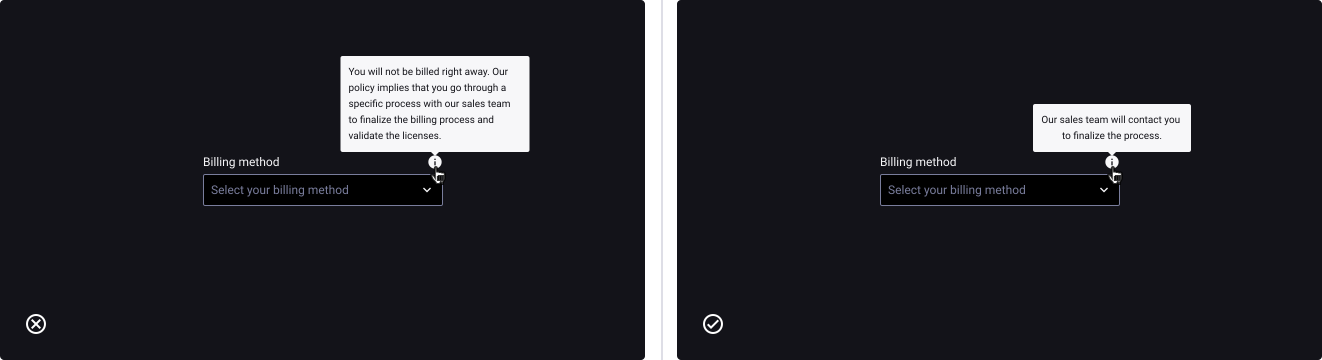
- Don’t: overflow the tooltip with too much information. Tooltips are supposed to carry additional information so avoid taking too much of your user’s attention.
- Do: keep the tooltips content 1 or 2 (short) sentences long.
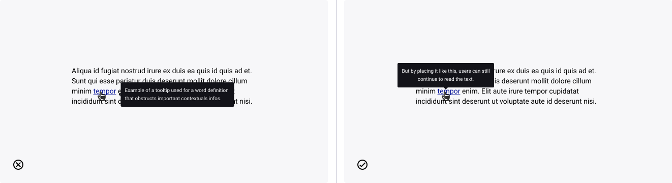
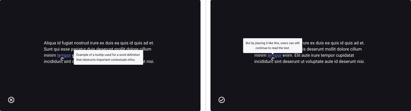
Use orientation options to avoid obstructions
- Don’t: mask important information under a tooltip.
- Do: choose the best orientation option so the tooltip doesn’t obstruct helpful contextual information.
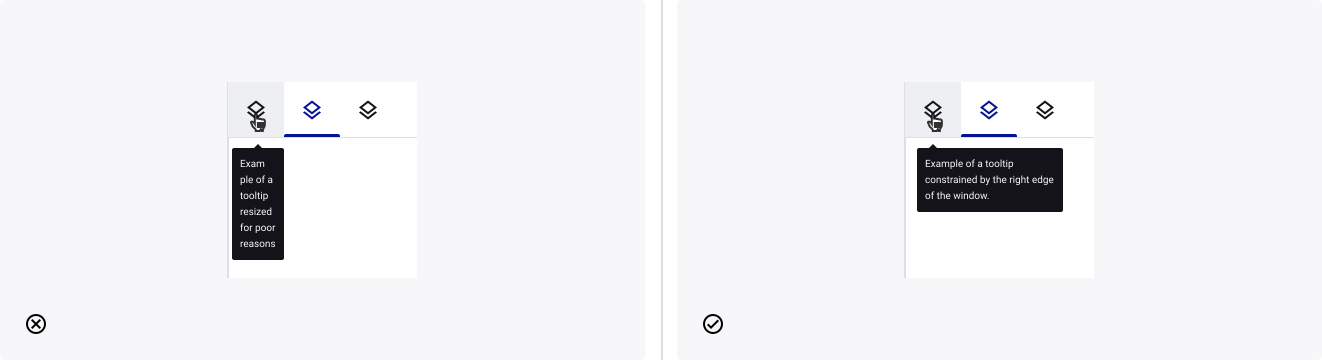
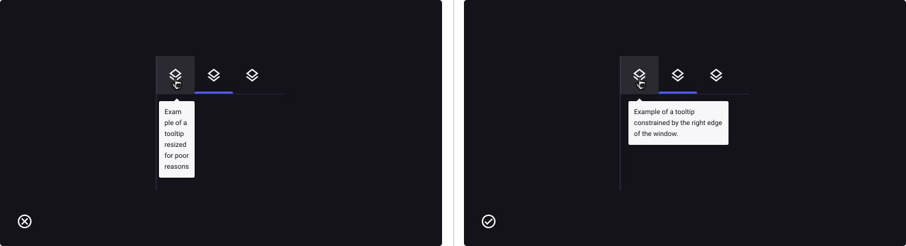
Use tip position options when constrained by the window’s edge/corner
- Don’t: resize the tooltip to bring the tip closer to its target.
- Do: Choose the right tip position to visually connect the tooltip with its target (start, center or end).