Slider


Overview
Sliders are form elements with which users can set a value by dragging a cursor along a bar. It uses a knob or lever moved horizontally to control a variable, such as volume on a radio or brightness on a screen.
Usage
When to use:
- When adjusting settings contained in a range
- When selecting a value from a predefined range
- When it’s possible to have a real-time feedback by dragging the handle
- When the specific value does not matter to the user, but an approximate value is good enough.
Sources
- Slider Design: Rules of Thumb by Nielsen Norman Group
- Slider Components overview by Material Angular
Anatomy
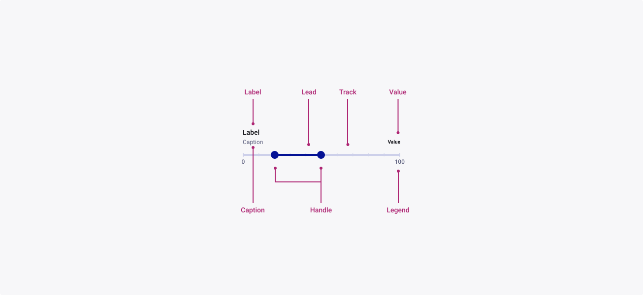
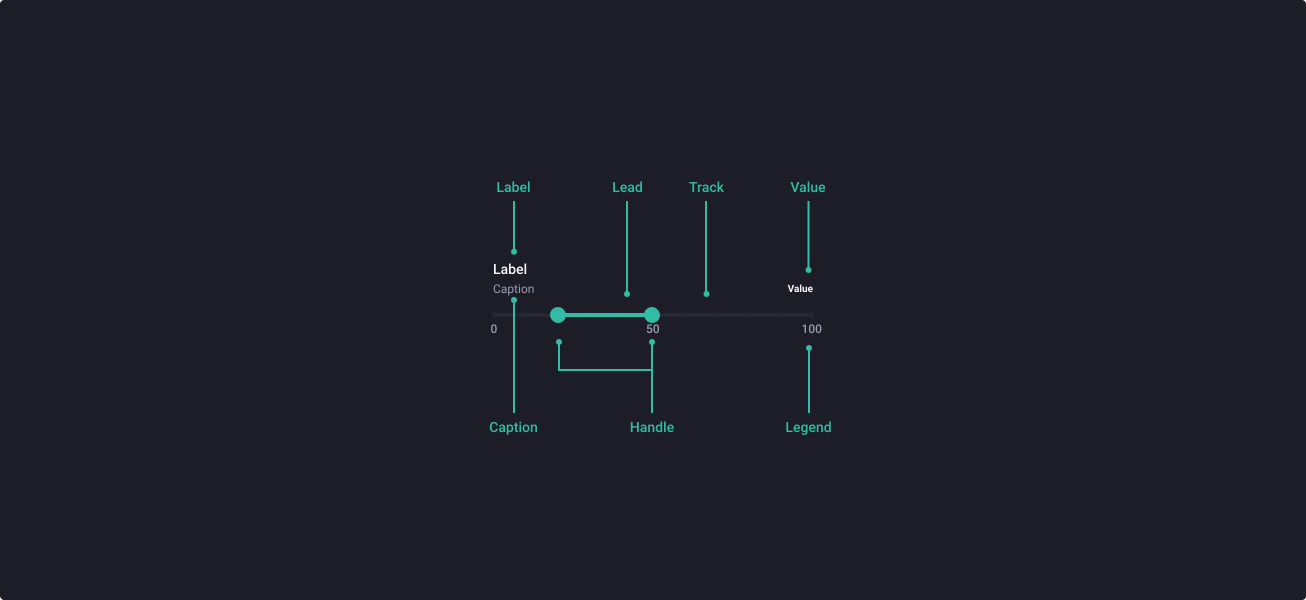
This component is almost entirely configurable, thanks to the Figma ‘Variants’ feature. To find out how you can use this flexible component, check out the following areas within the component to customise. All the sub-components can be accessed via the component’s layers list or by double-clicking in the corresponding zones highlighted with the purple boxes.
Want to learn more? Check out the Figma Variants Tutorial on YouTube, to understand how we build flexible components with Variants.
Properties
From the design point of view, each component has a number of options. These options and their names are platform agnostic, and each implementation should adapt these to fit into their framework. In Figma, these are defined as properties that help define each variant.
Heads up
A star or asterisk symbol (*) can be used as a prefix to some Figma component properties in order to inform that the corresponding property is only used that way on the design side (Figma component libraries).
◇◇◇◇❖ Legend Mark
| Property | Values | Default |
|---|---|---|
| size | small / medium / large | medium |
| priority | main / secondary | main |
| text | true / false | true |
| textPosition | top / bottom / none | top |
| color | primary / neutral | primary |
| active | true / false | false |
| value | text | “0” |
| tick | true / false | true |
◇◇◇❖ Legend
| Property | Values | Default |
|---|---|---|
| size | small / medium / large | medium |
| color | primary / neutral | primary |
| textPosition | top / bottom / none | top |
| tick | true / false | true |
◇◇❖ Slider
| Property | Values | Default |
|---|---|---|
| size | small / medium / large | medium |
| color | primary / neutral | primary |
| state | default / hover / focused / pressed / disabled | default |
| two handle | true / false | false |
| tick | true / false | false |
| hasTitle | true / false | true |
| title | text | “label” |
| hasCaption | true / false | true |
| caption | text | “caption” |
| showValue | true / false | true |
| value | text | “value” |
◇❖ Sub-component: Range Slider
| Property | Values | Default |
|---|---|---|
| size | small / medium / large | medium |
| color | primary / neutral | primary |
| legendPosition | top / bottom / none | bottom |
| start | 0% / 10% / 20% / 30% / 40% / 50% / 60% / 70% / 80% / 90% | 10% |
| length | 10% / 20% / 30% / 40% / 50% / 60% / 70% / 80% / 90% / 100% | 60% |
◇❖ Sub-component: One Handle Slider
| Property | Values | Default |
|---|---|---|
| size | small / medium / large | medium |
| color | primary / neutral | primary |
| legendPosition | top / bottom / none | bottom |
| start | center / left | left |
| length | 0% / 10% / 20% / 30% / 40% / 50% / 60% / 70% / 80% / 90% / 100% | 40% |
| direction | left / right / none | right |
Behaviour
One & two handles
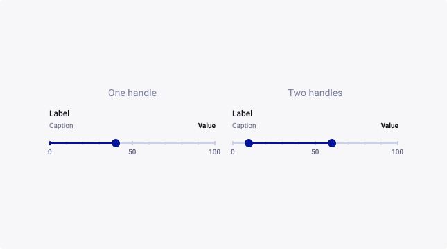
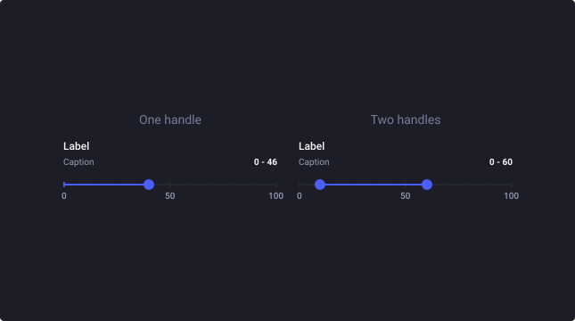
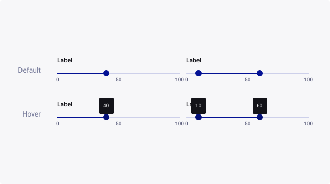
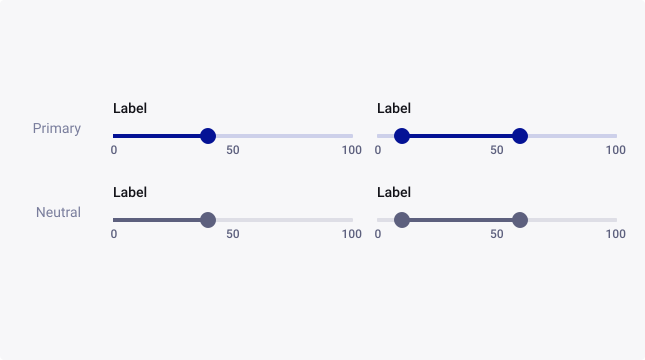
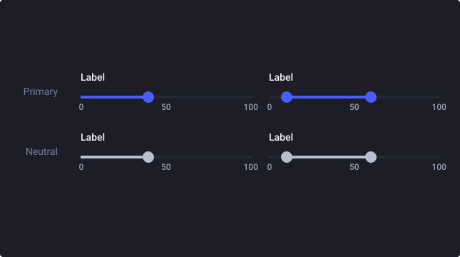
The slider can be used with one or two handles. Thus, it can be used to select a value by dragging a handle along the axis or to define a range with the two-handled one.
Sizes
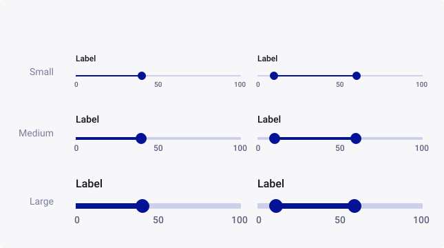
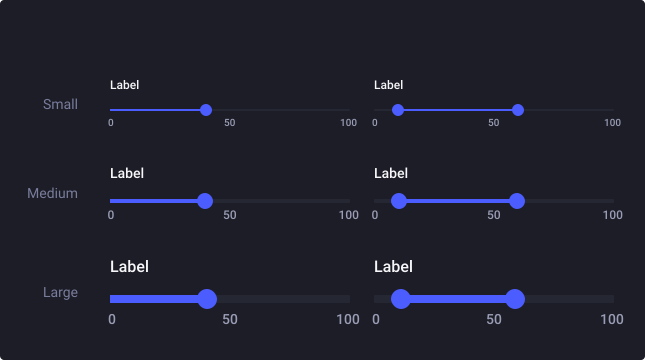
Sliders are available in three sizes to cater for the diverse range of use cases and devices that our business uses.
State
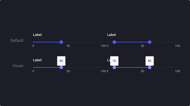
By default, the slider is in Default state. The Hover state provides tooltips to display the value selected thanks to the handle.
Steps
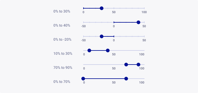
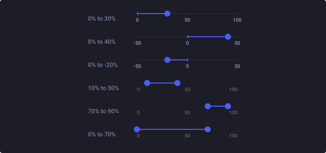
The component has a wide variety of positions. By choosing a start and end value you can adapt it to most situations.
The slider offers three behaviors:
- start at left, at zero, to the right for a linear selection
- start at the center, to the right or left for a positive or negative selection (for example.)
- a range for more flexibility in the choice of values
Colour
By default, sliders are emphasized (primary theme). Providing a visual prominence.
For visual components, like application panels, where colour shouldn’t be a standout element, choose the neutral theme to de-emphasize its focus on the screen.
Usage Guidelines
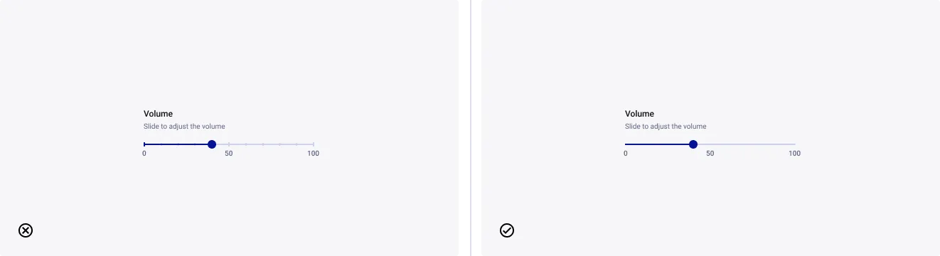
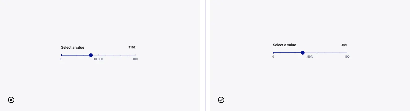
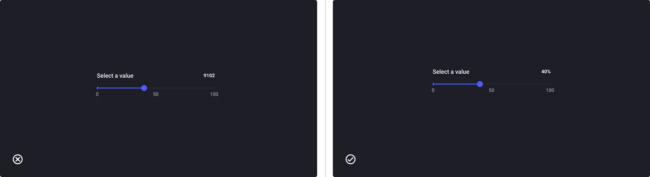
Use slider for imprecise or pre-determined ranges
- Don’t: use slider for large (e.g. 1-1000) or small (e.g. 1-3) ranges
- Do: use slider for medium range
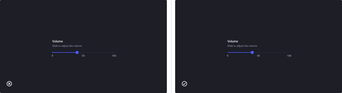
Use slider without tick for imprecise range
- Don’t: use tick when the steps looks approximative
- Do: use slider without tick and give contextual labels